A homeowner sees your 30-second spot from the couch, picks up a phone, and types the address from memory. One letter is wrong. Instead of your offer, pricing, or phone number, they get a bare screen that says the page isn’t there. They don’t know if you’re closed, if the site moved, or if they mistyped. Most will not work hard to find out.
That’s the moment most small sites never plan for, and it’s why 404 page best practices belong in your marketing work, not just your hosting setup. The eight practices below cover status codes, plain copy, search, useful links, branding, tracking, calls to action, and accessibility. Each one ends with a fix you can do this week, because a recovery page only earns its keep when someone recovers.
If you advertise with Adwave, treat this page as part of the campaign. A viewer who hits a broken URL after seeing your ad is a lead you’ve already paid to earn, so the error page deserves the same care as the landing page. Before you spend anything, Adwave can analyze your site for free, which gives you a clean starting point for checking how your pages, offers, and calls to action connect.
1. Return Correct Status Codes and Redirect Moved Content
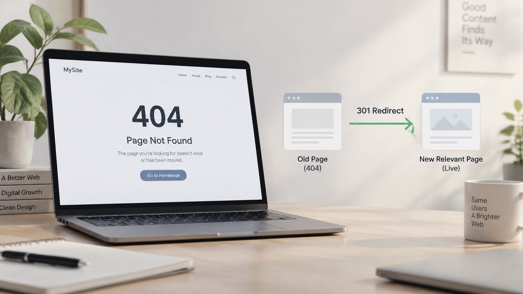
Start with what the server says, not what the screen looks like. A missing page should return a real 404 Not Found status. A page you’ve deliberately and permanently removed should return 410 Gone. Showing a friendly error message while returning 200 OK creates a soft 404, which tells search engines the page is fine when it isn’t.
The distinction is built into the protocol itself. RFC 9110 defines 404 as the server not finding a current representation of the requested resource, without saying whether that absence is temporary or permanent, and specifies 410 as preferable when removal is permanent. Use 301 or 308 redirects only when an equivalent replacement exists, not as a blanket fix for every broken URL.
How this plays out on a real site
Say a retailer discontinues a product line for good. Those product URLs return 410. A mistyped address returns 404. When the services section moves during a redesign, each old service URL redirects directly to its new equivalent, with no chains through intermediate pages. Random invented paths from scanners stay as 404s, because there’s nothing worth recovering there.
- Test the header, not the page: Run a made-up URL on your own site through a header checker or Search Console’s URL Inspection tool and confirm it returns 404.
- Build the map before you move: List every old URL and its replacement before a migration, then test the full list after launch.
Do this week by typing three fake URLs on your domain and checking each status code. If any return 200, fix your template before anything else.
2. Use Clear, Plain-Language Messaging
“We couldn’t find that page.” That’s the whole idea. Your visitor doesn’t need the error code as the headline, and they don’t need a joke about how lost they are. They need to know, in one breath, that this specific page isn’t here and that your business still is.
Nielsen Norman Group’s guidance on 404 messages recommends plain, non-blaming language, a precise explanation of the failure, and constructive recovery actions. Blame matters more than owners think. “You entered an invalid URL” accuses the person you want as a customer. “That page isn’t here anymore” describes the situation and leaves the relationship intact.
Copy that works for local businesses
Keep the headline under eight words. Follow it with one short sentence naming the likely causes, a mistyped address or a page that moved, then stop. Put the technical code in small print at the bottom if you want it there for support calls. Match the voice of the rest of your site so the page sounds like you, not like your hosting company.
Say a dental practice retires an old page about a promotion. The 404 headline reads “We couldn’t find that page.” The line underneath says the page may have moved, and a single button offers appointment booking. A patient who arrived from a flyer gets reassurance and a next step in about ten seconds.
Practical rule: Read your 404 copy out loud. If you’d be embarrassed to say it to a customer standing at your counter, rewrite it.
Do this week by replacing any headline that leads with “404” or “Error” with a plain sentence, then check that the next step appears before any explanation of whose fault it was.
3. Provide a Search Box
A visitor who lands on a dead URL usually still knows what they wanted. They wanted the whitening price, the three-bedroom listing, the part for a 2019 truck. A search box lets them say so instead of forcing them to start over with your menu and guess where you’d file it.
Google’s advice on useful 404 pages includes offering site-search suggestions or a search box alongside corrected URLs and links to parent sections. The key word is useful. Wire the 404 search box to the same index and relevance rules as your main site search, so results match what visitors would get anywhere else on the site.
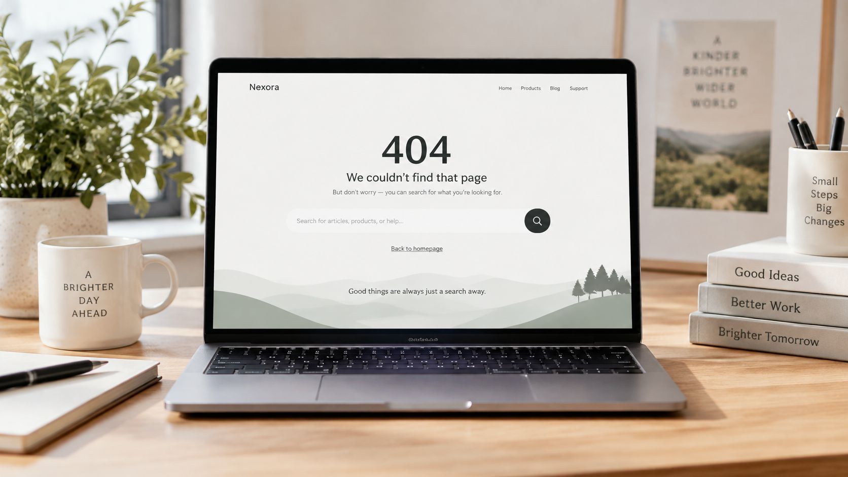
Say a real estate brokerage removes sold listings every week. Old listing links in emails and social posts keep circulating. The 404 page carries a search by city and price range, so a buyer chasing a sold home lands among current listings in the same budget instead of hitting a wall. An auto dealer can do the same with inventory search by make and model.
Make the search box earn its place
- Focus it on desktop: Place the cursor in the field on load so visitors can type immediately, but skip autofocus on mobile where it triggers keyboards and scrolling.
- Log every query: Searches typed on your 404 page are a free list of missing content and redirect candidates.
- Test misspellings: Try the common wrong spellings of your own service names and confirm results still surface.
Do this week by running five realistic searches from your 404 page, including two deliberate typos. If any return nothing, fix your search synonyms or add the missing page.
4. Link to Popular and Relevant Pages
Search helps visitors who know what they want. A short list of strong destinations helps everyone else. The mistake I see most is a alphabetical dump of every page on the site, which reads like a sitemap and gets ignored like one. Three to five well-chosen links beat twenty indifferent ones.
Pingdom’s audit of the 100 highest-ranked U.S. websites found 23 sites, or 23%, had an inadequate 404 page, and its baseline for recovery included a homepage link, broader navigation or a sitemap, internal search, and a contact option. That’s the floor. Your popular pages list is where you go past it, by pointing at what people come to you for.
Choose links by intent, not by menu order
A restaurant’s 404 should link to the menu, reservations, and locations, because those are why anyone visits a restaurant site. A dealership should link to current inventory and service booking. A home services company should link to its top two services and its service area page. If you can detect the section the broken URL came from, match suggestions to that section rather than serving one generic list to everyone.
Align the list with whatever you’re actively promoting. If a TV spot sends viewers to a seasonal offer, that offer page belongs on the 404 until the campaign ends, because the mistyped version of that campaign URL is one of the most likely ways anyone reaches the error page at all. Review the list quarterly so it tracks current promotions instead of last year’s.
Do this week by opening your analytics, noting your five most visited landing pages, and checking whether at least three of them appear on your 404. Swap out anything that’s there from habit.
5. Match the Brand’s Look and Feel
A visitor who types your address from a TV screen, a flyer, or a yard sign has no bookmark to fall back on. If the error page shows a bare server message or an unstyled template, they cannot confirm they reached the right business, and a page that looks abandoned gives them one more reason to leave. Your 404 should wear the same header, footer, logo, colors, and type as every other page. That consistency is what lets a stranger confirm, in about a second, that they found you.
Personality still has a place. GitHub’s 404 uses its Octocat mascot, and Mailchimp’s uses its chimp character. Both work because the navigation and next steps stay unmistakable underneath the art.
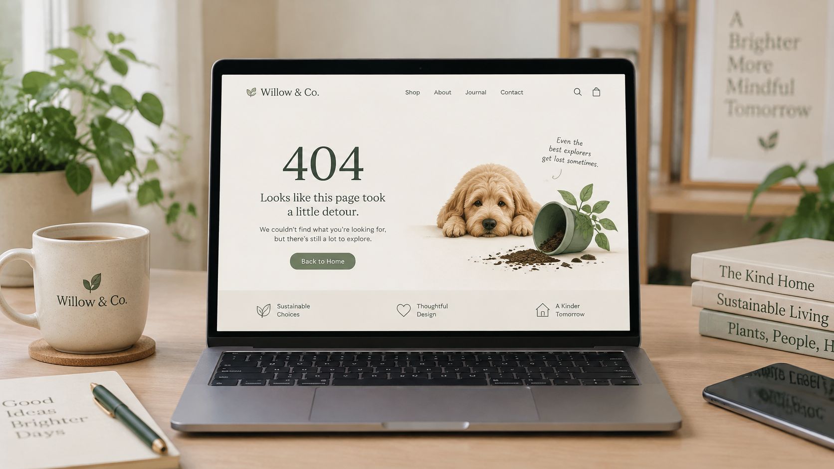
Tone needs a governor. A playful illustration suits a restaurant or a retailer; a law firm or a clinic should stay calm and competent, because the person landing there may already be stressed. Keep images compressed and the layout light. And if your working pages already confuse people, fix the underlying structure first with a cleaner website navigation architecture, because your 404 inherits whatever navigation you give it.
Brand the page like a storefront, not a storage room. If it doesn’t look like your business, visitors assume it isn’t.
Do this week: open your 404 beside your homepage in two tabs and compare logo, header, footer, and phone number. Fix anything missing or outdated before you touch the artwork.
6. Track 404 Errors and Fix Broken Links
Your 404 page is the bandage. Tracking is how you stop cutting yourself. Every hit on that page carries two useful facts, the URL someone asked for and the page or campaign that sent them there. Logged over a month, those facts separate into fixable problems and harmless noise.
Google Search Central’s guidance on 404 errors states ordinary 404s generally don’t harm search performance and can be ignored when the URLs shouldn’t exist, while warning against redirecting every error to the homepage or blocking invalid URLs with robots.txt. So triage by value. A broken internal link gets fixed at the source. A moved page with backlinks gets a redirect. Invented scanner paths get nothing.
A monthly review that takes an hour
- Sort by referrer: Hits arriving from your own pages mean broken internal links you control. Hits with no referrer often mean typed addresses from ads, mailers, or word of mouth.
- Filter the bots: Remove known crawlers in analytics and in your SEO reporting tool so the list reflects real visitors.
- Check campaign URLs separately: Any address printed or spoken in advertising gets its own watch, because a typo there repeats with every airing.
Say a marketing team spots steady 404 hits on a URL that differs from the correct one by one letter. The printed mailer had the typo. A redirect from the wrong spelling recovers that traffic the same day, months before the next print run.
Do this week by pulling your last 30 days of 404 URLs from Search Console, sorting by frequency, and assigning each of the top ten one action. Fix, redirect, return 410, or ignore.
7. Include a Clear Call to Action
Links offer directions. A call to action makes a decision. On a page people reached by accident, one obvious primary action outperforms a buffet of equal options, because a mildly frustrated visitor will take the clear path or no path. For most local businesses, that primary action should connect them to a human or to the transaction they came for.
A home services company puts a click-to-call button front and center, because someone with a leaking water heater doesn’t want to browse a services menu. A real estate agent offers a “Get a home valuation” button, which turns a dead listing link into a seller lead. A retailer might lead with current offers instead. The right choice depends on what a recovered visitor is worth to you, so pick by value, not by habit.
One primary action, one backup
- Limit the ask: One primary button and one quieter secondary option, such as returning home, is enough. Three competing buttons turn recovery into homework.
- Make mobile effortless: Use a tap-to-call link with your full phone number visible, since many ad-driven visits happen on phones with the TV still on.
- Measure the clicks: Tag 404 page buttons as events so you can compare recovery rates month to month.
Button wording and placement change results on error pages just as they do on landing pages, and the same testing habits behind strong call to action buttons apply here. Keep the label specific. “Book a service call” beats “Click here” every time.
Do this week by choosing the single action you’d want from a lost visitor, putting it above the fold on your 404, and demoting everything else below it. Then confirm the button works with one thumb on your own phone.
8. Keep the Page Fast and Accessible
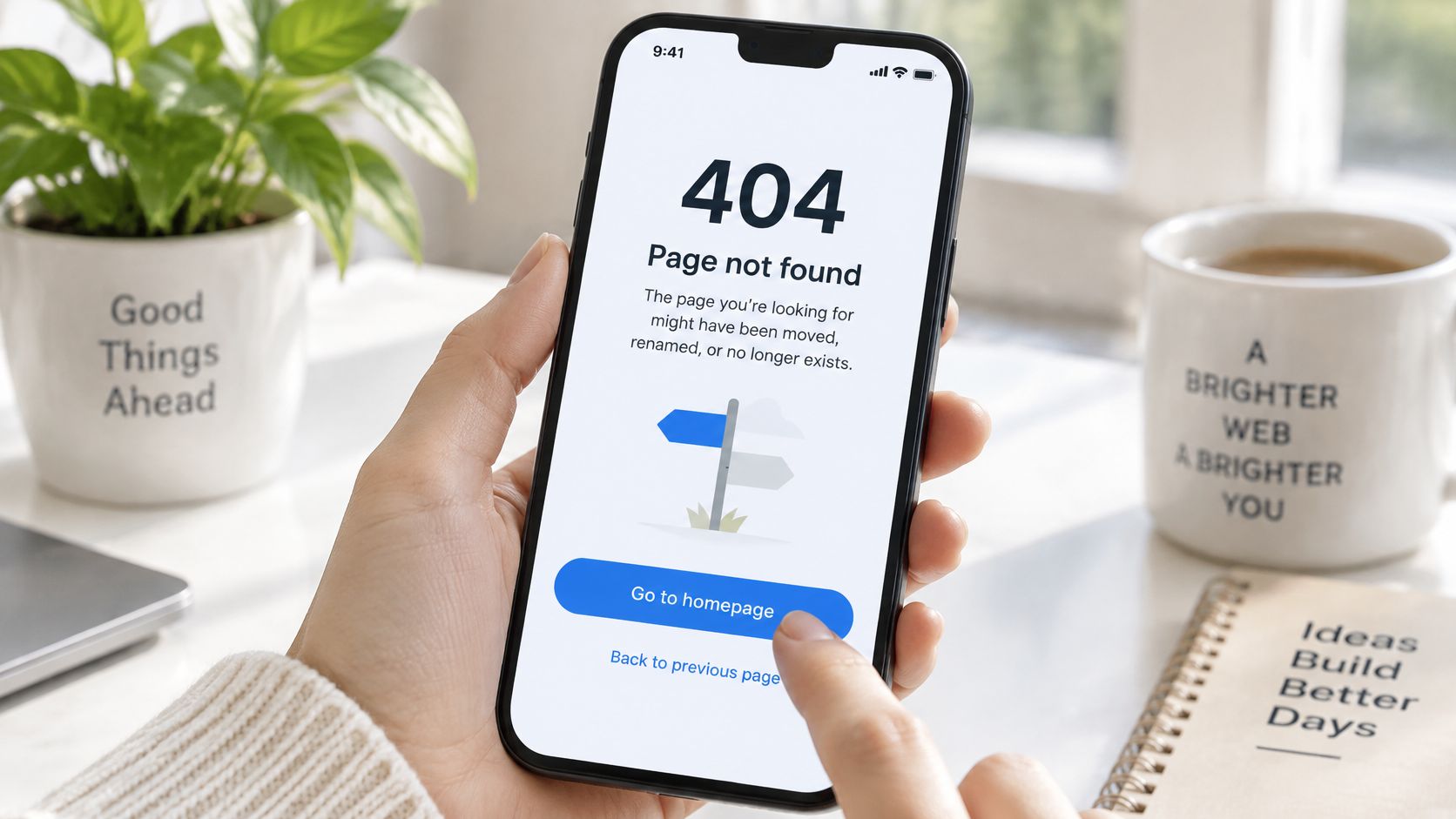
People reach this page by accident, often on a phone, sometimes on a slow connection, and sometimes using a screen reader or keyboard alone. Heavy decoration and clever visuals help none of them. Speed and clarity are the whole job, which makes the 404 the easiest page on your site to get right if you resist dressing it up.
WebAIM’s 2025 analysis found 94.8% of the world’s top one million home pages had at least one detectable WCAG 2 failure, with 45.4% showing empty links and 48.2% missing form labels. Error pages inherit those same failures when they’re built from the same templates and never tested. A search field with no label is invisible to a screen reader user. A link that reads “here” tells them nothing.
Build it plain, then test it honestly
Use a real heading that states the problem, descriptive link text, a labeled search field, and a logical tab order that reaches the main action quickly. Keep contrast strong and don’t rely on color alone to signal the error. A government style page with a clear heading and a skip link is a fair model. It isn’t exciting, and it works for everyone. The same discipline behind fixing website speed applies here, so keep total page weight low and skip autoplay anything.
Do this week by unplugging your mouse and tabbing through your 404 page start to finish. Run it through axe or WAVE afterward, then fix every unlabeled field and vague link the tools flag.
How each 404 page practice compares on effort, impact, and fit
| Item | Primary Benefit | Effort Level | Best For |
|---|---|---|---|
| Return Correct Status Codes and Redirect Moved Content | Protects crawl budget and preserves link equity | High | Site migrations and managing removed or moved pages |
| Use Clear, Plain-Language Messaging | Reduces confusion and helps visitors find their next step | Low | Any site with a 404 page |
| Provide a Search Box | Helps visitors find relevant content without leaving the site | Medium | Sites with searchable products, listings, or services |
| Link to Popular and Relevant Pages | Keeps visitors engaged and guides them toward useful content | Low | Sites with key services, offers, or categories to promote |
| Match the Brand’s Look and Feel | Builds trust and makes the error page feel familiar | Medium | Brands seeking a consistent site experience |
| Track 404 Errors and Fix Broken Links | Reveals broken links and campaign URL issues | Medium | Teams maintaining large sites or running campaigns |
| Include a Clear Call to Action | Helps recover leads and guide visitors to a next step | Low | Service businesses and lead-generation sites |
| Keep the Page Fast and Accessible | Makes the page usable for more visitors and devices | Medium | All sites, especially those serving mobile or accessibility needs |
Turning Every Dead End Into a Next Step
Start with the two fixes that pay off fastest. Get the status codes right, so missing pages return a real 404 or 410 and moved pages redirect to genuine replacements. Then give every stranded visitor one clear next step, whether that’s a search box, your best three pages, or a click-to-call button. Those two moves alone put you ahead of most sites, because they fix what search engines see and what people experience at the same time.
Everything else is upkeep, and upkeep is where owners usually quit. The page gets designed once, the links go stale, a redesign ships without a redirect map, and nobody looks at the error log until rankings or leads dip. Build two small habits instead. Review your 404 hits monthly and triage the top URLs by value, fixing internal links at the source and redirecting only where a real replacement exists. Refresh the popular links and call to action quarterly so the page promotes what you’re selling now, not what you sold last year.
For businesses that use TV advertising to drive traffic, the error page is part of the campaign whether you planned it or not. Viewers type addresses from memory, print pieces carry typos, and old spots keep circulating online long after an offer ends. A short, memorable campaign URL prevents many of those misses, and a redirect from the one or two most likely misspellings catches most of the rest. Test both before a spot airs, from a phone, the way a viewer would.
Adwave’s TV advertising platform starts at $30 per day from a prepaid wallet, with a daily budget you set from $30 to $10,000, no subscription, no contract, and the option to pause whenever you like. Use that flexibility to test your site’s recovery paths alongside your ads. Run a campaign, watch which URLs your viewers type, fix whatever the 404 data reveals, and pause while you make the changes if you need to. That’s 404 page best practices in working form. Not a prettier error message, but a page that’s technically honest, readable by everyone, and built to hand each lost visitor a reason to stay.
Your next viewer is going to mistype your address, so make sure the page they land on can still sell for you, then put that offer in front of local audiences with Adwave, where TV campaigns start from a prepaid wallet with a budget you control and no contract. Paste your website to get a free site analysis and ad creative built from your own pages, preview it, request changes, and launch when your landing pages and your 404 are both ready to catch the traffic.