You’ve paid for an ad click, a TV spot, or a shared listing. A visitor lands on your site, ready to act, and can’t find pricing, a phone number, or the right service. That’s rarely a design problem. It’s a website navigation architecture problem, and you can test and fix it before you send more traffic to it.
What Website Navigation Architecture Covers
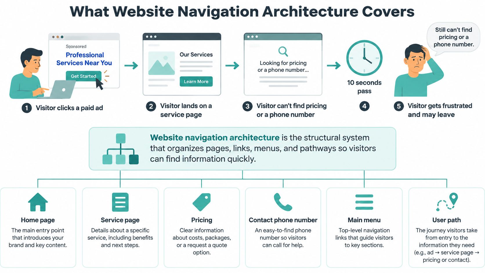
Say a visitor clicks a paid ad, lands on a service page, and can’t find pricing or a phone number within ten seconds. They don’t study your menu. They leave and choose the next business.
Website navigation architecture is the structural system that tells visitors where information belongs, what labels mean, how pages relate, and which path leads to a task. The visible menu is only the surface.
The Four Connected Parts
Think of a supermarket. Aisles form the hierarchy, shelf grouping is classification, aisle signs are labels, and the store map helps you reorient.
- Classification logic: How you group pages, by service, location, product type, or task.
- Hierarchical structure: Which pages are parents and which are children, such as Services, then Dental Implants.
- Labeling: The exact words for each destination, in menus, headings, and links.
- Orientation cues: Breadcrumbs, a highlighted current page, and clear headings that show where the visitor is.
Rosenfeld and Morville’s 1998 book brought information architecture into mainstream web practice, and by 2002 the discipline was commonly framed around navigation, labeling, content organization, and search, according to a systematic review of information architecture research.
That structure also governs how pages connect below the menu. If you’re mapping those connections on a store site, you can plan Shopify internal links with Rankira so related products and guides reinforce the hierarchy instead of scattering visitors.
Run this today: Ask a first-time visitor to find pricing, a quote form, and your service area, then note whether grouping, hierarchy, labeling, or orientation caused the failure.
That failure point tells you what to fix first. A wrong label needs different work than a missing hub page.
Navigation Patterns and When Each One Fits
No pattern is best in general. The right choice depends on how many pages you have, how deep the content runs, and what the visitor came to do. A five-page plumber’s site and a 500-listing brokerage shouldn’t share the same menu.
Use the table to match pattern to size and task, then check the risk before you commit.
| Pattern | Best for | Main risk | Typical site |
|---|---|---|---|
| Single-level top menu | Five to seven clear top items | Hides depth, labels must do all the work | Small service business with under 15 pages |
| Dropdown menu | Two levels of services or locations | Hover-only menus fail keyboard users | Service firm with several services in a few groups |
| Mega menu | Visible categories in large catalogs | Overwhelms mobile, link lists become bloated | Retail and e-commerce catalogs |
| Hamburger or off-canvas menu | Mobile-first layouts and tight headers | Hides options and lowers discovery | Secondary access on mobile only |
| Hub and spoke | Service pages grouped under one overview page | Relies on strong internal links | Multi-service firms such as legal or dental practices |
| Location-based structure | Visitors choosing a branch first | Thin, near-duplicate location pages | Franchises and multi-branch clinics |
| Search-led with category shortcuts | Large inventories such as listings | Weak when site search is poor | Real estate listings and large product sets |
| Breadcrumb trail | Orientation on deep pages | Not a primary navigation on its own | Any site deeper than two levels |
Two Rules That Decide Most Cases
First, match top-level items to what a visitor can scan in one glance. If someone has to read your header like a paragraph, you’ve grouped too little. Move detail under hub pages, where a short overview explains the group and links to each specific service.
Second, never use a pattern that hides the primary conversion path. A hamburger menu can hold secondary pages, but it shouldn’t bury Call, Book, or Get a Quote on mobile. If the highest-value action needs two taps to appear, the pattern is working against the visit.
Dropdowns and mega menus show the trade-off clearly. Both expose depth quickly on desktop, but both add interaction cost. A dropdown works when each group has a short, scannable list. A mega menu works when visitors benefit from comparing categories side by side, and it fails when you use it as a dump for every page on the site.
To pick your pattern, do three counts. Count your pages, count your levels, and name the top three actions a visitor must take. If you have under 15 pages and one level, start single-level. If you have several services in clear groups, use dropdowns or hub and spoke. If visitors arrive knowing a listing, size, or product name, lead with search and add category shortcuts for browsers who don’t.
Organizing Top Labels Around Need or Offer
You can organize top labels by customer need, such as “Get more calls” or “Book a visit,” or by offering, such as “TV advertising” or “Dental implants.” Need-based wording feels friendly in a pitch meeting. Offering names usually work better in navigation.
The difference shows up in three places.
Crawlability, Intent, and Analytics
Crawlability favors offering names because search and AI systems index pages by their subject, service, and location. A page consistently called “Dental implants” in the menu, heading, and internal links presents one clear entity. A page called “Restore your smile” forces systems and visitors to guess.
Query intent points the same way. Customers and AI answer engines look for a service name, a place, and proof. Google’s 2025 guidance says pages reached from classic or AI search must be easy to move through and clearly distinguish the main content, and that structured data should match visible page content while not being a special requirement for generative AI search, in Google’s guide to succeeding in AI search. Schema can’t rescue vague headings. It should mirror what visitors already see.
Analytics is where need labels blur. If “Get more calls” leads to three different services, you can’t tell which service drove the lead. Offering labels keep reporting clean, which matters when you’re following a path like the one in this customer journey mapping framework for small businesses.
The practical answer is a hybrid. Use offering names for main navigation so your entities stay consistent, and put need-based wording on buttons and calls to action, such as “Request a quote.” A salon marketplace works this way when a stylist can connect with salons offering nail workspaces, because the destination name states the offer while the action states the next step.
Keep one name for one entity across the menu, page heading, URL, and internal links. Variation feels creative to you and ambiguous to everyone else.
The Twelve Phrase Test
- List the phrases: Write the top twelve search phrases a customer would type.
- Check the match: Confirm each phrase has a page reachable in two clicks.
- Match the words: Make the label use the same words as the phrase.
For a multi-location business, name the location in the URL path and page heading, not only in the footer. That visible service and location relationship helps a visitor confirm they’re in the right place and helps an AI system retrieve the correct branch page.
Accessible and Mobile Navigation Requirements
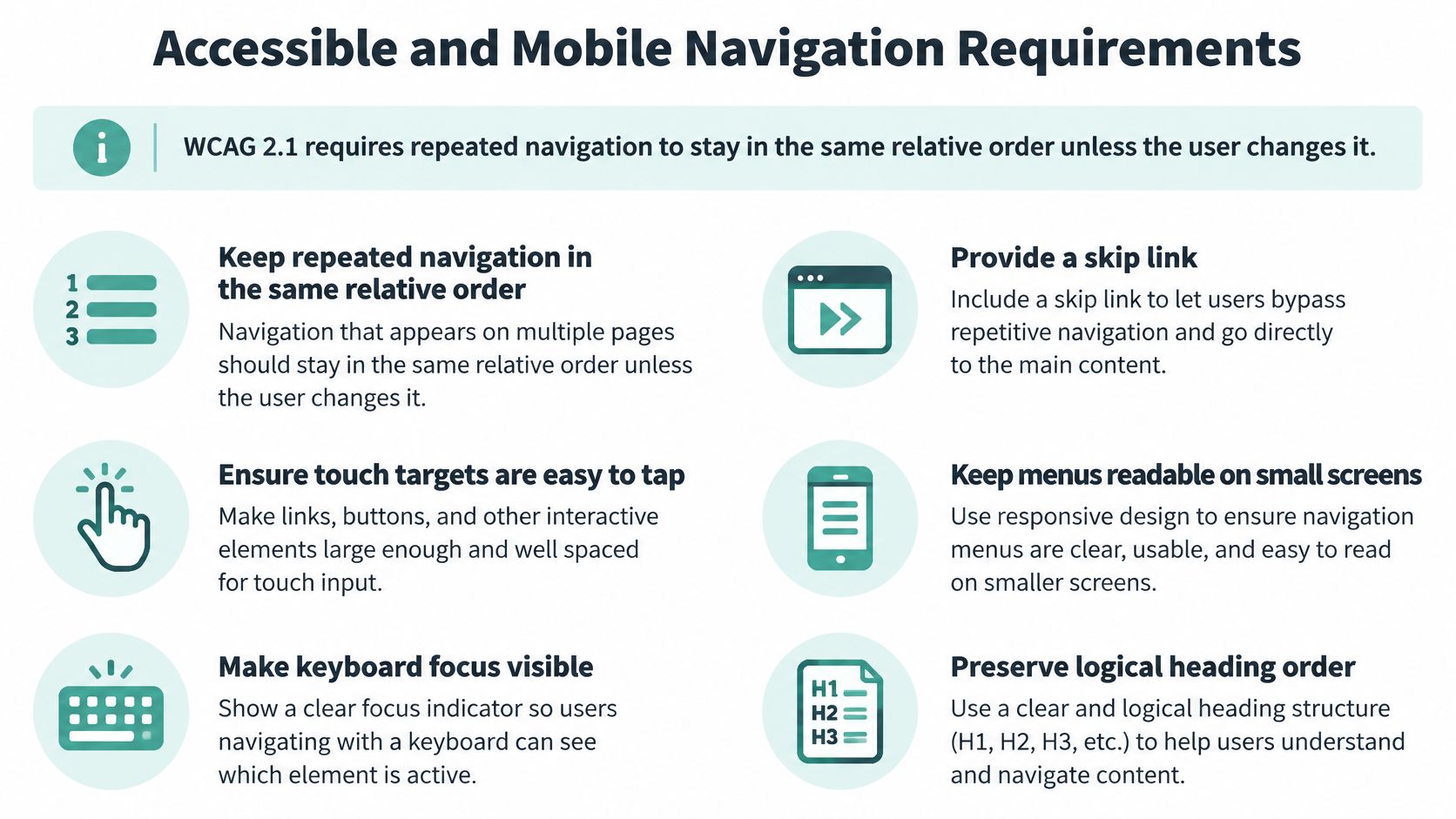
One requirement catches many small sites. WCAG 2.1 requires repeated navigational mechanisms to remain in the same relative order unless the user initiates a change, in the W3C Web Content Accessibility Guidelines 2.1. If Contact sits last on the homepage, it shouldn’t jump to second place on service pages.
Consistent placement lets visitors reuse what they’ve learned. Alternative routes matter too, because not everyone understands your categories the same way.
Controls to Build In
- Semantic navigation landmark: Use a proper nav element so assistive technology can find and skip it.
- Visible skip link: Let keyboard users bypass repeated menus and reach main content.
- Keyboard-operable menu: Support click and keyboard focus, with visible focus and a logical focus order.
- Descriptive link text and headings: Use a clean H1 to H3 hierarchy and labels that state the destination.
- Current location and a second route: Mark the current page, add breadcrumbs for deep pages, and offer site search or a sitemap.
Passing an automated score doesn’t prove these controls work. The 2025 Web Almanac accessibility chapter reports that only 31% of mobile sites meet minimum color-contrast requirements and only about 24% of desktop and mobile pages contain detectable skip links, even though median Lighthouse Accessibility scores reached above 85. A good aggregate score can hide serious failures for keyboard and screen reader users. For a fuller small business checklist, see this guide to website accessibility and ADA compliance.
On mobile, don’t copy desktop categories into a smaller bar. Put the highest-value action first: call, directions, booking, or quote. A visually simple hamburger icon isn’t automatically usable if focus disappears, contrast is low, or the call button hides inside it.
Spend ten minutes on a phone. Tab or swipe through the menu in order, check that the skip link appears, read only the headings aloud to see if the page still makes sense, and confirm the call button is visible without opening anything.
How to Test Navigation Before You Send Traffic
Opinions about a menu are weaker than task results. A site can feel acceptable while still slowing visitors down, which is why you should measure success, time, and backtracking rather than asking whether people like the labels.
Federal guidance on a documented redesign used open and closed card sorting to find expected categories, then tree testing to confirm whether users could find information and whether labels needed revision, as described in Digital.gov’s card sorting and tree testing case study.
A Six Step Testing Sequence
- List five to eight high-value tasks: Find pricing, request a quote, locate the service area, view case studies, and contact the business.
- Run an open card sort: Ask about 15 people to group and name your services, and record their exact words. If you’re unsure which phrases customers use, local keyword insights from NZ Apps can help you seed realistic task wording.
- Build the proposed hierarchy: Turn the sort results into draft parent and child categories.
- Run a closed card sort: Check whether people place items into your categories without coaching.
- Run a tree test: Show a text-only hierarchy, ask participants to find each task, and record success, directness, time-on-task, and backtracking.
- Revise and retest: Rewrite any label where success falls below roughly 70%, retest with new participants, and repeat once visual design is final.
That roughly 70% mark is a working flag, not a law. Treat a low score as a prompt to inspect first clicks and wrong turns, then fix the label or grouping causing them.
A controlled experiment involving 30 participants and five information-seeking tasks found statistically significant differences in completion time for some tasks between architectures, while System Usability Scale scores did not differ significantly, reported in a Springer study of information architecture and task performance. Perceived usability can mask slow wayfinding.
| Method | Question it answers | Typical participants | When to use |
|---|---|---|---|
| Open card sort | How users group and name your content | About 15 | Before building the menu |
| Closed card sort | Whether users place items in your categories | About 15 | When testing a proposed structure |
| Tree test | Can users find each task in the hierarchy without visuals | 30 or more | Before visual design is final |
| First-click test | Where users click first on a page | 20 to 30 | Checking labels on landing and service pages |
| Task completion check | Whether visitors finish high-value tasks on the live site | 5 to 10 per audience type | After launch and after each change |
After launch, keep measuring behavior. Track task completion, exits from navigation, and where campaign visitors hesitate, using tools such as heatmaps for understanding how visitors use your site. Compare results before and after each label change so decisions come from behavior, not preference.
Common Navigation Mistakes and How to Fix Them
Weak navigation isn’t only a small site problem. Baymard’s benchmark found 76% of top-grossing U.S. and European e-commerce sites performed at a “mediocre” level or worse for homepage and category navigation, in Baymard’s homepage and category usability research. Its newer summary reports mediocre-to-poor performance for 61% of desktop sites and 65% of mobile sites.
The usual response is to chase the three-click rule. Don’t. Nielsen Norman Group describes it as an unofficial heuristic with no published studies supporting it, and a study it cites found drop-off didn’t increase and satisfaction didn’t decrease when tasks required more than three clicks, in Nielsen Norman Group’s review of the three-click rule. Clear labels and low task effort matter more than an arbitrary click count.
| Mistake | Warning sign | Fix |
|---|---|---|
| Vague labels such as Solutions or Resources | Visitors leave within seconds of arriving | Use the service name or the customer’s own words |
| Hover-only dropdowns | Keyboard users cannot reach subpages | Add click and keyboard-focus support |
| Every page crammed into the top menu | Menu has more than seven items | Group pages under hub pages |
| Forcing every page within three clicks | Clear pages are buried under vague labels | Prioritize clear labels and low task effort |
| Mobile menu hides the call button | Few calls or quote requests from phones | Pin call, directions and quote actions |
| No breadcrumbs on deep pages | Visitors use the back button repeatedly | Add a breadcrumb trail with the current page marked |
Treat each row as a hypothesis, not a verdict. A high exit rate near a vague label suggests a labeling problem, but a quick tree test or first-click test confirms whether renaming it helps.
Rank the work by speed of impact. Rename vague labels first, because wording changes are cheap and measurable. Pin the main action on mobile next. Then add breadcrumbs and hub pages, which take more building but support every deep page and paid landing page after them.
Confirm Your Navigation Before Sending Ad Traffic
Good checks look different by business, but the pattern is the same. A plumber advertising emergency repairs keeps “Emergency Repair” and the phone number in the header. A real estate broker leads with search and a “Find a listing” shortcut, a restaurant keeps reservations one tap away, and a multi-branch clinic gives every location its own named page.
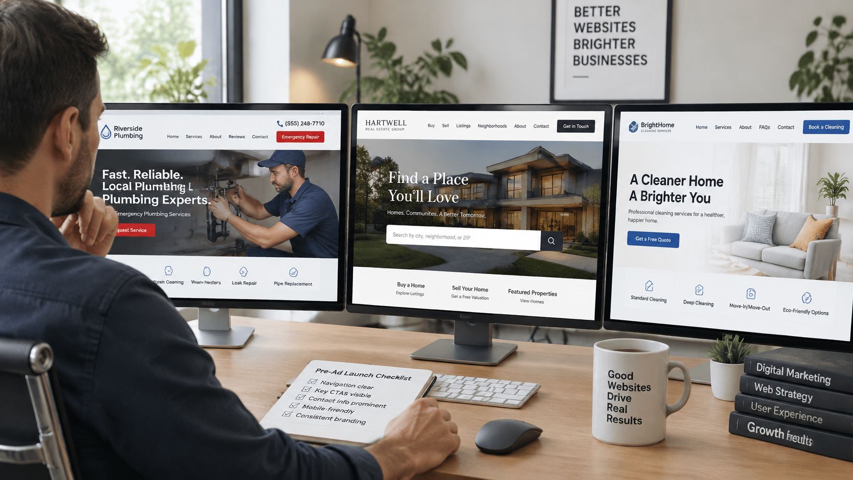
For ad landing pages, keep the header to one primary action, the phone number, and the service area, and move secondary links to the footer. This aligns with landing page best practices that increase conversions, because paid visitors need confirmation and a next step, not a full site tour.
Launch Checklist
- Message match: The ad headline’s words appear in the navigation or page heading.
- Visible action: The main action shows without scrolling, with phone and quote options in the header.
- Clear eligibility: The service area is stated on the page.
- Working orientation: The skip link and breadcrumbs work.
- Passed tasks: Your tree test passed on the highest-value tasks.
At that point, Adwave is a practical option because we can build TV, image, search, and social ads from your website URL, and our website analysis is free with your plan visible before you spend. You connect your website to track visits and conversions while we refine the campaign, and we provide 7 installation guides for Shopify, WordPress, Wix, Squarespace, Webflow, Google Tag Manager, and hand-coded sites.
- Run the task test.
- Fix the flagged labels.
- Launch the campaign.
Once your services, locations, and main action are easy to find, visit Adwave to turn that clear website into TV, image, search, and social ads built from your URL. You’ll see a free analysis and plan before spending, then track visits and inquiries from the campaign in one view as it’s refined.