
You're getting traffic to your website, but the numbers don't answer the question you care about. Are visitors noticing your main offer, finding your contact button, and moving toward becoming a customer, or are they landing, hesitating, and leaving?
That gap matters even more when every visit is expensive and hard won. A local campaign, a seasonal promotion, or a new service page might bring the right people to your site, but standard reporting often stops at page views and bounce rate. If you want to make more money from the visitors you already have, you need to see what they're doing on the page, not just how many showed up.
Why Your Website Analytics Tell an Incomplete Story
A lot of small business owners have the same experience. You check your analytics and see traffic coming in. Maybe your homepage got visits. Maybe your landing page had a spike after a campaign. But then the trail goes cold.
You can tell that people arrived. You can't easily tell whether they noticed the phone number, tried to click a photo that wasn't clickable, or gave up before reaching the form.

That's the blind spot in standard website reporting. Metrics like page views and bounce rate are useful, but they summarize behavior instead of showing it. If you've already set up reporting with a tool like this GA4 walkthrough for small businesses, you've got the traffic layer. What's missing is the visual layer.
Numbers tell you that something happened
Analytics can show that a page underperformed. They can show a drop-off. They can show that one campaign brought more visitors than another.
What they usually don't show is why.
A visitor may have left because:
The offer was too far down the page and they never saw it
The button didn't stand out enough to earn a click
The layout created confusion and people looked in the wrong place
A non-clickable image pulled attention away from the actual next step
Heatmaps show you what visitors did
Website heatmaps became a standard UX and conversion tool because they turn raw interaction data into visual patterns. They record clicks, mouse movements, and scroll behavior, then color the page by frequency so you can see what gets attention and what gets ignored, as described in UXCam's website heatmap guide.
Practical rule: If your analytics tell you a page has a problem, a heatmap helps you inspect the page like a storefront window. You can see where people stop, what they reach for, and what they miss.
For a small business, that's valuable because you usually don't need a full redesign. You need to find the one part of the page that's getting in the way of revenue.
What Are Heatmaps and What Can They Show You
You run a promotion, send people to a service page, and see visits come in. The page gets attention, but only a few people call, book, or ask for a quote. A heatmap helps answer the next question. What did those visitors do once they landed there?
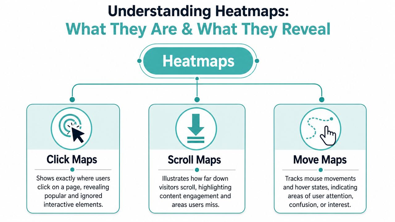
Heatmaps work like a weather report for a single page. Instead of showing temperature, they show activity. Color overlays highlight where visitors click, how far they scroll, and where mouse movement gathers.
That visual layer matters because small business decisions usually happen page by page. You are often not trying to rebuild the whole site. You are trying to fix the booking page tied to a paid ad, the contact page tied to your Google Business Profile, or the landing page tied to an email campaign.
If your goal is stronger button performance, this guide to call-to-action buttons and placements that get clicks pairs well with heatmap analysis.
Click maps
A click map shows where people click or tap.
This is usually the fastest one to read. You can spot whether visitors use your main button, ignore key links, or keep pressing on something that looks clickable but is not. For a small business, that can explain why traffic from a specific campaign feels expensive. People arrived, but the page did not guide them to the next step.
A click map helps you answer questions like these:
Are visitors clicking the action you want most
Are they choosing images, menu items, or side links instead of your main button
Are mobile visitors tapping parts of the page that create confusion
Scroll maps
A scroll map shows how far down the page people get before they stop.
This matters more than many owners expect. If your offer, trust signals, pricing summary, or contact form sits too low, a good share of visitors may never reach it. The page can look fine to you because you know what is there. New visitors do not.
For low traffic sites, scroll maps are especially useful because they help you inspect campaign pages one at a time. You may not need thousands of visits to notice a pattern if nearly everyone from a local ad campaign stops before the form or never reaches your financing message.
Move maps
A move map tracks mouse movement as a clue about attention.
It helps you notice hesitation. If visitors hover around your pricing, FAQ, or service area details and then leave, that often points to uncertainty. Maybe the offer is unclear. Maybe the next step asks for too much too soon. Maybe the page pulls attention into the wrong spot.
Mouse movement is only a clue, not proof. Still, it is often enough to show where a page feels easy and where it feels awkward.
What heatmaps are best at
Heatmaps are most useful when you want to examine specific parts of a page and connect those patterns to a business outcome.
That last point is where heatmaps become more than a design tool. For a small business, the primary value is not just seeing clicks. It is seeing whether traffic from a postcard QR code, local search ad, Facebook campaign, or email promotion is reaching the part of the page that leads to revenue.
How to Read Heatmap Patterns on Your Small Business Site
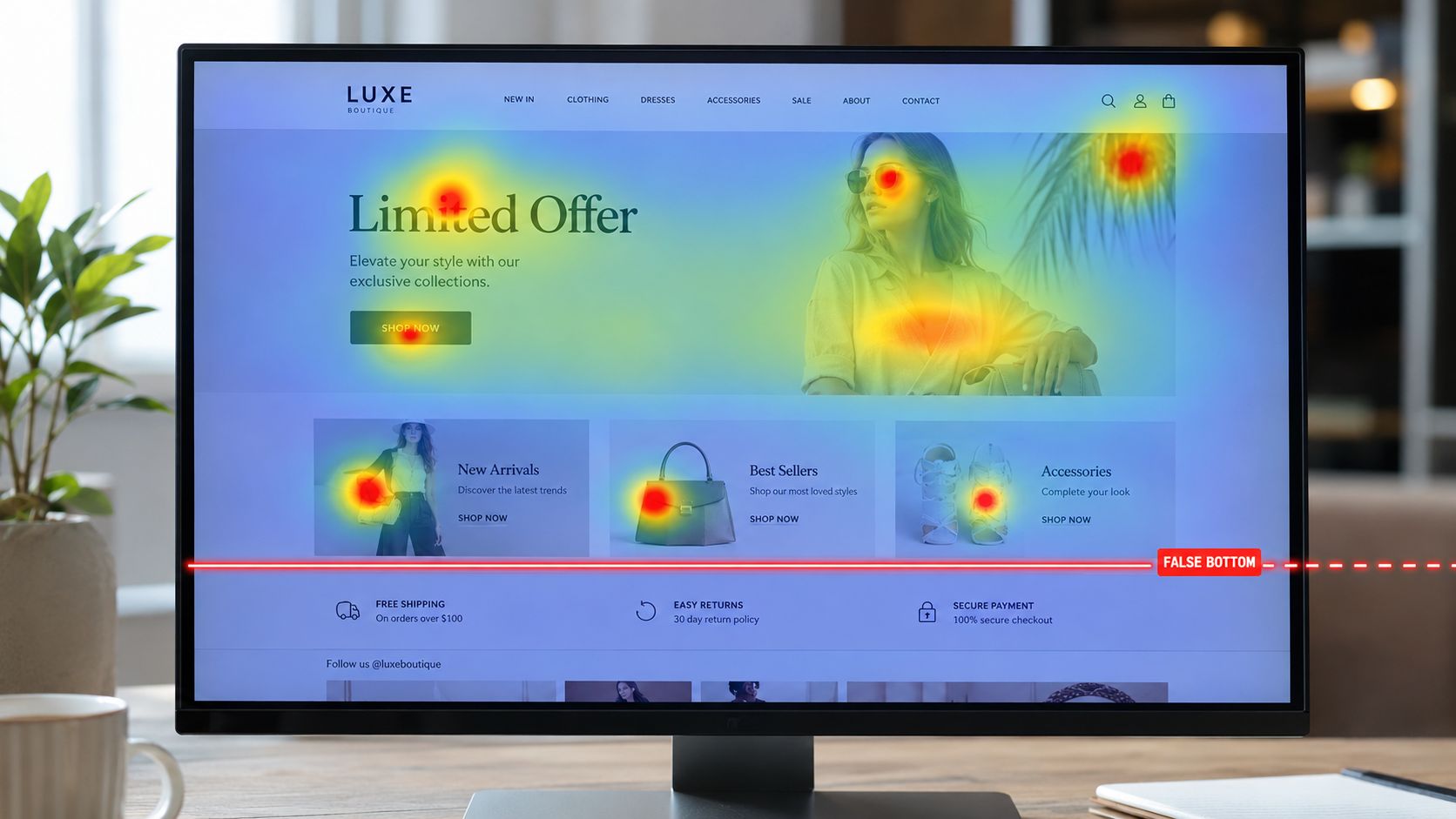
The first mistake people make with heatmaps is treating red as “good” and blue as “bad.” Color only shows activity. It doesn't tell you whether that activity helps your business.
A red hotspot on your contact button is promising. A red hotspot on a decorative image might mean visitors are confused.
Patterns worth noticing
Some heatmap patterns show up again and again on small business sites.
Ignored main CTA Your primary button sits in a visible spot, but visitors don't use it. That often points to weak wording, poor contrast, or a mismatch between what the visitor expected and what the page offers.
False bottom Visitors stop scrolling because the page looks finished even though key content continues below. This often happens when a background color, image block, or wide spacing creates an artificial endpoint.
Clicks on non-clickable elements People click photos, icons, or headings that don't lead anywhere. That usually means the design suggests interactivity where none exists.
Attention in the wrong place Move activity clusters around side elements, decorative graphics, or secondary text while your main offer gets little attention.
Low traffic changes the way you read the map
Generic advice often fails for small businesses. Many guides assume you have heavy traffic and quick pattern stability. A lot of local businesses don't.
A page may only get a modest number of visits. Traffic may also be mixed. Returning customers behave differently from first-time visitors. A short campaign burst can distort what looks like a trend.
Nebula's guidance for smaller sites is useful here. A key best practice is to run heatmaps for a few weeks and make sure you have enough visitor activity before drawing conclusions, so a hotspot doesn't solely reflect noise or one campaign burst, as explained in Nebula's article on using heatmaps to understand visitors better.
Don't redesign a page because a handful of people clicked one area. Wait for a pattern you can trust.
Segment before you decide
If your traffic is mixed, segment the data before acting. A page can look fine overall while hiding a serious problem for one audience.
Use separate views when possible:
Mobile vs desktop so you can spot layout problems on smaller screens. This is especially important if you're reviewing pages against a mobile website design checklist for local businesses.
Campaign traffic vs all traffic so you can see whether a specific ad or promotion sends people with different expectations.
New visitors vs returning visitors because repeat customers already know your brand and often use the site in distinct ways.
Ask the right question for each page
A homepage and a landing page shouldn't be judged the same way.
Here's a simple way to read them:
The map becomes more useful when you read it through the page's job. If a page is supposed to generate leads, the key question isn't “where did people click?” It's “did their behavior move them toward contacting you?”
From Insight to Action Quick Experiments for Your Website
A small business owner opens a heatmap and sees a mess of clicks, scrolling, and missed buttons. It can feel like one more report to stare at. The useful part is much simpler. You are looking for one clear point of friction on a page tied to money, then testing one fix.
For a small business, that usually means no full redesign and no months-long project. It means quick experiments on pages that support calls, form fills, bookings, or sales from a specific campaign.
Four fast tests that often matter
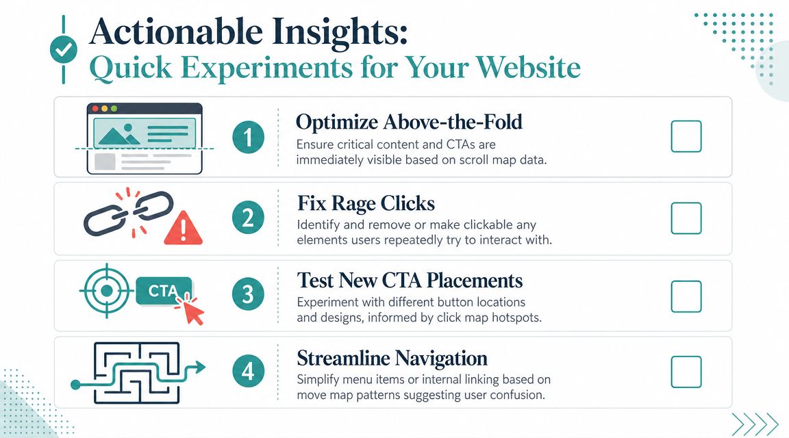
Move the key action higher If visitors from a promotion rarely scroll far enough to reach your form or booking button, the problem may be visibility, not interest. Put the offer, contact option, or next step closer to the top so more people see it.
Rewrite the main button A button can be visible and still underperform. “Submit” asks for effort. “Get a Quote” or “Check Availability” gives a clearer reason to click, especially when the page matches the campaign that brought the visitor there.
Make confusing elements clickable or less prominent Heatmaps often reveal “rage clicks” on images, icons, or headings that look tappable but go nowhere. That is like putting a door handle on a wall. Either link the element to something useful or tone down the design cues that suggest action.
Reduce competing choices A page with too many buttons can send people in circles. If the goal is a lead, let one action stand out and push lower-priority links into the background.
Keep the experiment small and easy to judge
Heatmaps work best when you treat them like a flashlight, not a blueprint. They help you spot one problem area. Then you make one change and check whether more visitors complete the action you care about.
A simple process works well:
Choose one revenue-related page
Pick one friction point
Change one element
Measure one business outcome
If you are working on a lead-generation page, these landing page best practices that increase conversions can help you turn a heatmap clue into a cleaner test.
Ask a business question before you change anything
This step prevents random tweaking.
Instead of saying, “the page feels busy,” ask, “are visitors from our Facebook ad seeing the offer and reaching out?” Instead of saying, “I want a better layout,” ask, “does moving the quote form higher lead to more qualified inquiries this month?”
That shift matters for low or mixed traffic. Small businesses often cannot wait for huge sample sizes. You need a practical question, a focused change, and a result you can compare against the campaign or page purpose.
Try questions like these:
If more visitors see the offer sooner, do more of them contact us?
If the button text matches what the ad promised, do more campaign visitors click?
If we remove extra links, do more people finish the form or booking step?
Prioritize pages by revenue potential
Start where a small improvement can produce real money.
This matters in every industry. A local contractor may focus on a quote page tied to Google Ads. A retail shop may focus on a product page for a seasonal offer. A venue business trying to improve wedding venue online visibility should pay close attention to the pages that lead to availability checks and inquiries, not just general browsing.
The goal is simple. Use heatmaps to improve the pages where clearer decisions lead to more leads, more bookings, or more sales.
Connecting Clicks to Customers The Adwave Advantage
A business owner runs a paid campaign, sees people clicking through, and expects inquiries to follow. The clicks show up. The bookings do not.
That gap is where heatmaps become useful for revenue decisions.
A heatmap can show whether visitors noticed the offer, skipped past the form, or clicked something that did not help them move closer to contacting you. But the question is not “where did people click?” It is “did this page help the right visitor become a lead or customer?”
Mouseflow's heatmap overview explains this clearly. Heatmaps show on-page behavior. They do not measure business results by themselves. For a small business, that matters even more because traffic is often low, mixed, or tied to a few active campaigns. You cannot afford to study clicks in isolation. You need to connect page behavior to lead volume, lead quality, and sales from a specific traffic source.
Why campaign traffic should be reviewed separately
A visitor from a Google Ads campaign does not behave like someone who found your site through a blog post or a directory listing. They arrive with a goal already in mind. They expect the page to continue the same message, offer, or promise that got the click.
If that match breaks, people hesitate.
For example, a venue business trying to improve wedding venue online visibility should not judge a landing page only by total clicks. It should ask whether visitors from that campaign are reaching pricing details, checking availability, and starting an inquiry. Those actions are much closer to revenue than a general click map across all traffic.
What Adwave helps you do with that information
The practical advantage is not “better website engagement.” It is clearer decision-making.
Adwave can help you look at a page the way a business owner needs to. Which campaign sent the visitor? What did that campaign promise? Did visitors from that source notice the offer, trust the page, and take the next step? If not, the problem may be the headline, page order, missing proof, a weak call to action, or a mismatch between the ad and the landing page.
That makes heatmaps more like store cameras than a cash register. They show what people did in the aisle. Your campaign and conversion data show whether those visits turned into purchases.
For a small business, that often leads to a tighter review process:
Compare behavior by campaign or traffic source, not just all visitors together
Look for signs of mismatch between the ad message and the landing page
Check whether visitors interact with the parts that support buying decisions
Judge success by leads, bookings, or sales after the change, not by click activity alone
That is how clicks start connecting to customers. Heatmaps help you see the hesitation. Campaign data helps you see the cost of that hesitation. Together, they give you a much better shot at improving the pages that bring in revenue.
Your First Step in Understanding Your Website Visitors
A small business owner often looks at a page and asks a simple question: “Why are people visiting but not contacting us?” Heatmaps help answer that without turning you into a spreadsheet person.
Start with one page tied closely to revenue. That could be your quote form, booking page, top service page, or a landing page built for a specific ad campaign. If your traffic is low or mixed, that focus matters even more. You are not looking for broad trends across your whole site. You are looking for clues on the pages that can lead to a sale.
A practical starting process looks like this:
Check your analytics to spot the page with weak results or a high drop-off point
Open the heatmap for that page and look for signs of hesitation, confusion, or ignored content
Make one change you can clearly measure
Watch what happens to leads, bookings, calls, or sales from that page or campaign
That order matters. Analytics show where the problem is. Heatmaps help explain what may be causing it.
For a small business, that is a much better use of time than reviewing every page or waiting for huge traffic volumes. A few sessions from the right campaign can still be useful if they show a clear pattern. For example, if visitors from a seasonal ad keep missing the booking button, you do not need hundreds of visits to test a stronger button placement or clearer headline.
Heatmaps work like watching customers in a store aisle. Analytics show that people entered and left. The heatmap helps you see where they paused, what they skipped, and where they lost confidence.
Keep the first test simple. Change the page headline. Move a call to action higher. Shorten a form. Add trust signals near the inquiry button. Then judge the result by business outcomes, not just click activity.
Small improvements on a high-value page can produce more revenue than a full site redesign.
If you build that habit, visitor behavior becomes easier to understand. You can connect campaign traffic to page behavior, and page behavior to actual inquiries or sales. That is where heatmaps become useful for a small business. They help you make smarter page changes with the traffic you already have.
If you're ready to drive more qualified visitors to the pages you're improving, Adwave gives small businesses a practical way to launch TV advertising without the old barriers of large production costs or complicated media buying. Pairing stronger traffic with better landing pages can help you get more value from every campaign.


