
A call-to-action button deserves more respect than most small businesses give it. KISSmetrics reports that changing a single word in button copy can swing conversion rates by 10 to 30 percent, and it recommends keeping button text to 2 to 5 words for clarity and immediate action, which is why vague labels like “Submit” and “Learn More” so often underperform for conversion-focused pages ( KISSmetrics on CTA button best practices). One button can decide whether a visitor becomes a lead, books a showing, requests a quote, or leaves.
That matters even more for SMBs. A real estate agent may only get a small pool of high-intent visitors to a listing page. A home services company may be paying for every click from search. A local retailer may be trying to turn TV interest into site visits. When traffic is limited, weak CTA words and lazy placement waste demand you already paid to create.
That's also where a platform like Adwave fits naturally. Adwave helps small businesses create, launch, and measure TV ads in minutes, so the landing page CTA has to carry its share of the work once that attention arrives. If you're sending viewers from a TV spot, search ad, or social campaign to a page, the button needs to finish the job.
If you're also planning campaigns around events or launches, these 10 event promotion strategies pair well with stronger CTA execution on the landing page.
1. Action-Oriented Verb-First CTAs
Most weak CTA buttons fail in the first word. “Submit,” “Continue,” and “Learn” don't create momentum. Strong buttons start with a verb that tells the visitor exactly what to do next.
For SMBs, that usually means using verbs tied to the buyer's actual intent. A realtor doesn't need “Proceed.” They need “Book Showing” or “See Listings.” A roofer doesn't need “Click Here.” They need “Get Estimate.” Adwave works the same way. “Launch Your Ad in Minutes” is stronger than “Create TV Ads” because it starts with movement and hints at speed.

Match the verb to the next step
The best verb depends on what happens after the click. If the next page opens a scheduler, use “Book” or “Schedule.” If the click starts a build flow, use “Create,” “Build,” or “Launch.” If the click reveals pricing, say “See Pricing.”
That sounds obvious, but many pages break trust here. A button says “Get My Quote” and sends the user into a long generic form. A button says “Start Free” and drops them into a sales demo request. Good CTA copy sets the right expectation before the click.
A few patterns work especially well:
Use direct verbs: Get, Start, Book, Claim, Launch, View, See.
Pair action with outcome: “Get My Estimate” beats “Get Started.”
Keep it short: Short labels are easier to scan and easier to trust.
Practical rule: If the first word on your button could fit on any website in any industry, it's probably too generic.
For Adwave, this principle lines up well with its product flow. A small business owner can go from website URL to broadcast-ready ad quickly, so the CTA should sound immediate and concrete, not abstract. The same thinking also applies to surrounding copy. Adwave's guide to website copy that converts visitors into customers reinforces the same discipline. Clear words move people faster.
2. Value-Driven and Urgency Combined CTAs
Urgency by itself often sounds cheap. Value by itself can feel passive. Put the two together, and the CTA starts doing real selling.
The trick is honesty. If you say “today,” “this month,” or “limited,” that condition needs to be real. Otherwise the button may get attention once and lose trust after that. Small businesses don't need fake countdowns. They need a clear reason to act now.
Lead with what they get
A button like “Launch Your First Ad for $50 Today” works because it combines benefit and timing in one short line. The value is obvious, and the timing is specific. That matters for budget-conscious SMBs evaluating tools like Adwave, especially when they want a low-friction first campaign.
Vertical tailoring helps:
Real estate: “Promote This Listing This Week”
Home services: “Book More Local Leads This Month”
Restaurants: “Fill Tables This Weekend”
Retail: “Launch Your Sale Campaign Today”
What doesn't work is puffed-up urgency with no substance. “Act Fast” tells me nothing. “Claim Your Spring Promo Spot” at least gives me context.
Use urgency only when the business can back it up with a real constraint, date, seasonal window, or limited opening.
In practice, I've found this style works best for time-sensitive offers, seasonal campaigns, service calendars, and launch windows. It's less effective for high-consideration decisions where the visitor still needs education. If the buyer isn't ready yet, urgency can create resistance instead of action.
For Adwave, this approach fits especially well when promoting campaign starts, local launches, or low-barrier trial campaigns. Since campaigns start at $50, there's room to make the offer concrete without sounding inflated. The button should still read like a promise the page can keep.
3. First-Person Perspective CTAs
Sometimes the highest-impact CTA change is a pronoun. A first-person button feels more owned, more personal, and less like an instruction from the brand.
Instead of “Create Your TV Ad,” write “Create My TV Ad.” Instead of “Get Your Quote,” try “Get My Quote.” That shift seems minor, but it changes the emotional tone. The visitor stops feeling pushed and starts feeling committed.
Make the click feel like their decision
This works especially well for SMB audiences because many buyers are owner-operators. They're not browsing for entertainment. They're solving a practical problem for their business. “Launch My Campaign” speaks to that sense of control better than “Launch Your Campaign.”
First-person CTA phrasing is especially useful in vertical-specific pages:
Real estate: “Promote My Listing”
Home services: “Get My Estimate”
Legal: “Review My Case Options”
Health and wellness: “Book My Consultation”
KISSmetrics also notes that first-person phrasing such as “my” instead of “your” can improve response in CTA copy, which supports why this framing tends to feel more compelling at the moment of decision (as noted earlier in its CTA guidance).
The key is consistency. If the button says “Create My First TV Ad” but the next page shifts back to distant corporate language, the experience feels disjointed. Keep the page voice aligned with the button voice.
A practical Adwave example is easy to imagine here. “Create My First TV Ad” feels friendlier and more ownership-driven than “Create a TV Ad.” For a local business owner trying television for the first time, that personal framing lowers resistance without making the offer sound soft.
4. Benefit-Focused Over Feature-Focused CTAs
A feature-focused CTA describes the tool. A benefit-focused CTA describes the result. Buyers click for results.
That's why “Start Free Trial” often gets beaten by something like “Get More Leads” when the page has already explained the offer. One tells me what the company wants me to do. The other reminds me why I'm here.
Translate the platform into the outcome
Many SMB sites miss the mark by using software language on business-owner pages. A contractor doesn't wake up wanting to “access dashboard features.” They want more booked jobs. A broker doesn't want to “explore ad products.” They want more listing visibility.
Better CTA thinking by vertical looks like this:
Real estate: “Promote More Listings”
Home services: “Book More Service Calls”
Retail: “Drive More Store Visits”
Automotive: “Reach Local Car Buyers”
The strongest CTA buttons sit at the intersection of what the user wants and what the page can deliver. If the page is top-of-funnel and educational, the benefit might be lighter, such as “See How TV Ads Work.” If the visitor is further along, the benefit can be stronger, such as “Launch My Local Campaign.”
What usually underperforms is default language like “Submit,” “Sign Up,” or “Continue.” Those words describe mechanics, not motivation.
For Adwave, benefit-focused CTA writing is a natural fit because the product itself is built around accessibility for small businesses. The business owner doesn't care that the workflow is simplified unless that translates into something concrete: faster launch, wider local reach, easier ad creation, simpler measurement. The button should point to that payoff.
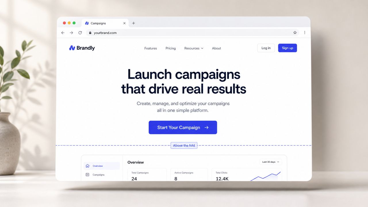
5. Button Placement Above the Fold
Copy can't convert if nobody sees the button. Placement is the first test every CTA has to pass.
HubSpot points to the long-standing practice of placing a CTA above the fold, and attention research cited by WordSeed notes that visitors often scan pages in an F-shaped pattern, making top-left and other highly visible placements easier to notice. Vye reports a similar visibility gap in ad positions, with top placement at a 7.11 percent click-through rate versus 0.55 percent in ninth place, which reinforces the same core lesson: visibility drives response ( HubSpot CTA placement data and related visibility research).
Give the hero section one job
For many SMB landing pages, the best primary CTA belongs near the headline and value proposition. If someone arrives from a branded search, a referral, or a TV ad, they may already be primed to act. Don't make them hunt.
What works in the hero:
One clear primary button: Don't split attention too early.
A headline that explains the offer: The button should make sense instantly.
Enough contrast and spacing: The eye should land on the CTA fast.
What doesn't work is placing the main CTA below a wall of copy, a slider, a testimonial carousel, and a stock photo. By then, the visitor has already started deciding whether to leave.
Adwave pages benefit from this especially well because the offer is direct. If a small business owner can create and launch a TV ad in minutes, the hero should say that clearly and present a primary action right away. Adwave's own resource on landing page best practices that increase conversions is useful here because it supports keeping the page centered on one commitment point.
6. Sticky and Persistent CTA Placement
On long pages, a static CTA can disappear at the exact moment a user becomes ready to act. That's where sticky placement earns its keep.
A persistent header button, a bottom mobile bar, or a floating action strip keeps the next step available while the visitor reads. This is useful on pages that need more persuasion, such as service explainers, pricing pages, or product pages with multiple sections.
Use persistence without becoming annoying
Sticky CTAs work best when the page is long enough to justify them. On a short page, they often feel unnecessary. On a long page, especially one selling a more involved offer, they reduce friction because the user doesn't need to scroll back up to convert.
Common good uses:
Long-form SaaS pages: Keep “Start My Trial” available during scroll.
Real estate listing hubs: Keep “Book Showing” or “Contact Agent” accessible.
Home services pages: Keep “Get Estimate” in view after trust-building sections.
Common bad uses include giant sticky bars that cover content, animated banners that fight for attention, and mobile footers that block forms or chat tools. A sticky CTA should support the page, not overpower it.
For Adwave, a sticky CTA makes sense on educational pages that explain how AI-generated TV ads work, how targeting works, or how reporting works. Visitors may need that context. Once they're convinced, the CTA should be one tap away.
7. Contrast and Visual Hierarchy CTAs
Button color debates waste time when the primary issue is hierarchy. The best CTA isn't “the best color.” It's the button that stands out from everything around it.
A strong CTA has visual priority. It looks like the main action. Secondary links look secondary. Navigation looks less important. Supporting text frames the decision instead of competing with it.
Design the page so the button wins
Most cluttered SMB pages suffer from the same problem. Every element is trying to be noticed. The logo is loud. The nav is loud. There's a pop-up, a badge, three icons, and a chat bubble. In that environment, even good CTA copy can get buried.
A better setup is simple:
Give the primary CTA the highest contrast in its immediate area
Use white space so the button isn't crowded
Reduce the visual weight of secondary actions
Keep one dominant clickable path
If you offer both “See Demo” and “Start Now,” decide which one matters more. Then design accordingly. Don't make both buttons identical and hope users sort it out.
Good CTA hierarchy is less about decoration and more about decision control.
Adwave is a useful running example here because its audience often includes busy owners and marketing managers who don't want to decode a page. If the business case is strong and the setup is simple, the button should visually confirm that simplicity. Clear contrast and obvious priority help that happen fast.
8. Microcopy and Secondary CTA Strategy
The button gets the click, but the line around the button often earns the trust. Microcopy matters because last-minute objections are usually small, not dramatic.
Someone is asking, “Will this take forever?” “Do I need to talk to sales?” “Am I committing too early?” A short line beneath the button can answer those concerns before they become a bounce.
Use supporting text to remove friction
Strong CTA stacks often look like this: a primary button, a lighter secondary option, and a line of microcopy that reduces hesitation.
Examples by vertical:
Adwave: “Launch Your Ad Now” with “See a Demo First” underneath, plus a short line noting the low starting point and ease of setup.
Home services: “Get My Estimate” with “See Service Areas” as a secondary action.
Real estate: “Book a Showing” with “View Listing Details” as a lower-commitment option.
Not every visitor is ready for the same step, making a secondary CTA beneficial. It helps capture cautious but interested buyers without weakening the main path.
What you want to avoid is generic fallback text. “Learn More” is too vague to do real work. “See How It Works” or “Watch the Demo” is better because it tells the user exactly what happens next.
Microcopy is also one place where Adwave fits naturally. Its workflow is straightforward, and campaigns start at $50, so supporting lines can reduce friction without overselling. If the button asks for a launch action, the nearby microcopy should reassure the user that the process is manageable.
9. Mobile-Optimized CTA Button Design
A CTA that looks fine on desktop can fail badly on mobile. That's a common problem for local businesses because many prospects first visit from a phone, often while multitasking.
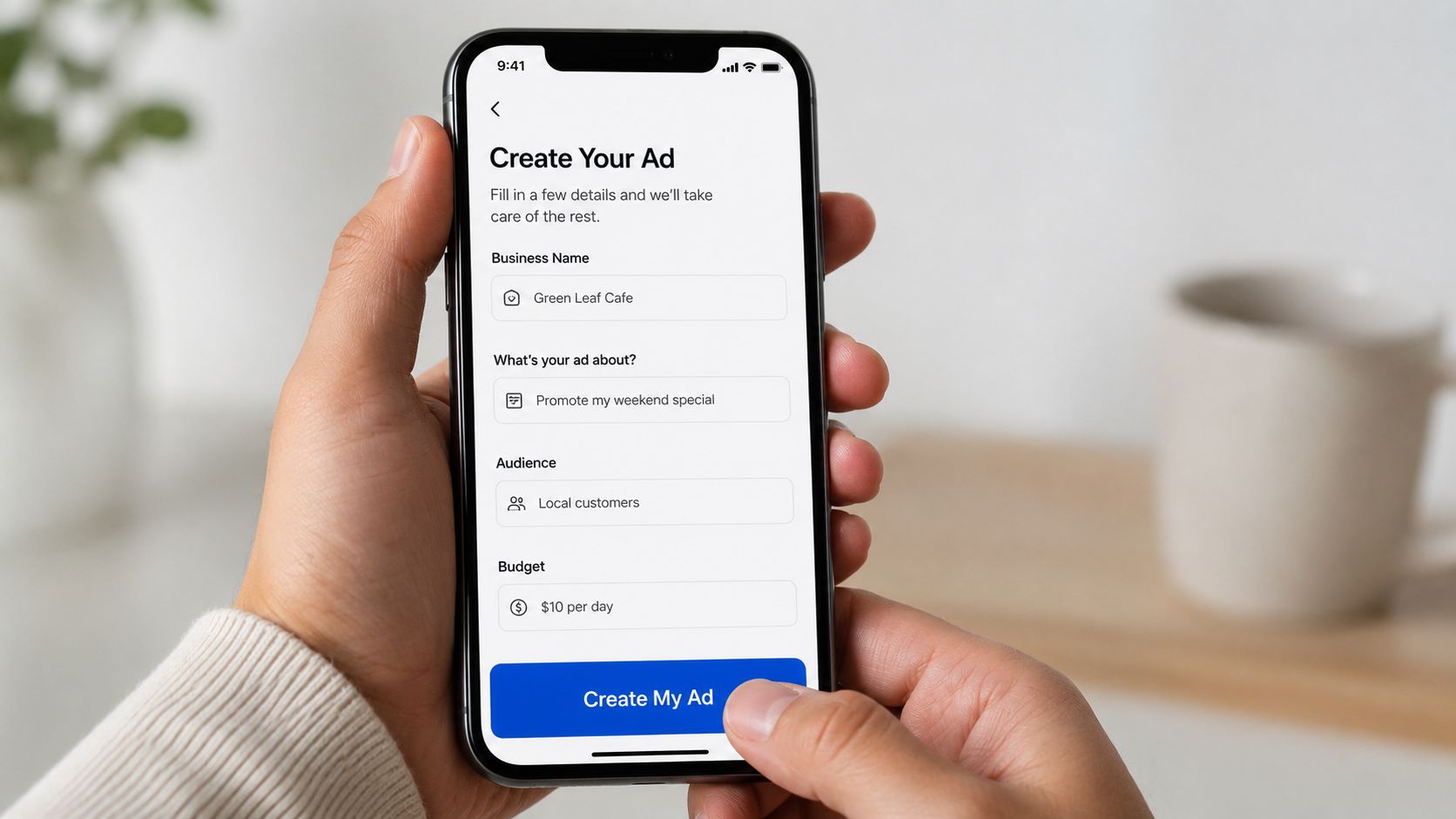
Contentsquare and CXL both emphasize that there isn't one universal best CTA position. Performance improves when CTAs appear where users naturally encounter them in the page flow, often above the fold, at the beginning and end of content, and repeated on longer pages. Contentsquare also recommends multiple placements on longer pages and notes that white space, contrast, and mobile-friendly sizing improve discoverability ( Contentsquare on CTA placement and discoverability).
Build for thumbs, not just screens
On mobile, readability and reachability matter as much as wording. If the button is tiny, jammed between blocks of text, or placed awkwardly, people won't tap it confidently.
Good mobile CTA habits include:
Shorter copy: “Create My Ad” reads better than a long sentence.
Larger tap targets: The button should feel easy to hit on the first try.
Full-width or near-full-width buttons: These are easier to notice and tap.
Positioning near natural thumb zones: Especially on long pages.
For local businesses, mobile friction is expensive. A homeowner trying to book a service won't fight a bad form. A shopper seeing your page after a TV spot won't pinch and zoom to find the button.
Adwave is a strong fit for this mobile-first thinking because small business owners often review ad options from their phones between other tasks. Its guide to a mobile website design checklist for local businesses is especially relevant if your CTA clicks are dropping on smaller screens.
10. Social Proof and Authority Near the CTA
A button rarely works alone on a trust-sensitive page. Social proof next to the CTA can remove the final doubt that stops the click.
This matters most when the offer is unfamiliar, the buyer is skeptical, or the commitment feels meaningful. A newer platform, a premium service, or any ad product aimed at cautious SMB owners benefits from proof placed close to the action.
Put credibility where the decision happens
The common mistake is burying trust signals far below the fold while expecting the hero CTA to carry everything. If someone is deciding right now, the proof should be near that decision point.
Good examples include:
Industry-specific testimonials near the button
Relevant customer logos beside the CTA
Review snippets that reinforce reliability
Short proof statements tied to the audience's use case
For Adwave, this is especially valuable. Small businesses considering TV advertising may need reassurance that the platform is practical for companies like theirs. Vertical-specific proof is better than generic praise. A real estate page should show real estate relevance. A home services page should show local service relevance.
There's also a placement nuance here. Not every CTA belongs above the fold. Some high-consideration offers perform better lower on the page after pricing context, proof, or trust signals. Guidance summarized by Best Version Media points out that not every CTA should be placed above the fold, especially for more complex purchases where users may need more information before clicking ( Best Version Media on when CTAs should move lower on the page).
Adwave's own guidance on using reviews and testimonials as social proof on social media also reinforces the broader principle. Put proof close to the moment of action, not in a distant section users may never reach.
Top 10 CTA Words & Placement Comparison
Launch Your High-Converting CTA Strategy
The fastest way to improve conversion usually isn't a full redesign. It's tightening the decision point. That means better button words, stronger placement, cleaner hierarchy, and fewer points of friction around the click.
If you take one lesson from Call-to-Action Buttons: Words and Placement That Get Clicks, let it be this: clarity beats cleverness. A button should tell people what happens next, why it matters, and why they should feel comfortable clicking now. Most underperforming CTAs fail because they're vague, buried, visually weak, or disconnected from buyer intent.
For small businesses, this is practical work, not branding theater. A real estate agent needs a CTA that moves a buyer to schedule a showing. A home services company needs a button that turns urgency into quote requests. A retailer needs landing pages that convert campaign traffic while interest is still fresh. Every click has a cost. Every missed click has one too.
The strongest CTA systems usually share the same traits. They start with a direct verb. They speak in benefits, not internal product language. They often work better in first person. They appear where users see them, and on longer pages they reappear when needed. They also respect the user's context. A quick, low-risk offer can ask early. A higher-consideration offer should earn the click with proof, pricing context, and trust signals first.
That's one reason Adwave fits naturally into this discussion. Adwave helps small businesses create, launch, and measure broadcast-ready TV ads in minutes, with campaigns starting at $50 and distribution across 100+ premium channels including NBC, Hulu, and ESPN. If you're using Adwave to drive awareness and qualified visits, your landing page CTA becomes the handoff point between attention and action. Better CTA strategy helps that handoff convert.
Treat CTA optimization as an ongoing discipline. Test the wording first. Then test placement. Then refine hierarchy, supporting microcopy, and mobile design. Keep the page promise aligned with the button promise. When the click feels clear, relevant, and low-friction, more visitors act.
A CTA for Adwave. If you want more qualified traffic reaching your landing pages, Adwave gives small businesses a practical way to create and launch TV ads quickly. Pair that traffic with sharper CTA buttons, and your site has a better chance of turning attention into leads, bookings, and sales.


