
You’ve opened the campaign report, and the heatmap looks encouraging. Red and orange cover the hero image, the main button glows, and a few footer links barely register. The tempting conclusion is obvious: keep the hot content, remove the cold content, and send the next version.
That conclusion can be wrong. Email heatmap analysis is useful only when you know which signals represent human interaction, which reflect technical behavior, and which recipients your report fails to represent. The strongest workflow treats the heatmap as evidence for a decision, then checks that evidence against clicks, conversions, privacy effects, and accessibility.
What an Email Heatmap Actually Shows
An email heatmap is a visual overlay of engagement data placed on top of the campaign creative. Warm colors usually indicate concentrated activity, while cooler colors indicate less recorded activity. Depending on the platform, that activity may include clicks, scroll depth, mouse movement, attention estimates, or image loads.
Those behaviors aren’t interchangeable. A click map records where subscribers tapped or clicked links, buttons, images, and other tracked elements. An attention or scroll map estimates how far readers moved through the message. A hover or movement map records mouse position as a possible proxy for visual focus. A recipient can scroll past a section without reading it, hover over a headline without selecting it, or load an image without consciously viewing the email.
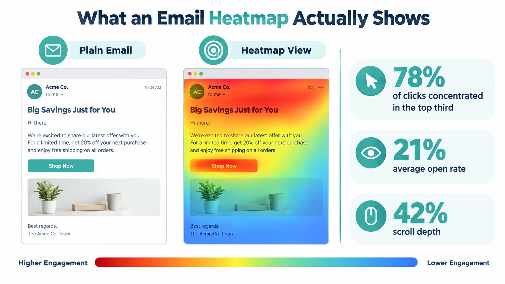
Practical rule: Treat a click as a stronger behavioral signal than a color gradient built from inferred attention.
Start with the behavior, not the color
A click heatmap can answer, “Which link attracted interaction?” A scroll map can answer, “How far did the message remain visible?” A movement map can suggest which areas drew the cursor. Each answer supports a different decision, so label the report before interpreting it.
For example, a hot header image might mean that the image links to the main offer. It might also mean that the image is large, appears early, or receives accidental taps on mobile. Check the destination URL and downstream behavior before calling it a winning creative element.
The practical question is not whether the map looks complete. It’s whether the map helps you choose what to change. Guidance on using heatmaps to understand visitor behavior is useful here because the same principle applies to email: visual evidence is only valuable when it leads to a defensible action.
Setting Up Your First Heatmap Analysis
A first analysis should be a controlled measurement exercise, not a quick glance at a colorful report. Start with a limited test audience or a holdout so the main campaign can continue producing results while you collect evidence. The test group should represent the audience you want to understand, rather than an accidental mix of recent subscribers, inactive contacts, and internal recipients.
Build clean event tracking
Give every meaningful destination its own tracking identity. Tag the primary button, linked hero image, text links, navigation links, and secondary offers separately. If several elements lead to the same landing page, use distinct parameters or link labels so you can tell whether the interaction came from the image, button, or copy.
Before sending, click every tracked element in both the desktop and mobile versions. Confirm that the destination loads, the parameters persist, and the platform records the expected event. A broken link can create a misleading cold zone, while duplicated tracking can make one area appear more popular than it is.
Choose an email analytics platform that supports click maps and, where relevant, scroll or attention reporting. Enable only the tracking you can interpret. If your business question concerns offer selection, verified clicks and conversions matter more than a broad movement overlay.
Clean before you interpret
Filter obvious bot activity and automated image loads where your platform allows it. Remove internal tests, preview-triggered events, and contacts outside the segment under review. Separate mobile and desktop results when the layouts or interaction patterns differ materially.
Don’t decide that a variation wins because the map contains more activity. Compare the map with click rate, landing-page behavior, conversion events, unsubscribes, and delivery quality. A useful guide to email open rates and click rates can help keep those metrics in their proper roles, especially when open-based reporting is affected by privacy controls.
Before opening the report, confirm three things:
- The data is clean: Automated activity and irrelevant recipients have been excluded.
- The sample is sufficient: The campaign has collected enough observations to make the pattern more than a handful of individual actions.
- The question is specific: You know whether you’re testing placement, offer clarity, copy, hierarchy, or audience fit.
Without that preparation, the heatmap becomes decoration. With it, the map can point to a focused experiment.
How to Read Hot and Cold Zones
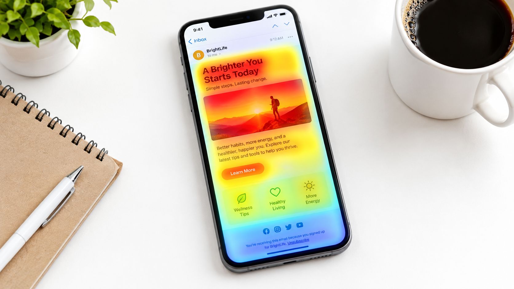
Color intensity is relative. Deep red and orange generally represent the highest recorded density of clicks, scroll activity, or movement. Yellow indicates a middle range, while green and blue usually mark less activity. The absolute color scale matters less than the pattern within the same email and the comparison between comparable audience segments.
A hot zone often appears around a clear headline, a relevant offer, a product image, or a prominent call to action. That doesn’t prove the element caused the engagement. It tells you where activity clustered. If the hot region also produces meaningful landing-page actions, repeat interaction, or conversions, you have stronger grounds for preserving or extending it.
Read the shape of attention
An F-pattern usually shows activity across the upper portion of the email, followed by scanning down the left side of the body. Recipients may reach the right side only when a visual cue, benefit, or offer earns their attention. This pattern can indicate that the hierarchy works at the top but loses force as the reader moves downward.
A dead footer looks different. The lower portion of the message remains cold even though the email received healthy traffic. That may mean the message is too long, the primary action already captured attention, or the footer contains low-priority links that don’t deserve prominent space.
Cold doesn’t always mean useless. A legal link, preference center, or unsubscribe link may be intentionally quiet. A cold product section may be a problem if it contains the offer the campaign was meant to promote. Context determines whether you should cut, move, rewrite, or leave the area alone.
Turn patterns into decisions
Use the map to form a narrow decision:
- A concentrated button zone: Keep the placement, then test the wording, design, or destination experience.
- A hot image with weak downstream activity: Verify whether the image receives accidental or low-intent clicks.
- A cold secondary offer: Move it closer to the main message or remove the competition.
- A cold lower section: Shorten the email, strengthen the transition, or test a more useful reason to continue.
A hot zone tells you what earned attention. It doesn’t tell you why, and it doesn’t guarantee that the attention created value.
Where Heatmaps Lie and What to Do About It
A brightly colored heatmap isn’t automatically reliable. Traditional open tracking relies on an invisible 1×1-pixel image. When a mail client downloads that image, the system records an apparent open. Apple Mail Privacy Protection can route content through Apple-operated proxy infrastructure and preload images before a recipient reads the message, which can make open-based signals look stronger than genuine attention. Apple describes how Mail Privacy Protection hides Mail activity and IP addresses from senders.
That distinction matters because an image load isn’t a click. Campaign Monitor explains that Apple Mail Privacy Protection can download images when a message arrives instead of when the recipient opens it, making open-dependent metrics such as click-to-open rate less dependable. Its explanation of Apple Mail Privacy Protection and email measurement supports a simple operating rule: prioritize verified link clicks and destination behavior.
Separate technical activity from human interaction
Build the report around unique clicks, repeat clicks, landing-page sessions, and conversion events. Treat open overlays as directional context, not proof that a recipient saw or understood a particular section. Compare Apple Mail-heavy segments with other mailbox groups instead of assuming that privacy-induced distortion affects every audience equally.
The same caution applies to image-based creative. Image fetching can produce activity even when a recipient never meaningfully engages. Technical explanations of how Apple Mail Privacy Protection affects open tracking show why image-load signals should sit apart from direct interaction signals in the analysis.
Audit the people the map can’t see
A heatmap shows recorded behavior. It doesn’t show who couldn’t perceive, move through, or understand the email. The Email Markup Consortium’s 2025 analysis of 443,585 emails found that 99.89% contained accessibility issues rated Serious or Critical (review the accessibility analysis).
That creates a dangerous optimization loop. A low-click region may have missing alt text, poor contrast, unclear link labels, an illogical screen-reader order, or a button that doesn’t work well with keyboard navigation. Dark mode can alter contrast, stripped images can remove the visual message, and motion-sensitive recipients may skip animated content. A blank-looking area may reflect an accessibility or rendering failure rather than weak demand.
Run a sanity check before changing any hot or cold zone:
- Compare clicks with destination behavior.
- Separate image loads from direct interactions.
- Review Apple Mail and other mailbox segments independently.
- Inspect desktop and mobile layouts separately.
- Run automated WCAG checks and test keyboard navigation.
- Review alt text, text-only rendering, and screen-reader order.
- Check conversion outcomes before declaring a winner.
A less visually complete map built on verified clicks can be more useful than a richer map that combines clicks with inflated open signals.
Running an A/B Test from a Heatmap Insight
A heatmap should produce a hypothesis, not a redesign spree. Write the hypothesis in one sentence and tie it to a visible pattern: “Moving the cold menu link into the first content block will increase menu clicks because readers interact with the header but rarely reach the current link.”
Keep the test narrow. Change one meaningful element, such as button placement, headline wording, image treatment, or the order of two content blocks. Define the primary metric before launch. If the flagged element is a button, use clicks on that button or its click-through behavior. Add a guardrail, such as overall revenue, conversion quality, or unsubscribe rate, so a local improvement doesn’t hide a broader decline.
Use a written decision rule
Calculate the required sample using the baseline conversion rate, the minimum detectable effect, the chosen confidence level, and the traffic available to each variant. Set a fixed runtime that covers a complete send cycle, and don’t stop the test just because one version looks warmer early.
| Element | Hypothesis | Primary Metric | Guardrail | Sample Size | Decision Rule |
|---|---|---|---|---|---|
| Button placement | Moving the button higher will capture more action from readers who don’t reach the lower block | Clicks on the tested button | Overall conversion and unsubscribes | Based on baseline rate and minimum detectable effect | Choose the variant only when the primary result is statistically significant and the guardrail doesn’t regress |
| CTA wording | A clearer benefit will improve interaction with the existing button | Click-through on the CTA | Revenue or qualified leads | Calculated before launch | Keep the new wording only if the primary metric improves without harming the guardrail |
| Content length | Removing a low-activity section will preserve attention for the main offer | Main offer clicks | Total conversions and complaints | Calculated for the expected audience | Roll out only when the shorter version wins on the primary metric and remains safe on the guardrail |
Document the original heatmap, audience definition, send conditions, hypothesis, variant, metrics, and stopping rule. After the result is clear, roll out the winner to the eligible audience, archive the evidence, and queue a fresh heatmap review for the next comparable campaign.
A practical email A/B testing workflow helps prevent a common mistake: treating every interesting pattern as permission to test several changes at once. If the result can’t identify what caused the change, the next heatmap won’t teach you much.
Three Real Heatmap Stories and What Changed Next
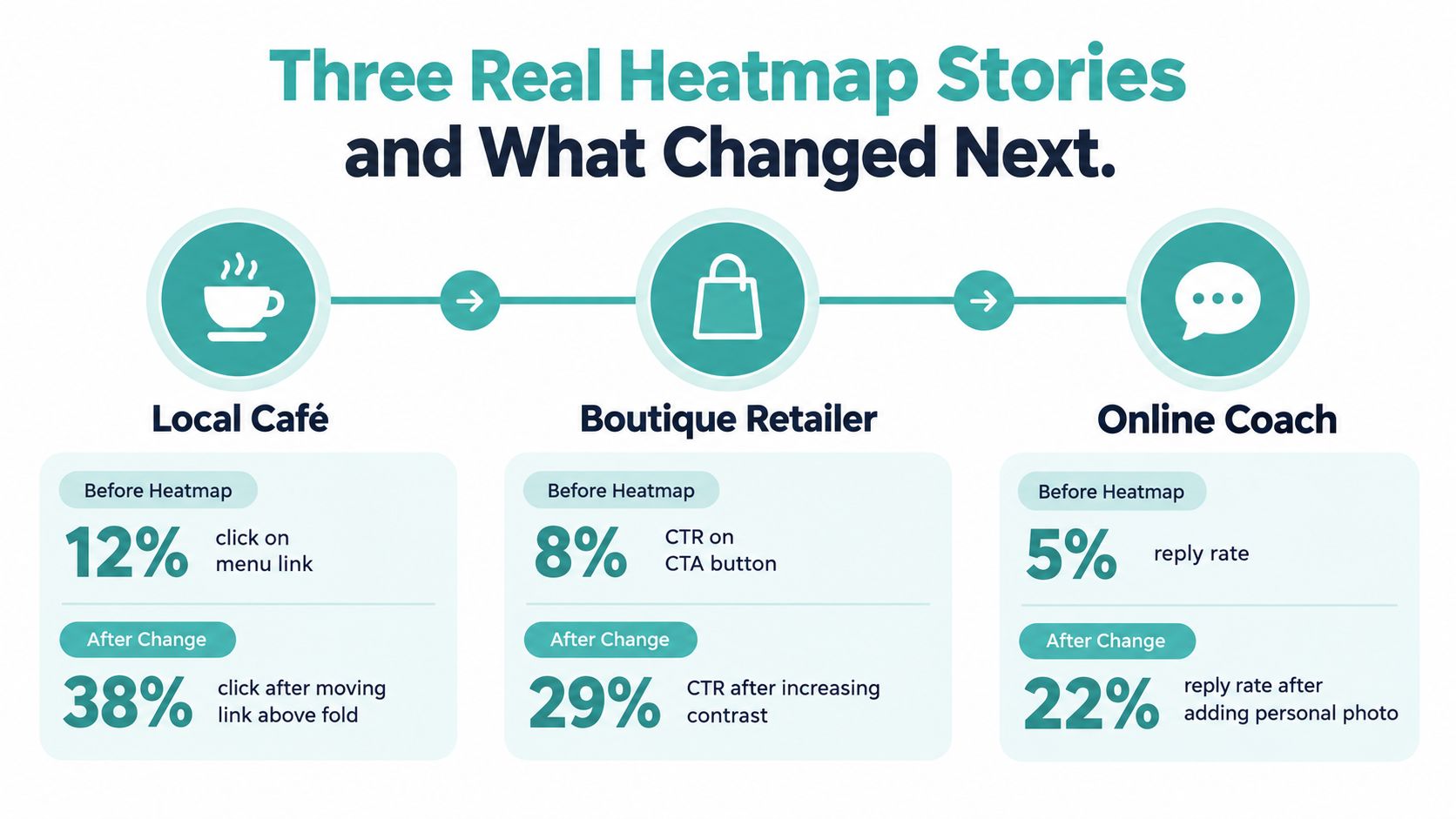
A local café saw clicks cluster on its header image while the menu link received little interaction. The team moved the order button closer to the top of the message and made the route to purchase more obvious. The next review focused on whether the new button attracted qualified visits, not merely whether the color changed.
Borrow this move: When the image attracts attention but the intended action stays cold, connect the high-attention area directly to the next step.
A SaaS newsletter showed a strong-looking footer CTA that very few readers reached. Rather than redesigning the button repeatedly, the team shortened the email and placed the demo link inside the second paragraph, where readers were already engaging with the product explanation. The change tested content length and action placement together in a controlled version, then compared demo activity with the original path.
Borrow this move: A cold footer may be a hierarchy problem. Move the action to the point where the reader has enough context to care.
A retailer found that a coupon banner sat in a cold section of the message. The team stopped treating the banner as a required component and rebuilt the layout around one clear hero offer, with supporting details below it. The next analysis examined whether the revised hierarchy restored interaction from previously quiet segments.
Borrow this move: If a promotional block stays cold, test the offer’s prominence and clarity before blaming the audience.
These stories share a discipline that matters more than the visual overlay itself. Each team identified one behavioral pattern, changed the path to action, and measured what happened after the click. None treated a heatmap as proof that a design element was naturally good or bad.
Turning Email Insights into Local Growth
A verified email signal can inform channel decisions, but it shouldn’t be copied into another channel without adaptation. If a particular offer attracts qualified clicks and conversions, retarget engaged visitors through paid social. If the message performs well with a defined audience, use the same benefit as a starting point for lookalike or local prospecting creative.
Email can also validate the hook for a broader local campaign. Small-budget tactics such as geofenced Meta advertising or Google Local Services Ads can extend a proven message in digital environments. Household-addressable TV offers a different route, placing the validated offer into a video format designed for local reach.
For marketers exploring that path, high-intent lead magnets in ecommerce offers useful context on building the audience that makes downstream channel testing more valuable. The email heatmap remains the diagnostic layer. It helps identify which promise, product, or call to action deserves further distribution.
Use this six-step review after every campaign:
- Confirm the signal: Check clicks, destinations, conversions, and privacy effects.
- Write one hypothesis: Name the element and the expected behavior change.
- Pick one channel: Choose email, paid social, search, or local TV.
- Set a benchmark: Define the primary metric and guardrail before launch.
- Launch: Keep the creative and audience decision traceable.
- Measure in 30 days: Review the downstream result and feed the learning into the next test.
For broader planning, the small-business marketing resource can help connect individual campaign findings with a wider local growth plan.
Adwave turns a validated offer into a broadcast-ready TV ad from a website URL, then supports targeting, pacing, and real-time performance tracking across premium channels. If your email heatmap has identified a message worth testing with local viewers, visit Adwave to explore a practical next step from email insight to TV reach.