
You're staring at a color picker, a mood board, and a first TV ad budget, and the wrong choice feels expensive before you've even spent a dollar. That's the right instinct. How to Choose Brand Colors That Resonate with Your Audience isn't about picking what looks nice in a browser tab, it's about choosing a palette that people recognize fast, trust in context, and remember after the spot ends.
Why Brand Color Is a Strategy Decision, Not a Style Choice
A founder can get away with “I like this blue” for a logo draft. The moment that same brand moves into storefront signs, social posts, and TV, taste stops being enough. Color becomes part of brand positioning, because people form an initial judgment within about 90 seconds, and the same research body has long been cited to show that 62% to 90% of that assessment can be based on color alone, according to the Institute for Color Research research summarized by Canva.
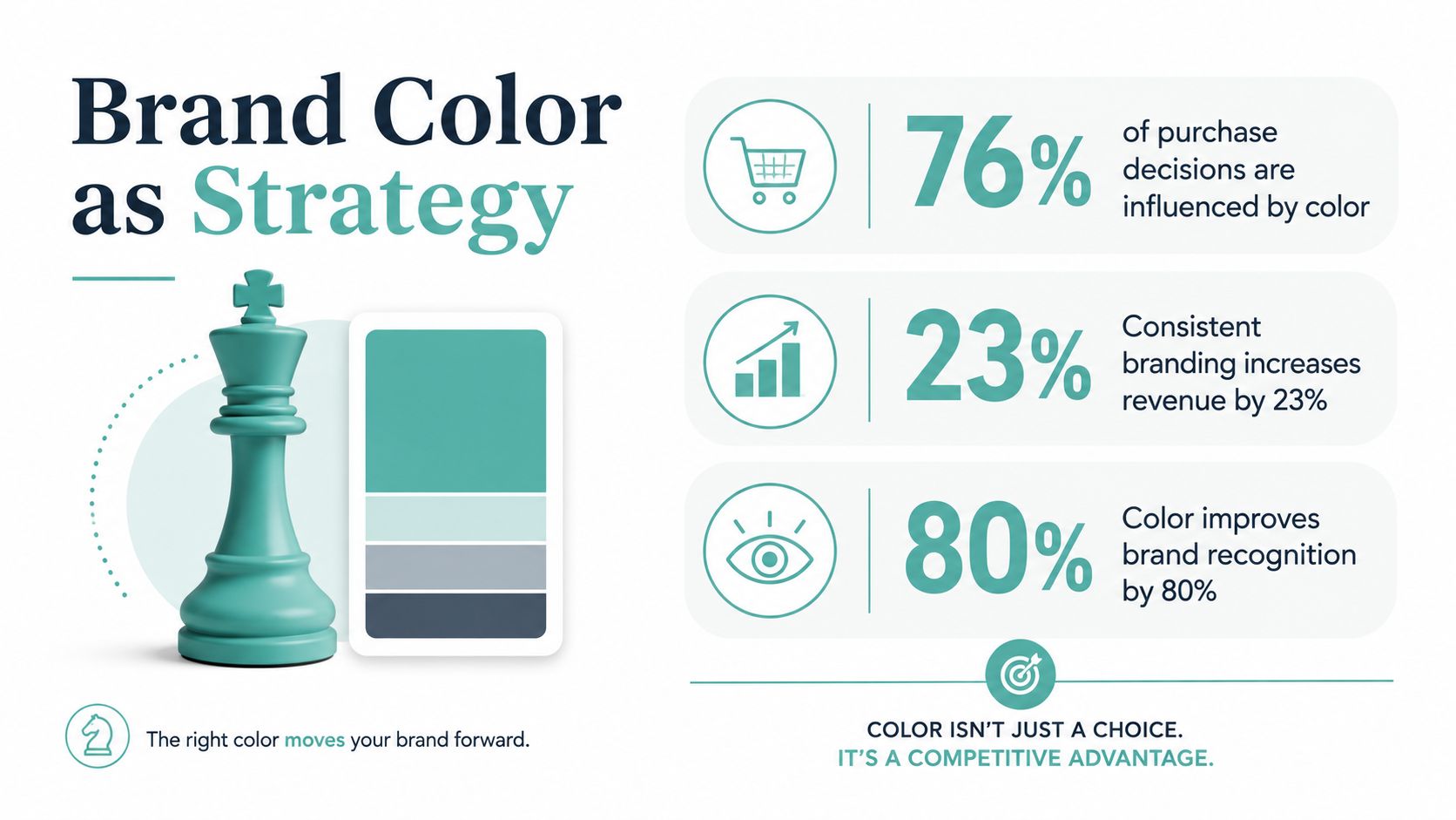
The practical takeaway is simple. If your palette fits audience expectations and your category norms, it helps people file you away quickly. If it clashes, it creates hesitation, and hesitation is expensive when you're trying to build recall across every touchpoint. Adwave's own brand-awareness guidance stresses that a strong visual style guide should define core brand colors and how the logo gets used, which is the kind of discipline a local business needs before it buys media on brand awareness in marketing.
The four decisions behind a good palette
You need four decisions, in order. First, define the personality you want to project. Second, learn what your audience already expects in your category. Third, build a compact palette around one primary color. Fourth, test that palette in the channels where it'll live, including TV.
Practical rule: pick the palette for the brand you want to own, not the color you happen to like in a design tool.
That sequence matters because a palette isn't just decoration. It's a memory device, a category signal, and a consistency tool. If you get it right, the same colors can anchor a website header, a printed menu, and a broadcast ad without feeling like three different businesses. If you get it wrong, the brand looks scattered before a single customer ever clicks or calls.
What Color Psychology Means for Your Brand
Color psychology gets abused because people treat it like a cheat sheet of universal feelings. It isn't. Red can signal urgency, excitement, or danger. Blue often signals trust and stability. Green is commonly tied to growth, health, and nature. Yellow can read as optimism or cheerfulness. Neutrals tend to calm the design down and make the rest of the palette easier to use.
The meaning changes with category and culture
The trap is assuming those signals work the same way everywhere. They don't. A color can perform differently in finance, wellness, retail, or food, and it can shift again when you cross borders. A widely cited example is white, which often suggests purity or simplicity in Western markets, while in several East Asian contexts it's more closely associated with mourning and funerals. Red can also swing between danger or urgency in one market and celebration or prosperity in another, depending on where and how you use it.
That's why the useful question isn't “What does this color mean?” It's “What does this color mean to my buyers, in my category, in my market?” If you sell local services, your audience may expect one emotional cue. If you're moving into TV, the cue has to survive motion, lighting, and quick recognition on a living-room screen.
Rule to keep: treat every color psychology shortcut as a starting point, then check it against category norms before you commit.
Use psychology as a filter, not a verdict
The best palettes usually combine emotional fit with practical function. A blue may feel safe, but it can also make you disappear if every competitor in your space leans the same way. A warmer accent might create distinction, but only if it still feels credible to your audience. That's the job of color strategy, matching what the palette says with what the brand needs to own.
Once you understand that, inspiration becomes useful instead of dangerous. You can borrow the feeling of a palette without copying it blindly, and you can reject a trendy shade if it sends the wrong signal for your market.
Researching Your Audience Before You Pick a Hue
Color research should start with customers, not a design mood board. The fastest way to waste time is to choose a palette in isolation and then hope people “get it.” They won't always, especially if your business is moving from local visibility into broader channels where the brand needs to work harder on first glance.
Start with direct audience signals
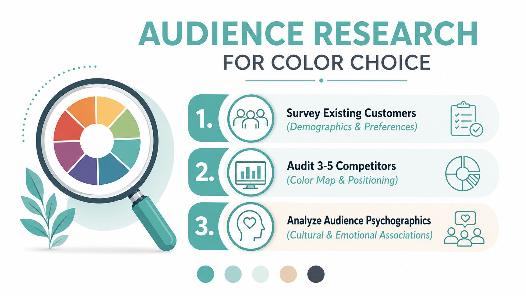
Run a short survey with existing customers. Keep it practical. Ask which colors feel most trustworthy in your category, which brands they already associate with quality, and which tones feel too loud, too cold, or too generic. You're not collecting art criticism. You're mapping expectation.
Then talk to a few customers in brief interviews. The useful questions are boring on purpose. What brands do they trust? Which visuals feel premium? Which colors make them think of a business that is established versus one that's cheap? Those answers tell you what your market already rewards.
Audit the local competitive set
Next, look at the three to five businesses your audience compares you against. Don't just note the colors. Note the saturation, the warmth or coolness, and the balance of the palette. A saturated red says something very different from a muted burgundy, and a bright teal behaves differently from a quiet blue-gray.
Build a simple map. Put the competitors on one axis for tone, then another for distinctiveness. You're looking for overlap. If everyone in your category uses the same safe palette, there's room to claim white space without becoming weird for the sake of it.
Here's the key mindset shift. Color research is a segmentation problem, not a universal emotional code. The same red can feel like a warning sign in one industry and a loyalty cue in another. That's why audience research beats a generic color chart every time.
When you've got those signals, you're ready to build a palette that fits the market instead of fighting it. If you want a rough external point of comparison, WearView's brand visuals give you a useful sense of how color can support product presentation in the wild, especially when you're thinking about what a customer sees before they read a word: WearView.
Building a Palette That Works Across Categories and Channels
Turn your research into a system, not a single hero color. The cleanest brand palettes usually use the 60/30/10 split, with 60% primary, 30% secondary, and 10% accent, plus neutrals to keep everything grounded. That structure gives you enough range for web, social, print, and video without making the brand feel busy.
Keep the palette compact
I'd keep it to three to five colors. More than that, and you start inviting visual noise. A compact palette is easier to remember, easier to apply, and easier to police across a team. That's especially important when you're handing assets to designers, printers, editors, or a media platform.
The other hard rule is to stop choosing by taste alone. A color can look beautiful and still fail the job. It can disappear against a background, clash with your category, or feel out of place once it's placed next to copy, imagery, and a logo lockup.
Score the palette before you lock it
Use a decision matrix and score each candidate on three things, emotional fit, category distinctiveness, and readability across channels. That forces discipline. A palette that wins on emotion but loses on legibility isn't ready. A palette that looks fresh but feels off-brand also isn't ready.
Use a table like that with your own options. One palette may be more distinctive, but the other may travel better across website headers, print menus, and motion graphics. I'd choose the one that survives the most real uses, not the one that wins on a slide.
For a practical visual reference on building a tight visual identity on a budget, Adwave's visual identity guide is worth a look because it connects color consistency to the broader brand system instead of treating palette choice as an isolated design exercise.
A quick note on implementation
Document the final palette in exact codes and use it everywhere. That sounds basic, but basic is where most small brands slip. A color system only works when the same shade shows up the same way across the people handling your materials.
Making Your Palette Broadcast-Safe for TV and Video Ads
A palette that looks elegant on a website can wash out on TV. That's the part too many small-business guides skip. Broadcast and video introduce compression, motion, glare, and screen variation, so the palette has to survive a lot more than a static mockup.
Test for contrast, not just preference
Your on-screen text needs enough contrast to stay legible on a living-room TV, a phone, and a tablet. If your brand color sits too close to your background, the message gets thin fast. That doesn't just affect design quality, it affects whether viewers can read the offer in the few seconds they give you.
Also watch the safe area for text and logos. TV frames can crop edges differently across devices, and overscan still matters in some viewing setups. Keep important elements comfortably inside the frame so the brand mark doesn't get pinched at the edges.
Expect saturation to shift
Broadcast compression can flatten subtle gradients and push strong colors into mud or neon. That means the palette should be tested in motion, not only in a flat file. Check it across TV, mobile, print, and signage before launch, because a color that feels rich in Canva can look overprocessed in a spot.
A tool like Adwave fits naturally here. It's an AI-powered TV advertising platform that can generate a broadcast-ready spot from a website URL, place campaigns across 100+ premium channels, and start campaigns at $50 while keeping spend pacing automatic. If you already finalized your palette, that kind of workflow lets you carry the same brand colors into a TV ad without rebuilding the creative from scratch.
Don't launch the first version blind
Before you buy airtime, run mockups on a television, a phone, and a printed sample if you'll use the palette in offline materials. Then ask one blunt question, does the brand still look like itself when it moves and compresses? If the answer is no, adjust the color values before the ad goes live.
For a production-minded checklist on turning creative into a finished commercial, Adwave's guide to making a commercial is the kind of reference that helps tie palette decisions to actual video execution.
Testing, Measuring, and Refining Resonance After Launch
A good palette doesn't earn trust because you like it. It earns trust because customers recognize it, remember it, and respond to it across campaigns. That's why the work doesn't stop when the brand guide is signed off.
Measure the palette in the real world
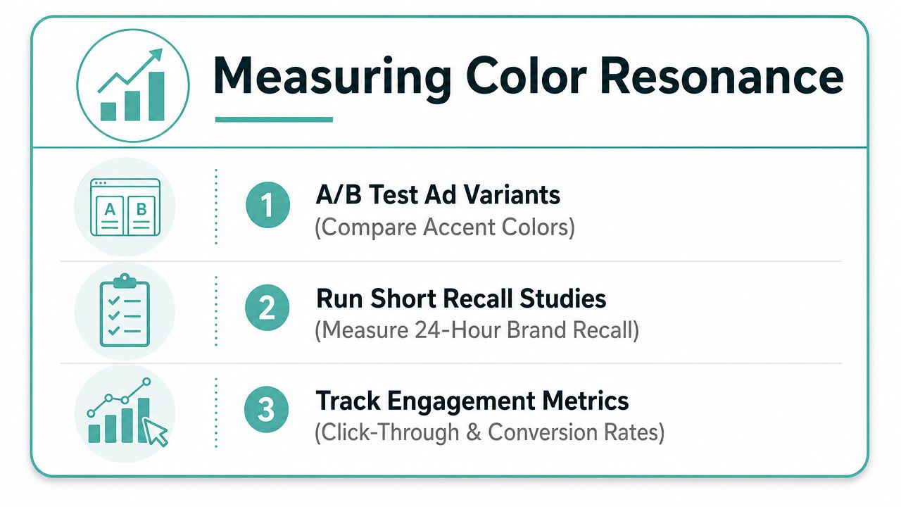
Run an A/B test with two ad variants that use different accents. Keep the offer and the copy consistent so the color is the variable you're testing. If one version keeps attention better or drives stronger response, you've learned something useful about how the market reacts.
Then run a short recall survey within a 24-hour window after the spot airs. Ask what people remember about the ad and which brand they associate with it. If they remember the message but not the brand, the palette may not be anchoring the identity hard enough.
Inside Adwave, the dashboard gives you real-time performance tracking, so you can watch brand-lift signals while the campaign is live. That matters because you don't want to wait until the end of a flight to discover the color system isn't doing its job. For a deeper framework on evaluating campaign performance, Adwave's measurement guide fits this stage well.
Watch for the common failure mode
The biggest mistake is treating color psychology as fixed across markets. It isn't. Meaning has to be checked against the product, the sector, and the local audience every time you enter a new market or expand into a new channel.
Lock the palette only after you've checked three things. It matches the audience. It reads cleanly in the formats you use. It performs in testing, not just in theory.
Keep the system compact, brief the team with exact color codes, and revisit the palette on a quarterly cadence as the brand grows.
A strong palette does more than make the brand look polished. It becomes the foundation that makes every future ad, billboard, storefront sign, and social post work harder.
If you're ready to turn a color system into a real TV-ready brand asset, Adwave can help you build and launch a broadcast-safe ad from a website URL, then track how the creative performs as it airs. Visit Adwave to see how the platform fits into your next campaign and to move from palette choice to measured visibility.