
The fastest way to waste money on branding is to ask for “a logo and a look” before you know what the business needs. I've watched owners sit in a blank Canva tab, staring at ten font menus and twenty swatches, because they were trying to design everything at once. If cash is tight, the smarter move is to build a visual identity in layers, starting with the parts customers will see first.
That usually means a clear logo, a controlled color palette, sensible typography, and a repeatable way to use them across real assets. Everything else, like motion, illustration, custom photography, and broadcast polish, can come later when the business has room for it. A budget identity works when it's treated like an operating system, not a one-off art project.
What a Visual Identity Is on a Budget
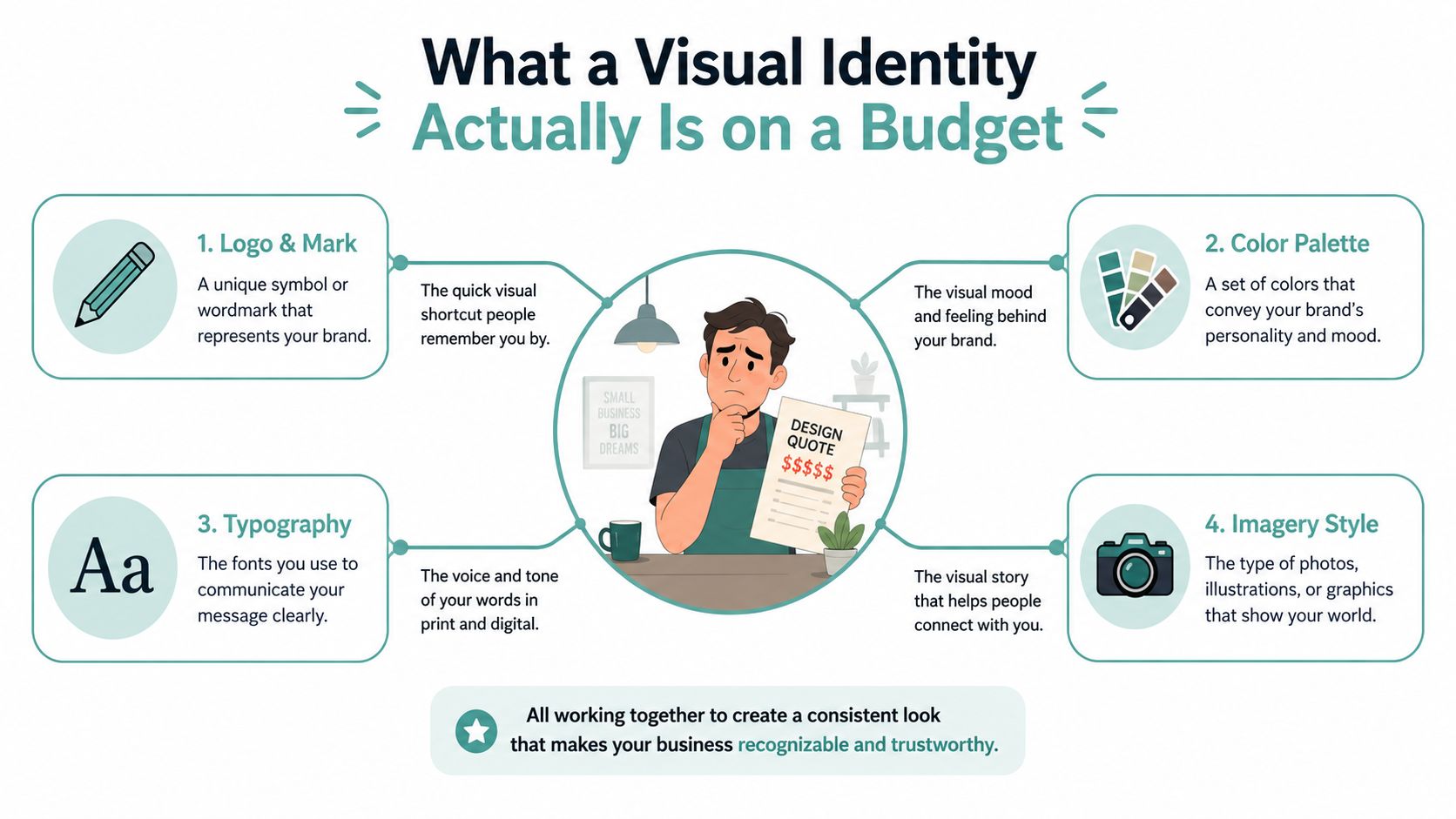
A local service owner usually does not need “brand development” in the agency sense. They need a system that makes the business look consistent on a website, a quote, a truck decal, a social post, and maybe a sign out front. That system is the visual identity, the set of visual cues that help people recognize the business and remember it.
The budget version strips this down to the essentials. Logo, color, typography, and often a simple imagery style are the core pieces, while custom illustration, motion graphics, and expensive photo shoots can wait. Vistaprint describes visual identity as the visual elements that express who a brand is, including logo, typography, social templates, and website layouts, which is exactly why small businesses need to think in systems, not in isolated files, when they are building on a budget. Vistaprint on visual identity
Practical rule: if an asset won't be used more than once, it probably doesn't belong in the first version of the system.
That's why a coherent identity can be built cheaply if the scope stays disciplined. The reader's job is not to make the brand look like a national chain on day one. The job is to make every customer-facing touchpoint feel like it came from the same business, then expand only after the core pieces are stable.
Realistic Budget Numbers for a Small Business Identity
The budget conversation gets messy when owners compare a freelancer quote to a full agency package without understanding the middle ground. The spending data shows a real gap. 71% of businesses with annual revenue below $500,000 spend only $100 to $500 per month on branding, while 57% of small businesses pay about $500 for a logo and roughly 18% pay up to $1,000. At the same time, the average cost of startup branding from a freelancer or small design firm is $5,000 to $20,000, which is why many small companies use phased, budget-first identity systems rather than buying everything up front. Branding statistics and small-business spend benchmarks
That range is why the first purchase should be the smallest version of the identity that can still be used consistently. A business does not get more credible because it paid more. It gets more credible when the same visual rules show up everywhere customers look.
If you want a practical adjacent example of how lean spending can still produce an usable web presence, the guide to building a business website on a $500 budget is a useful reference point for scoping.
A logo by itself is never the whole purchase. The real value is the repeatable system around it.
The negotiable costs are usually the extras, not the fundamentals. Spending more on strategy, custom illustration, or full-service launch packages makes sense only when the identity will be deployed across enough channels to justify the overhead.
Discovering Your Positioning Before You Design Anything
A budget identity gets sharper when the business knows exactly who it's speaking to. A generic “we serve everyone” brief produces generic visual work, and generic visual work is expensive because it has to be revised later. The better move is to define one clear customer segment, one offer, and one tone before a single logo concept appears.
Start with a one-sentence positioning statement. Write who the business serves, what it offers, and why someone should choose it over a nearby alternative. Then list two or three direct competitors and look for the visual patterns they repeat. That exercise usually reveals the white space you can own, which is where the brand stops feeling like a copy of the category.
A simple discovery checklist keeps this grounded:
Audience: pick one segment, not a vague crowd.
Offer: name the exact service, product, or package that matters most.
Tone: decide whether the brand should feel calm, fast, premium, warm, technical, or straightforward.
Differentiator: identify what you do that competitors are not visually focusing on.
Visual white space: note one stylistic choice you can own without confusing the audience.
The point is not to be unusual for its own sake. The point is to avoid designing a look that feels “professional” but says nothing. A clear positioning pass makes every later design choice easier because you're not decorating, you're translating strategy into visuals.
For a deeper framing of the audience and message side of the work, how to create brand awareness is a good companion read because it pushes the same discipline from naming into perception.
Building the Color and Typography System
Color and type are where most budget identities either become tidy or unravel. The trick is to treat them like a system with rules, not a mood board with good intentions. One of the most useful constraints is to limit the palette to 2 to 3 primary colors plus 1 to 2 neutrals, then document exact usage so nobody improvises later. Expert guidance also recommends checking every combination for accessibility contrast, with WCAG AA as the baseline before launch. Budget identity design guidance on color and accessibility
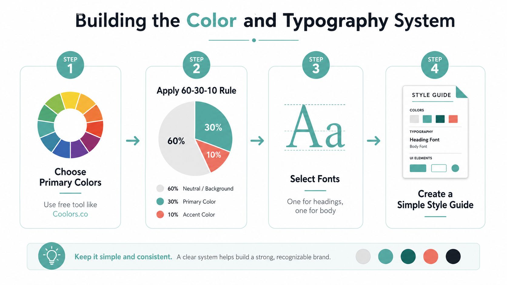
A workable palette starts in a free tool like Coolors.co, then gets locked into a practical balance. One source recommends the 60 to 30 to 10 rule, with 60% primary background or dominant color, 30% secondary color, and 10% accent color. That rule matters because it stops small businesses from turning every flyer, reel cover, and email banner into a different design experiment. 60 to 30 to 10 budget branding rule
Typography needs the same restraint. Pick one font for headlines and one for body copy from a free library like Google Fonts, then document when each should be used. A readable body font matters more than a trendy display face, because most budget identities live on small screens, in forms, and in quick-glance materials.
Practical rule: if a font looks clever but becomes hard to read on a phone, skip it.
A concise style guide should note color hex codes, text hierarchy, and minimum contrast expectations. If you're building social graphics on a budget, the free tools guide for social media graphics can help you keep the design system usable instead of ornamental. Once those rules are written down, anyone making materials can follow the same logic without asking the owner to approve every tiny decision.
Designing Your Logo and Core Templates
A budget logo should solve recognition, not try to win a design award. I usually start by sketching three rough concepts, testing them in black and white first, and deleting anything that only works because of color or special effects. That catches weak marks early and keeps the logo usable on invoices, favicons, signs, and social avatars.
The tool choice depends on the budget and the business stage. A free or low-cost AI logo maker is fine for a simple starting point, especially when the goal is to launch fast and test the market. If the business needs more nuance, a fixed-price freelancer can tighten the mark, clean up spacing, and prepare better file exports. The key is to ask for the right formats, not just a pretty preview. You want vector files when possible, plus transparent versions, horizontal and stacked layouts, and web-ready exports for day-to-day use.
That logo then becomes the seed for templates. One clean Instagram post layout, one flyer layout, one email signature, and one slide deck cover go further than dozens of one-off assets. Canva is often enough for this phase, because you can lock fonts, colors, and spacing into reusable files, then hand them to staff without re-explaining the brand every week.
A practical production sequence looks like this:
Sketch three concepts and keep the strongest silhouette.
Test in black and white so the idea survives without color support.
Lock one direction and stop revising too early.
Export the needed file types for web, print, and social.
Convert the logo into templates for recurring channels.
For small businesses building infographics, the resource on creating infographics without a graphic designer is a useful extension of this template-first approach. The point is reuse. A logo that feeds templates saves time every month, and time is the hidden cost most owners feel first.
Rolling the Identity Out Across Every Touchpoint
A visual identity fails when it only looks correct in one place. The rollout has to be operational, because customers don't experience a brand in a vacuum. They see the website, the Google Business Profile, the social bio, the inbox signature, the invoices, the storefront, the uniform, and the business card, often in the same week.
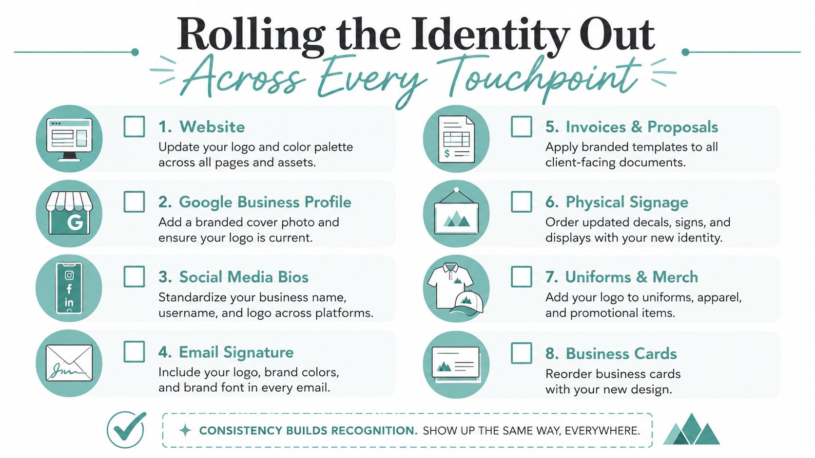
Start by auditing every surface first, then prioritize the ones customers notice. A website header usually matters before a truck decal, and a social profile matters before a brochure that sits in a drawer. Once the high-visibility pieces are updated, create branded templates so the identity doesn't drift every time somebody needs a new post or document.
That's where a comparison of spending paths helps. The $0 DIY route works if the owner can handle setup and keep the rules simple. The starter path is better if the business needs a few professionally cleaned-up assets without full agency overhead. The professional path makes sense when the rollout touches enough channels that the time saved is worth the fee.
For businesses wanting external help, 2026 graphic design work Brisbane is a useful reference for thinking about when a local designer can handle the first pass and when you should keep the rest in-house.
Adwave fits naturally into that rollout once the base system exists. It can generate a polished TV-ready ad from a website URL and basic business info, and campaigns start at $50 with automatic pacing so spend doesn't exceed the set budget. The same palette, logo, and visual rules can then carry into broadcast creative across channels like NBC and Hulu without dragging in a separate production crew.
Consistency matters more than channel count. A lean system that shows up the same way everywhere beats a fancy one that changes every week.
The last step is team training. If staff know which logo version to use, which colors are allowed, and which template handles each job, the identity stays coherent long after launch day.
Sticking to a Sample Budget and Timeline
A four-week sprint is enough to get a lean identity out the door without turning the project into a six-month detour. Week one belongs to discovery, competitor review, and a rough moodboard. Week two is for palette selection, font pairing, and the first pass at usage rules. Week three is for logo cleanup and core templates. Week four is for rollout, documentation, and fixing the gaps that show up when real materials get touched.
A realistic line-item approach keeps the spend visible. In one lean setup, the owner uses free tools for research and design work, then pays only for the pieces that need money. That might mean a modest Canva subscription for asset production, a small print run for cards or signage, and a one-time designer fee if the logo needs refinement. If the business is still testing its offer, there's no reason to buy motion packages, oversized brand books, or custom illustration systems yet.
The strongest guardrails are simple. Don't pay for a complete rebrand if the business only needs consistency. Don't overbuild color variants. Don't commission every asset before the first version is working. And don't treat year one as the time to solve every future channel at once.
A lean timeline also makes the visual identity easier to extend later. Once the website, social headers, signage, and email signature all share the same rules, broadcast creative can follow the same logic. That's the point of a phased build, the identity gets stronger because each layer has a job, not because everything was designed on day one.
If you want a faster way to push the same visual system into ads after your logo, colors, and templates are set, Adwave turns a website and basic business info into broadcast-ready TV creative. Visit Adwave if you want to carry a budget visual identity into premium channels without turning the project into a production-heavy rebuild.


