Mobile pages that loaded one second faster achieved up to a 27% increase in conversion rates, according to the SOASTA study cited in Google’s mobile site speed playbook. That’s the right frame for appointment booking page design. Your page isn’t a prettier contact form, it’s the front desk when nobody can answer the phone, and it has to book, reschedule, cancel, and reassure without help.
The Six Zones Every Booking Page Needs
Demand isn’t the problem. In the 2025 Eliciting Insights survey of 384 U.S. adults who had visited a healthcare provider in the previous year, 95% had either booked a medical appointment online or said they would do so if the option were available, and 92% of people who had already booked online said they planned to use online scheduling again.
Adoption was broad, not just young. 80% of Millennials had used online scheduling, with another 19% willing to use it, 69% of Generation X had used it, with another 28% willing, and 55% of Baby Boomers had used it, with another 32% willing. 67% considered their provider’s online booking experience “very easy.” That’s your bar whether you’re a dental office, a salon, a dealer service lane, or an HVAC company booking two hour windows.
Sketch the page before you style it
| Zone | Visitor question | Show this | If it is missing |
|---|---|---|---|
| Hero | What am I booking? | Service, duration, starting price, place or time zone | People leave before opening the calendar |
| Next availability | How soon can I come? | Earliest real openings, not a blank month | Soonest-slot seekers cannot decide |
| Calendar | Which time works? | One column on mobile, unavailable times labeled in text | Color-only or tiny pickers block booking |
| Details | What do you need from me? | Only fields that qualify the visit, with labels and autofill | Extra questions and account walls add drop-off |
| Review | Is this the visit I chose? | Service, date, time, contact, price or deposit, cancel terms | Surprise terms create no-shows and chargebacks |
| After booking | How do I change it? | Confirmation method plus reschedule and cancel | Staff absorb calls the page should have handled |
Read that table as a sequence, not a menu. A visitor shouldn’t meet the calendar before they know what the visit costs and how long it takes, and they shouldn’t meet your cancellation rule for the first time in a reminder text.
Run two people through one phone screen
Take a new dental patient booking a cleaning and a homeowner booking a two hour diagnostic visit. Both need to see the service, the earliest opening, and the price signal without scrolling into a brochure. Both need a big, plainly worded button, and it’s worth checking call to action button words and placement that get clicks before you default to a vague “Submit.”
If either person still has to call to finish, name the missing zone and fix that before you touch colors, photos, or scheduler brands. A page that can’t answer “how do I change this” will convert first bookings and then hand the work back to your staff.
Practical rule: If a zone doesn’t answer a visitor question, it’s decoration. Cut it or move it below the booking flow.
Owners who sell booked calls rather than visits face the same math, which is why some teams talk about commission-based client acquisition as a way to tie spend to real conversations. Either way, the page has to turn intent into a confirmed time, not a lead someone chases tomorrow.
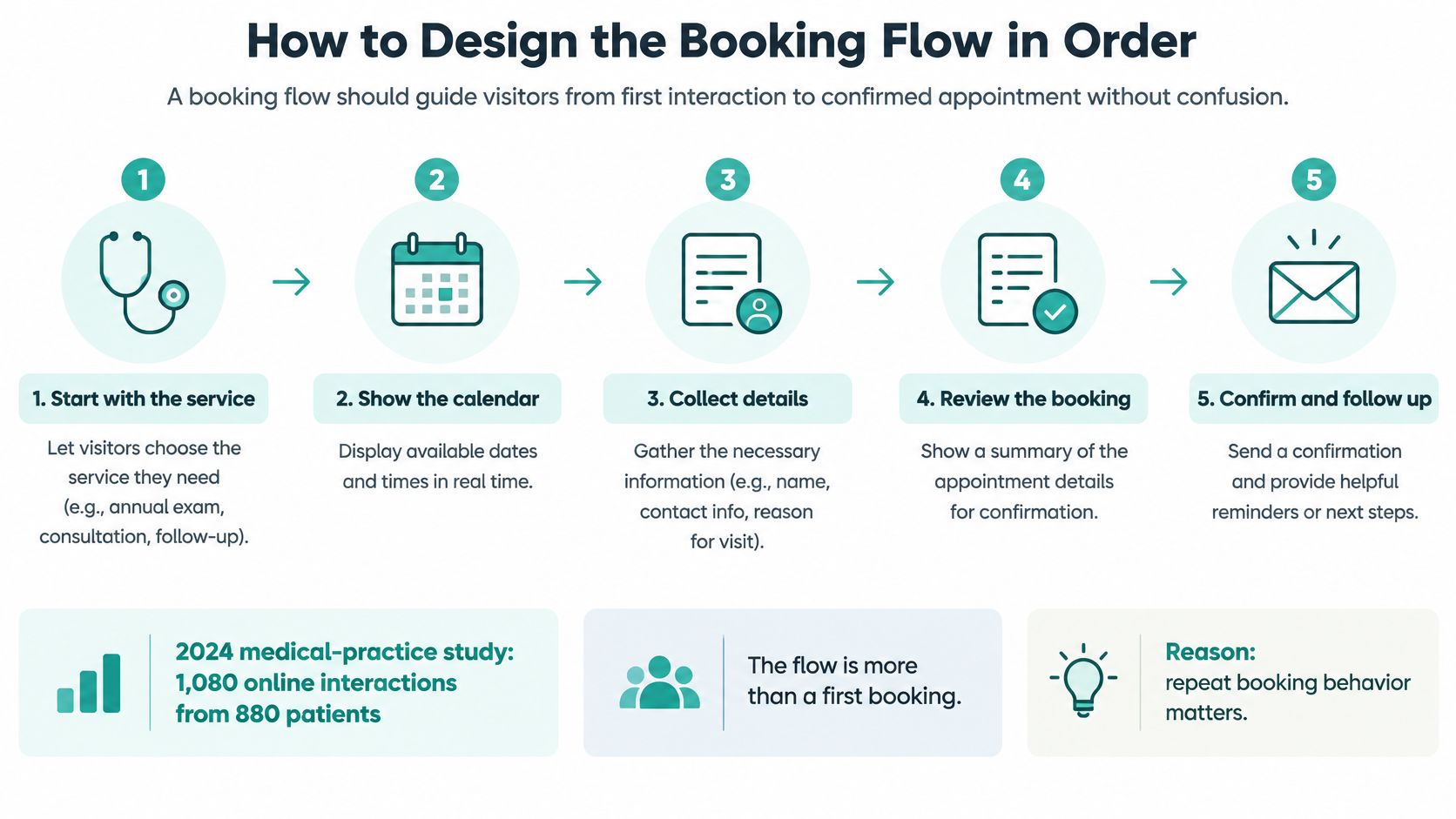
How to Design the Booking Flow in Order
Build for the whole scheduling life, not the first click. The 2024 peer-reviewed study of online appointment scheduling in a medical practice recorded 1,080 online interactions from 880 patients over 12 weeks, compared with 2,427 appointments arranged offline by 1,902 patients.
Those online interactions were 76.8% new bookings, 13.1% rescheduling requests, and 10.1% cancellations. Nearly a quarter of the work your page does happens after the first booking. If reschedule and cancel live only inside an account nobody remembers creating, that work becomes phone calls.
Timing is just as blunt. 47.7% of online appointments were scheduled within seven days and 62.4% were scheduled within 14 days, and users selected the earliest available appointment in 44.1% of cases. Cancellations and rescheduling were concentrated close to the date too, with 36.8% occurring one or two days beforehand.
The six build steps
- Name one primary service and its duration first. Don’t draw anything until “new patient exam, 60 minutes” or “oil change, 45 minutes” is fixed, because duration drives which slots are even possible.
- Put the next seven to 14 days above the fold. Show the earliest real opening as a tappable chip, then the calendar. A blank month view makes soonest-slot seekers do your job for you.
- Give new and returning visitors one shared calendar. Online users in that study averaged 41.7 years versus 50.3 years for offline users, and new patients showed a particular preference for online booking, so the new visitor path can’t be a PDF form and a phone number.
- Place reschedule and cancel where people look. Link them from the confirmation screen, the confirmation message, and the reminder. Don’t bury them behind a login.
- State what the confirmation says and when it arrives. “You’ll get a text in a couple of minutes with a link to change this visit” removes the anxious second submission.
- Keep a phone fallback as a choice. Staff it, show the number, but don’t make a call the only way a stuck person can finish.
If you’re comparing tools while you build, look at how this booking system handles recurring sessions and schedule changes. Tutoring is a useful test case because the second, third, and moved appointment matter as much as the first.
Same order, two businesses
A dental new patient visit and a same week oil change look different and flow identically. Service and duration, earliest opening, calendar, short details, review, confirmation with change links. When the order feels boring, it’s working, because the visitor never has to guess what happens next.
Fields to Keep and Trust to Show
A booking form should collect enough information to make the appointment clear and workable, without turning the booking into an intake interview. In a 2025 survey of 1,089 respondents, 80% used online appointment scheduling at least some of the time, and 55% said they were likely to consider changing doctors for a provider offering online scheduling. A convenient page can help earn the booking, but clarity about the visit helps keep it.
A shorter form is not always better. Removing a field can reduce friction, but removing context can leave someone unsure about the service, cost, or what happens after booking. Use form optimization for conversions to assess each field by its job, then check that the same details remain clear through confirmation and any later schedule change.
Decide each field by the job it does
| Field | Rule | Input | Why it is here |
|---|---|---|---|
| Service | Required | Select or radio | Sets duration, price, and staff |
| Date and time | Required | Picker plus a text alternative | Identifies the appointment |
| Full name | Required | Text with name autofill | Supports confirmation and front-desk check-in |
| Mobile or email | One required | tel or email | Delivers reminders and reschedule information |
| New or returning | Required only if the visit differs | Radio | New visits may need more time |
| Visit notes | Optional | Textarea | Gives useful context without blocking booking |
| Marketing consent | Optional and separate | Unchecked checkbox | Keeps consent separate from the appointment |
| Account password | Do not ask | None | Avoids an account barrier before booking |
Every required field should change the appointment, its reminder, or its price. If it does none of those jobs, make it optional or remove it. Keep notes optional unless the answer affects the service or preparation.
Show the trust lines before submit
- Salon color appointment: Show duration and starting price. If a visitor expects a short appointment but has booked a much longer service, that mismatch can disrupt the day.
- Real estate buyer consult: Name who they will meet, where, and for how long. A vague “consultation” gives too little information to judge the visit.
- Dealer paid diagnostic: State the deposit and cancellation terms before submission. Surprise charges can turn a booking into a dispute instead of a reschedule.
Before the button, repeat duration, price or deposit, who they’ll see, place, time zone, how confirmation arrives, and the cancellation rule. These details give visitors a clear record to check later, including when they need to move or cancel the appointment. Keep the line that answers a likely question, even if it adds a little length.
For visitors in the European Economic Area, place a privacy line beside the submit button. Name your business as controller, state the booking purpose and legal basis, and explain retention and their rights plainly. Keep marketing consent in its own unchecked box, separate from the booking.
Quick-Start Wireframes and Templates
Sketch two layouts on paper before you style anything. You’ll catch ordering problems in ten minutes that a polished mockup hides for weeks.
Mobile wireframe, top to bottom
- Header: Business name and a tap-to-call number.
- Hero block: Service name, duration, starting price, and place or time zone.
- Next available chip: The earliest real opening, with a link to see more dates.
- Single-column calendar: Seven days of tappable slots, with unavailable times labeled in text.
- Details panel: Name, one contact field, a new or returning choice, and an optional notes box.
- Review card: Service, date, time, time zone, price or deposit, and the cancellation rule, with a Back link.
- Book this visit button: Followed by a confirmation panel with reschedule and cancel links.
Desktop keeps the same order
Use two columns, with the visit summary sticky on the left and the calendar and form on the right. Don’t invent a different sequence for larger screens. Someone who starts on a laptop and finishes on a phone shouldn’t have to relearn your page.
Build one template per service type and change only the duration, price, and cancellation rule between them.
A dental cleaning, a salon color, and a dealer oil change can all run on the same skeleton. That consistency is what makes testing possible later, because you’re comparing services on one layout instead of comparing three layouts at once.
Mobile Accessibility and Error Recovery Tips
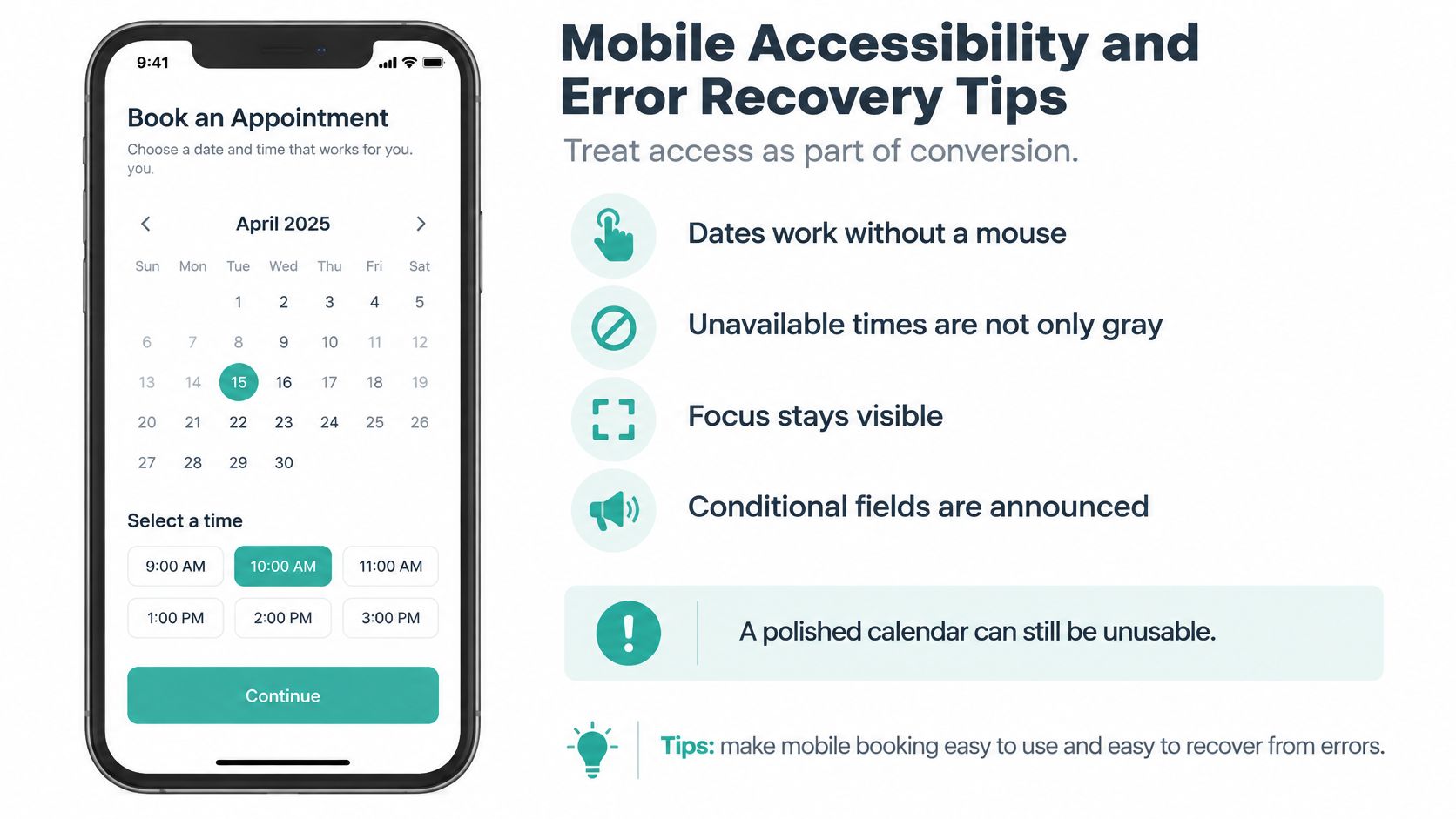
A polished calendar can still be unusable. If dates need a mouse, unavailable times are only gray, focus disappears after a tap, or a new field appears without being announced, the booking doesn’t happen and your analytics just call it abandonment.
Treat access as part of conversion. The person booking with a screen reader, the person with low vision in bright light, and the contractor thumb-typing in a driveway are all trying to give you the same appointment.
Build the task, not the checklist
- Build mobile first. One column, large tap targets around 44 pixels, and no times that only appear on hover.
- Let arrow keys move through days and slots. Add a labeled text input for date and time as a fallback, so the picker is never the only door.
- Say unavailable in text. Never let color alone carry that meaning.
- Label every field visibly. Keep focus order identical to visual order, and make the focused element obvious.
- Name new fields when they appear. If choosing “new patient” reveals insurance or intake questions, assistive technology has to announce them.
For layout fundamentals that support all of this, mobile-first website design covers why the small screen should set the structure rather than inherit a shrunk desktop page.
Errors people can actually fix
Under WCAG 2.2, when an input error is detected automatically, the affected item must be identified and the error described to the user in text. In practice that means a specific message beside the failed field, an explanation of the fix, every other answer left intact, and a clear way to resubmit.
“Invalid input” in red at the top of the page fails that test. “Enter a 10 digit mobile number so we can text your reminder” under the phone field passes it, and it also tells the visitor why you asked.
On the review step, repeat service, date, time, time zone, place, and contact details so the booking can be corrected before it’s final. Then test the whole task four ways, keyboard only, with a screen reader, at 200% zoom, and on a mid-range phone in glare. Record successful bookings by input method, not only by total conversion, or you’ll never see which group your calendar is turning away.
Speed Tests and the Funnel Worth Measuring
Judge the page by confirmed appointments, not clicks on a Book button. Clicks tell you people tried. Confirmations tell you the calendar, the form, and the scheduler all held together.
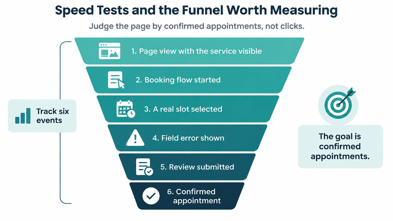
Six events, read by segment
| Stage | Event to record | A drop usually means |
|---|---|---|
| Arrival | Page view with the service visible | Slow load or an unclear offer |
| Start | Calendar or flow opened | Hero or next-available block was missed |
| Choice | A real slot selected | Thin availability or a hard picker |
| Details | Field error shown | Bad labels, wrong input type, or an extra required field |
| Review | Submission after the summary | Surprise price, deposit, or cancel rule |
| Done | Confirmed appointment | Scheduler failure or a double submit |
Split every stage by device, traffic source, and service type. A healthy desktop funnel can hide a mobile calendar that’s losing half your salon bookings. Keep guardrails beside the main metric, including completion time, field error rate, the stage where people leave, back button use, cancellations, and no-shows.
Fix speed before adding persuasion
In Google’s mobile benchmark data, increasing load time from one to ten seconds raised bounce probability by 123%, and a Google-commissioned study associated a 0.1-second improvement with an 8.4% increase in retail conversions and a 10.1% increase in travel conversions. Treat those as directional evidence, not appointment guarantees.
Compress hero and calendar images, defer scripts that aren’t the scheduler, and reserve space for the time list so slots don’t jump as they load. Test on a mid-range phone over a slow connection, and use website speed fixes that cost nothing before you pay for a redesign. Then change one thing at a time, such as moving the earliest slot higher, and keep the winner only if confirmed appointments rise without more errors or no-shows.
Launch the Page and Fill Open Slots
Launch week is a checklist, not a celebration. Work through it on a real phone, with real availability, before you send anyone paid traffic.
Three days of checks
- Day one: Confirm the live page shows next availability, a review step, text error messages, and reschedule plus cancel links on a phone.
- Day two: Book and cancel one real test appointment for your main service, then reschedule a second one from the reminder link.
- Day three: Check the reminder, time zone, and price against what your front desk sees, because a mismatch there becomes a no-show argument.
If your front desk is drowning in the calls the page hasn’t absorbed yet, you can Hire Medical Virtual Assistants to cover phones and intake while the self-service flow takes over. That keeps the fallback staffed without making it the only path.
Send demand to the booking page, not the homepage
Once the page works, point campaigns straight at it. Adwave is a good fit here because it turns your website into image and video ads that you can review and refine before launch, and setup takes about five minutes from pasting a website to live ads, with no agency and no ad accounts needed.
Connect tracking before you judge results, since external booking tools and offline sales need additional setup to be measured. After seven days, compare confirmed appointments, no-shows, and the calls the page should have handled. Keep what raises confirmed visits, and run a fresh push when a dated offer, a new clinician, or a seasonal service opens up slots worth filling.
Your booking page is built, tested, and ready to take real appointments, so now it needs local people to see it. Adwave turns your existing website into image and video ads you review and approve before anything goes live, which makes it a practical way to fill open slots without building an ad operation. Start putting your confirmed-booking funnel in front of nearby customers today by visiting Adwave.