You’ve updated your website, added a booking button, and started thinking about advertising. Yet a homeowner comparing your business with another local provider still has basic questions: Is this company real? Has anyone nearby used it? What happens after I send my details? A polished page helps, but a few claims that visitors can verify give them a stronger reason to take the next step.
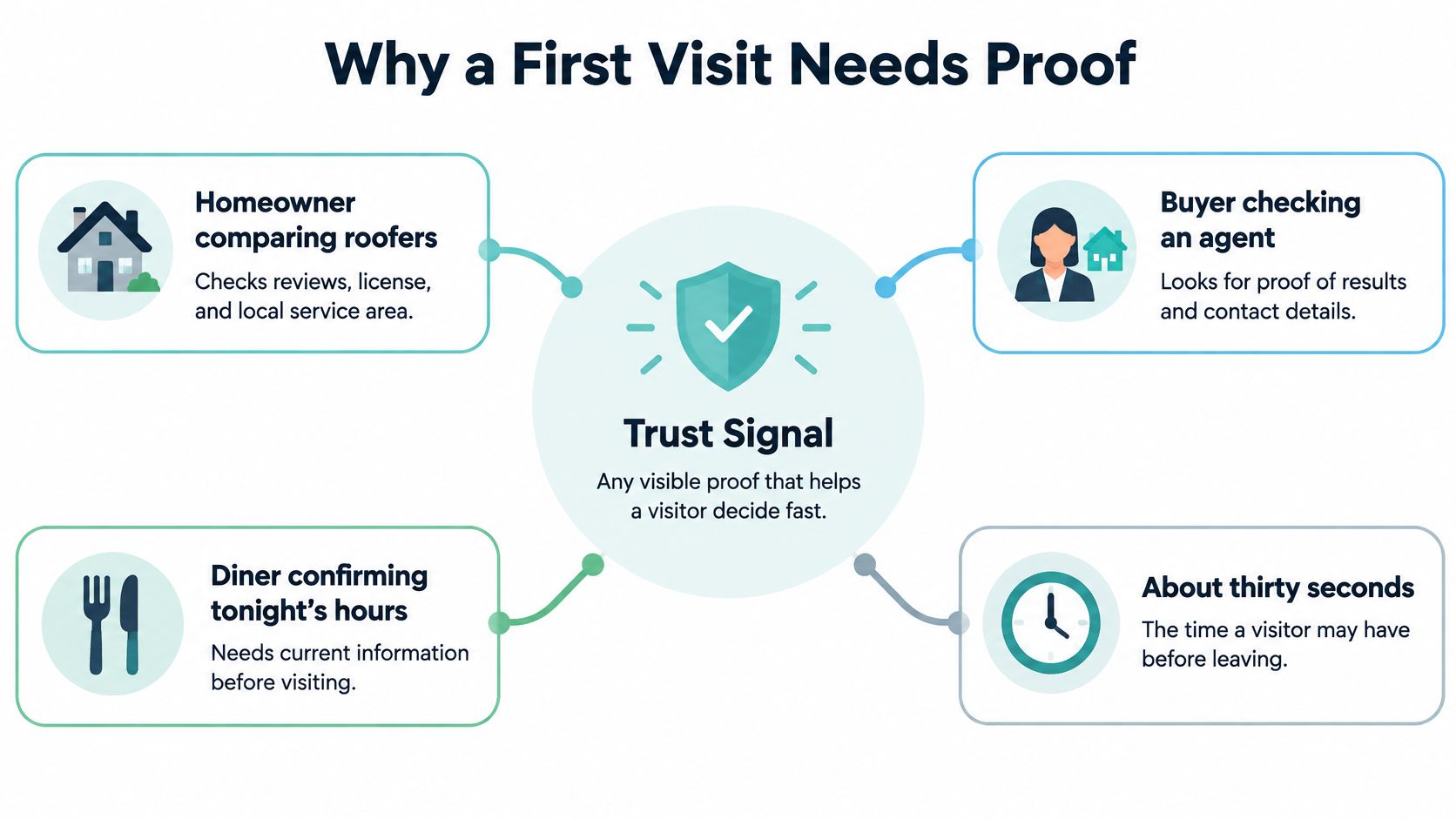
Why a First Visit Needs Proof
Say a homeowner opens your roofing website between meetings. They’ve given themselves about thirty seconds to decide whether to request an estimate. Your headline promises excellent workmanship, but they can’t find your service area, identify the person behind a testimonial, or tell whether the phone number reaches your office.
They don’t need another slogan. They need evidence that you’re real, reachable, and likely to deliver.
A trust signal is an on-page cue a stranger can use to make that judgment. Think of a physical storefront: a lit window suggests someone’s operating, a posted license supports a specific qualification, and someone at the counter makes the business accountable. A slogan on the door doesn’t do those jobs.
In Storyblok’s 2023 survey of 1,000 consumers, 43% of global consumers said a brand’s website was more valuable than its mobile app or social-media accounts when making purchases. Your page needs to provide enough substance for that decision, not merely direct people elsewhere.
The doubts behind a visitor’s hesitation
Visitors bring different concerns, but you can organize them into practical categories:
- Identity risk: Is this the business I meant to contact, and does it serve my area?
- Performance risk: Can this provider do the particular job I need?
- Data risk: What will happen to my contact or payment information?
For the roofer, a recognizable local customer story addresses performance risk. A working phone number and accurate service area address identity risk. A clear explanation beside the estimate form addresses data risk.
Polish, a browser lock, and a row of icons aren’t interchangeable with evidence. They can make a page look orderly without answering whether the business can complete the visitor’s job.
When choosing trust signals on website pages, start with the unanswered customer question. Reachability and relevant customer evidence deserve attention before decorative logos.
Trust Signals Worth Adding First
Trust signals to add first on a local site
| Signal | What it proves | Local priority | Place it |
|---|---|---|---|
| Named review with date and job | A real customer used this service, when attributable | High | Near the headline and the form |
| Link to Google or another third-party profile | Feedback the business does not fully control | High | Beside any star summary |
| Phone, address or service area, and hours | The business is reachable | High | Header and footer |
| Privacy, refund, or cancellation terms | How data is used and what happens if the visitor is unhappy | High | Next to the submit or buy button |
| License, insurance, or trade certification | A specific qualification or coverage claim can be checked | High when the trade requires it | Beside the offer |
| HTTPS and familiar payment marks | HTTPS protects data in transit; marks identify accepted payment methods | High only on payment or sensitive forms; HTTPS throughout | Around the payment fields |
| Press or partner logos | Someone outside noticed or works with the brand, if substantiated | Low unless the name is locally known | Below the main offer |
| Guarantee or best-price language | A promise with conditions, not proof of results | Only if the terms are written | Next to the offer, with the conditions |
Start by marking what’s missing, then distinguish customer evidence from business promises. A dated review describing a furnace repair gives a prospect something concrete to evaluate. A guarantee describes what you promise to do if a stated condition occurs.
In Nielsen’s 2012 global survey, 70% of surveyed internet users trusted messages from online consumer reviews, while 92% of consumers worldwide trusted recommendations from friends and family more than other forms of advertising. These are historical trust findings, not a promised conversion lift for your website.
Choose relevance before prominence
A review should describe the service your visitor is considering. For real estate, Royal LePage Brookside Realty on verified reviews offers a useful category-specific resource for thinking about what buyers and sellers should be able to check. On your own page, connect the customer’s experience to the service rather than displaying praise without context.
Next, check your operational details. A mobile service business doesn’t need to publish a private home address to appear legitimate, but it should clearly identify the towns or neighborhoods it serves. Publish hours that match when someone can answer.
Keep policies beside the relevant action. Cancellation terms belong near booking; refund terms belong near purchase. Privacy information should explain data handling rather than pretend to be a customer-satisfaction promise.
Practical rule: If a visitor can’t verify a cue without calling you, treat it as a claim that still needs support.
Credentials need an issuer, an applicable scope, and a way to check their status. For technical foundations, the website security basics and SSL guide can help you separate encrypted connections from other credibility questions.
Press logos can wait if local customers won’t recognize them. Guarantees can wait until you’ve written understandable conditions. Pick the highest-priority missing items, not every available icon.
Surface Cues versus Proof Visitors Can Check
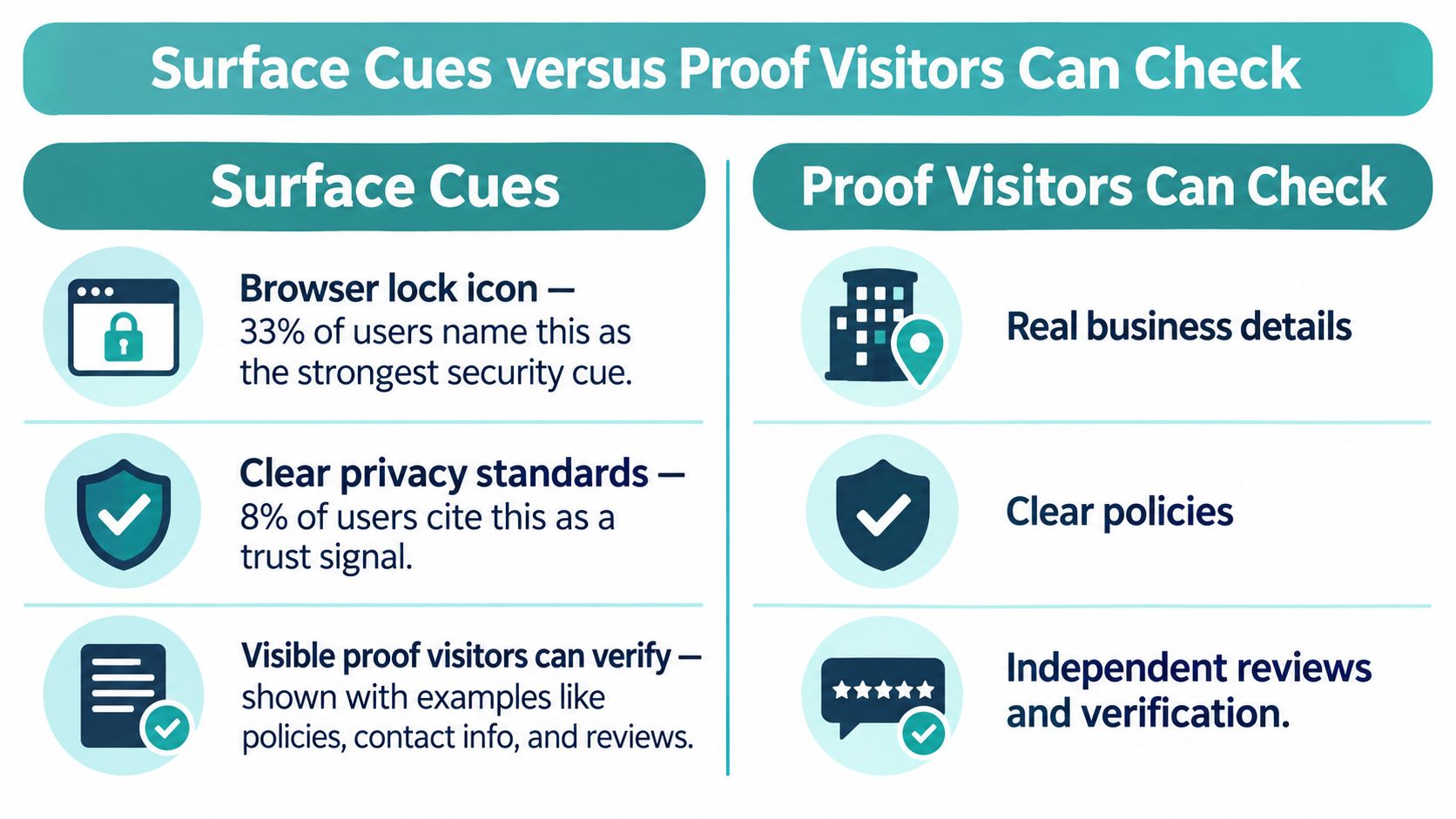
A browser security symbol can feel more reassuring than a carefully written policy. In the survey discussed by Clutch’s guide to trustworthy websites, 33% of users identified the browser lock icon as the strongest security cue, while 8% cited clear privacy standards and 5% cited transparent data practices.
That distinction matters: what makes visitors feel safe isn’t always what gives them the strongest basis for judging a business.
HTTPS confirms encrypted transmission. It doesn’t establish that the company completes jobs, honors refunds, or handles stored customer information responsibly. Likewise, a familiar-looking star widget doesn’t explain where its reviews came from.
Separate appearance from accountability
Surface signals include generic seals, stock photography, unexplained ratings, and visual security cues. They help people interpret a page quickly, but their meaning may be narrow or unclear.
Proof signals give visitors something specific to inspect:
- Business identity: A consistent name and phone number that match the linked public profile.
- Local relevance: A defined service area and customer stories tied to actual locations.
- Qualifications: A license number linked to an appropriate lookup destination.
- Data handling: A short explanation of why information is requested, supported by an accessible policy.
Digital Skyrocket’s discussion of what makes a website trustworthy is a useful companion when reviewing the broader credibility of a page. For local identity checks, use the guide to consistent business names, addresses, and phone numbers to review details across your website and public listings.
An unfamiliar seal can work against clarity. If a visitor clicks it and finds no issuer, an expired verification page, or an unrelated destination, you’ve introduced another unanswered question. Remove it rather than asking customers to interpret it.
Test the smaller, stronger version
The working hypothesis is straightforward: fewer claims, each checkable in a click, may outperform a crowded badge row. That’s a hypothesis for your own first-visit traffic, not a universal conversion rule.
Try replacing decorative seals with a relevant independent review destination. Keep a legitimate surface cue where sensitive information is requested, then pair it with verifiable evidence. Don’t remove useful technical reassurance just to make the page look minimal.
A visitor should be able to explain what a badge means, not just recognize that it looks official.
Proof for Real Estate, Auto, and Restaurants
A homeowner comparing agents opens an agent biography. A license number, a recent sold address, and a named client from a relevant neighborhood help them assess local experience. An unnamed luxury testimonial beside a stock skyline could belong to almost any brokerage.
Only publish client details or property information you’re authorized to use. Specificity helps when it’s accurate and appropriate, not when it exposes someone’s private information.
Proof to show by local business type
| Business | Proof to show | Demote | Put it on |
|---|---|---|---|
| Real estate | License, recent address, named local client | Unnamed luxury quotes and stock skylines | Agent bio and listing page |
| Automotive | Warranty terms, real OEM certifications, dated repair reviews | Perfect scores and vague best-price claims | Service scheduler |
| Restaurant | Current hours, dated prices, recent diner reviews | Expired awards and best-in-town claims | Hours and reservation block |
| Home services | License, insurance, service-area map, located before-and-after | Unfamiliar national seals | Quote form |
Match the evidence to the immediate decision
A driver booking brake service needs to understand the repair process and applicable warranty. Show manufacturer certifications only when they genuinely apply to the shop and work offered. A dated review describing a brake inspection is more relevant to this decision than an unexplained perfect rating.
Place warranty coverage and exclusions where the driver chooses a service. If the appointment is only an inspection, say so. Don’t let the booking interface imply a final repair price when diagnosis is still required.
A diner checking tonight’s plans needs current hours, usable menu information, and confidence that reservations reach the restaurant. Date the menu or price information so visitors can judge its currency. Recent customer photos can add context, but they shouldn’t substitute for accurate opening hours.
For a home-services business, show a before-and-after with a location description, the work performed, and any meaningful limitations. A patio renovation in the visitor’s town provides a more useful comparison than an unlabeled gallery. Place the service-area map before the quote request so people don’t submit inquiries for locations you don’t cover.
Make the ad and destination agree
Nielsen Norman Group’s ecommerce credibility findings identify professional design, reliable functionality, transparent policies, and clear security information as complementary signals. Apply that principle to local landing pages: the visitor should recognize the same business, offer, and area they encountered in the ad.
If an automotive ad promotes service appointments, don’t send people to a general vehicle inventory page. If a restaurant ad features a particular menu, make that menu easy to find.
Finish with the cover-the-logo test. Hide the logo and inspect what remains: neighborhood references, staff identities, actual work, and specific service details. If the remaining evidence could describe any competitor, replace generic content with facts that identify your business.
Where to Place Proof on the Page
Put reassurance where visitors make decisions, not wherever there’s spare space. In Baymard Institute’s 2017 checkout study, 19% of online shoppers had abandoned a checkout during the previous three months because they didn’t trust the site with their credit-card information; the study also estimated approximately $260 million in annual U.S. retailer losses associated with security fears.
Those are checkout findings, not a forecast for local lead forms. The practical lesson is that people can judge the payment area separately from the surrounding page.
Build a decision sequence
- Put identity in the header. Display the business name, working phone number, and service area. On mobile, make the phone number tappable.
- Restate the offer in plain language that matches the ad or search result. Clarify whether visitors are requesting an estimate, reserving a table, or buying.
- Place a dated, relevant review or applicable credential beside that offer. Make its supporting destination easy to open.
- Ask only for information needed for the next step. Explain why a required phone number is necessary. Don’t request a full address when a postal code will establish service eligibility.
- Beside the button, explain data use and expected follow-up timing. Provide a real alternative contact method, and promise only a response window your team can meet.
- When collecting card details, use a visually bounded payment area and genuine accepted-payment marks. Keep payment reassurance out of unrelated forms.
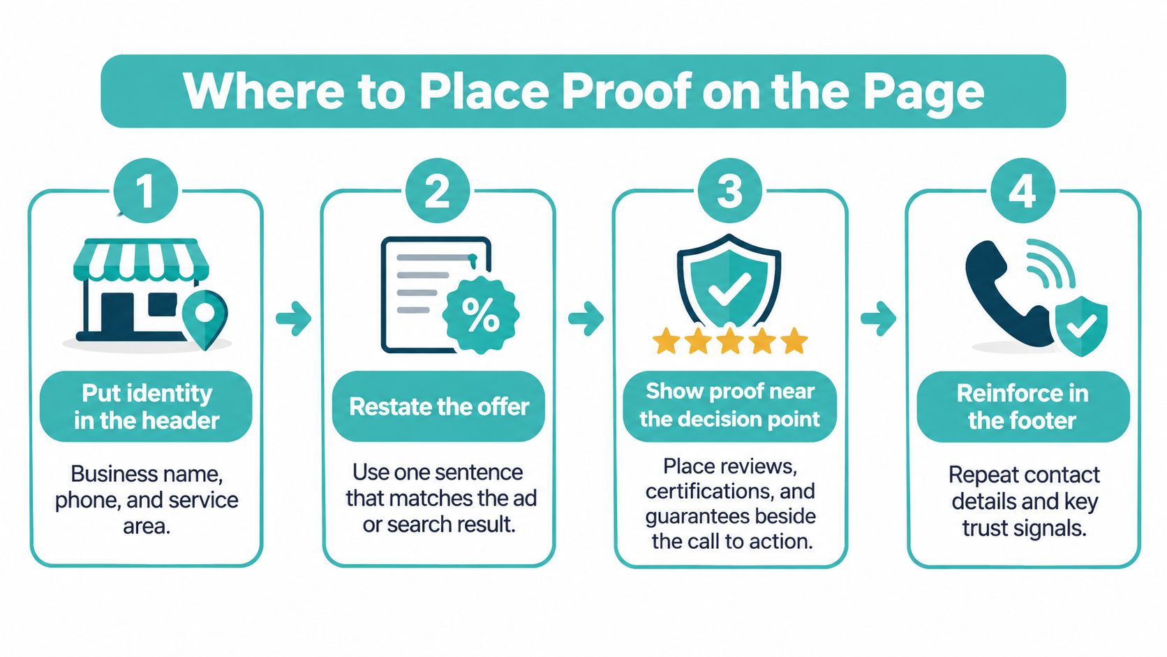
The footer can reinforce contact and policy information, but visitors shouldn’t need to reach it to resolve a concern beside the submit button. The landing-page best practices guide provides additional context for arranging the conversion path.
Test placement without confusing the result
Change a single element at a time. For example, compare the existing badge row with a specific review and its independent profile link while keeping the offer and form unchanged.
Metrics to compare in a placement test
| Metric | What it shows | How to read it |
|---|---|---|
| Form starts | Interest in the next step | Compare by variant |
| Completions | Whether the ask feels safe | Compare by variant |
| Qualified leads | Whether quality held | Reject completion gains that lower quality |
| Abandonment on phone, email, payment fields | Which field causes doubt | Fix the field with the highest drop-off |
Compare rates using equivalent traffic, not raw totals from unequal audiences. Let each version accumulate enough form starts to reveal a useful pattern rather than declaring a winner after a quiet afternoon.
Stop a variant if completions increase but lead quality falls. More submissions aren’t a success if they create irrelevant inquiries. And no placement test can repair broken HTTPS, a dead phone number, or an unexplained promise.
Review Mistakes That Cost Credibility
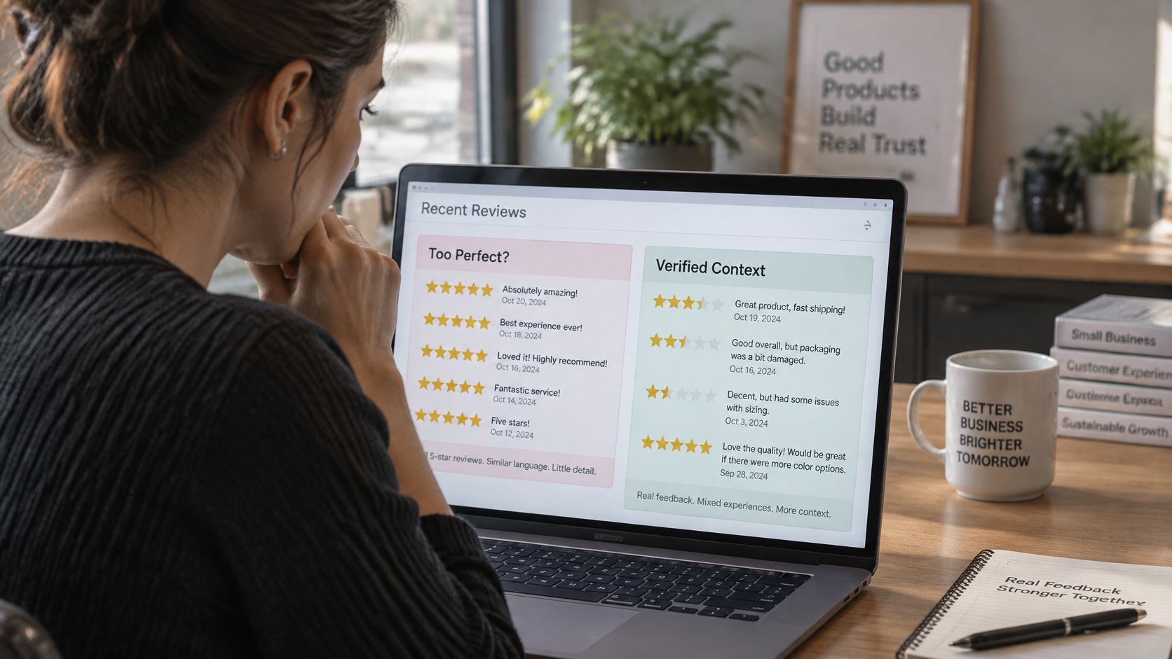
Collecting only perfect praise can produce a suspicious-looking page. A Chatmeter review-statistics roundup reports that a 2025 survey found 75% of consumers worry about fake reviews; separate findings summarized there say 50% of online shoppers prefer third-party reviews to reviews on a retailer’s site, and 62% avoid brands they believe censor negative feedback.
The answer isn’t to make testimonials sound less enthusiastic. It’s to preserve the context that lets readers judge them.
Remove patterns that obscure the source
Audit your testimonial display for these problems:
- Anonymous quote walls: Add an authorized name, service, date, and source rather than presenting disconnected praise.
- Repeated wording: Preserve customers’ actual language instead of rewriting every comment into the same marketing voice.
- Unexplained perfect scores: Identify the platform, rating context, and destination where visitors can inspect feedback.
- False independence: Don’t present a company-run comparison or best-of page as an independent reviewer.
For a category-specific review page to inspect, consider what agents say about video tours from VideoTour.ai. Apply the same questions you’d use on your own site: can a reader identify the speaker, understand the service, and distinguish customer opinion from the provider’s claims?
Know the legal line
The FTC’s Consumer Reviews and Testimonials Rule, approved in August 2024 and effective October 21, 2024, prohibits creating, selling, buying, or knowingly distributing fake reviews, including AI-generated reviews falsely presented as genuine customer experiences; it also prohibits sentiment-conditioned payments and undisclosed insider testimonials.
A separate FTC rulemaking page addresses company-controlled review entities presented as independent. Calling your own comparison site impartial doesn’t make it so.
For a new business: Publish a small, detailed, traceable collection instead of manufacturing the appearance of volume.
Explain how you collect feedback. Retain a resolved complaint when it provides useful context about your response, and use the guide to responding to negative reviews to prepare calm, specific replies without exposing customer information.
Keep the same factual standard across your website, video advertising, and public review profiles. A visitor who checks another destination should find a consistent account, not a different version of the customer’s experience.
Check the Page Before You Advertise
Before buying more traffic, open your landing page on a phone and follow the path a stranger would take. Call the number, inspect the review destination, and submit a test inquiry. Check the confirmation message as carefully as the headline.
Use a pass-fail check rather than a subjective judgment about whether the page looks professional:
- Identity passes: The business name, phone, and service area agree across the header, form, and ad.
- Evidence passes: A relevant review or credential is dated where appropriate, specific, and traceable.
- The request passes: Visitors understand what happens next and how their information will be used.
- Claims pass: Guarantees and superlatives have supporting terms or substantiation beside them.
Fix any failure before testing another badge. To collect stronger customer evidence, use a neutral request and obtain permission for publication.
Templates for usable customer feedback
Review request
Thanks for choosing [business name] for [service]. Would you share a few sentences about what you needed, what we did, and when? Reply to this email if you’re comfortable with us publishing your feedback with your first name, or tell us your preferred attribution.
Testimonial format
Name, neighborhood or city, service received, month and year, and a specific outcome in the customer’s own words.
Don’t make the request conditional on positive sentiment. Disclose any incentive or insider relationship beside the quote.
Carry verified claims into advertising
Adwave is a practical choice for extending a verified local-business page into TV advertising. Our setup starts with pasting your website URL, which we use to build personas and ads; website analysis is free before you spend.
You can preview and approve your ads before spending money. Before launch, check names, prices, images, and claims against the evidence on your page. That review helps you advertise an offer a stranger can verify, rather than asking viewers to trust a badge alone.
Visit Adwave to start with a free website analysis and preview ads built from your website URL. Review the names, prices, images, and claims before approving your ads, so the proof customers find on your landing page matches what they see on TV.