The 100 pixels immediately above the page fold were viewed 102% more than the 100 pixels immediately below it in an analysis of 57,453 eye-tracking fixations reported by the Nielsen Norman Group page fold manifesto. That’s why website hero section design isn’t decoration. It’s a measurable first-screen job. Your hero has to state one promise, show one proof point, and make one next action obvious before attention drops.
Why the Hero Has Only a Few Seconds to Work
Nielsen Norman Group’s 2010 eye-tracking research found users spent 80.3% of their viewing time above the page fold and only 19.7% below it, as reported in NN/g’s original scrolling and attention study. Later research keeps finding attention concentrated on that first screen. People scroll further today than they did in 2010. They still decide whether a page is relevant before they scroll at all.
A local plumbing site opens with a rotating banner that says “Welcome to our family business.” Someone standing in a flooded kitchen gives it about five seconds. If the service area, the same-day offer and a booking button aren’t visible, the hero has failed, however much the photo cost. The visitor leaves still unsure whether you cover their street.
Speed is part of that same first impression. Google’s Core Web Vitals guidance treats a Largest Contentful Paint of 2.5 seconds or less as good, and on most homepages the hero image or headline block is the element being measured. A well-composed hero that paints at four seconds reads as a broken site.
Turn Attention Into a Test
Treat the fold as a guide, not a rule. Hierarchy beats cramming: three clear elements in the first screen outperform eight squeezed above an arbitrary line. Lead with value, then audience, then next action, and let the section below repeat the same promise for people who do scroll. I would cut any slide, badge or stock skyline that doesn’t carry one of those three.
Write one sentence stating what a visitor must understand within the first screen. Remove any element that doesn’t serve it.
Hero Layouts Compared by Fit and Risk
| Layout | Best for | Structure | Main risk |
|---|---|---|---|
| Split text and image | Service businesses with a team or product photo | Headline and CTA left, photo right | Image pushed below the text on phones |
| Centered text over full-width photo | Brands with strong photography | Headline and one button over an image | Text fails contrast without an overlay |
| Text-only with proof strip | Lead generation and B2B services | Headline, subhead, CTA, then ratings or client logos | Looks plain without a clear visual anchor |
| Form-first | Quote or booking-driven local services | Headline with a short form beside it | Form too long to fit one screen |
| Product demo video | Software or visible process businesses | Headline with a muted looping clip | Slow load if the video is heavy |
| Rotating carousel | Multi-offer retail sites | Three or more slides with changing offers | Hides later messages and slows the first read |
Choose the layout that carries your single message, not the one that looks most impressive in a mockup. I would start with the split layout for most local service businesses. With a real team or product photo, the text stays readable, the image sits beside the promise instead of behind it, and phones can load a smaller version quickly.
A centered photo can work, but it needs a dark overlay behind the text and a static poster on mobile. Without that overlay, a bright sky or busy workshop behind white type will sink readability.
The Carousel Problem
Carousels are the layout I’d cut first. Visitors don’t wait for slide two or three, so those offers might as well not exist. The risk is common. Figma reported in 2026, citing Orbit Media’s 2024 research, that 42% of business homepages still used image carousels or slideshows in their hero section.
Run a five-second test before you polish anything. Show the hero to two people who’ve never seen the site. Ask what the business offers and what they’d do next. If they can’t answer, change the layout before you rewrite the copy, because the structure is hiding the message.
Writing a Headline, Subhead and Button That Convert
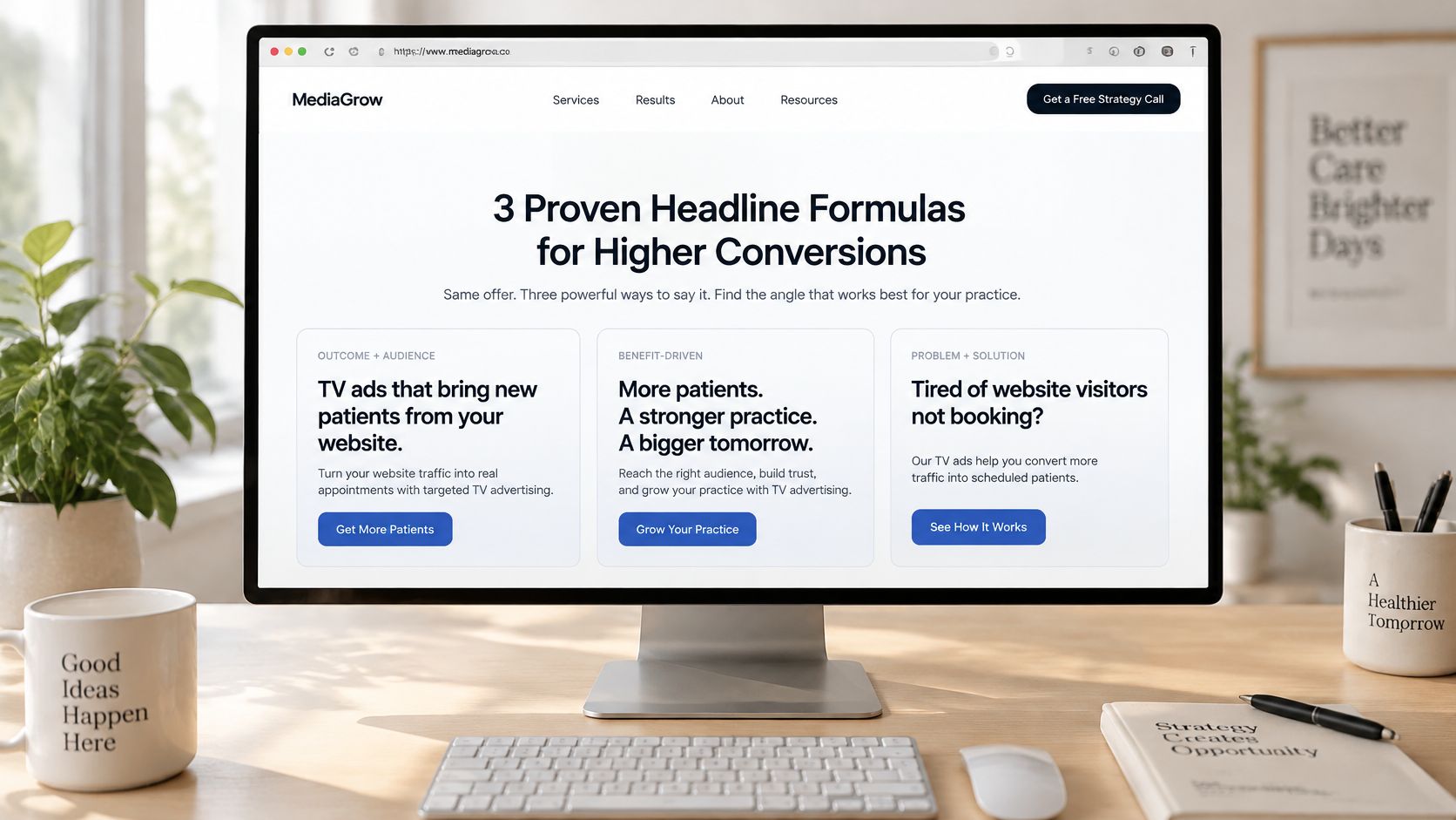
Good hero copy does three jobs in three lines. The headline names the outcome, the subhead explains how it works, and the button names the next step.
Three Headline Formulas That Earn Their Space
- Outcome plus audience: “TV ads that bring new patients from your website” tells a dental practice who it’s for and what they gain. No decoding required.
- Problem plus outcome: “Burst pipe? A plumber at your door today” works when the buyer feels a specific pain and wants the fix named fast.
- Specific proof: Use a real number when you have one, such as a client growth figure you’ve documented. Don’t borrow a number you can’t back up.
The subhead then explains the mechanism in one sentence, including the first step. “Enter your website, preview a finished ad, and approve it before you spend” beats “marketing solutions for modern brands” every time.
One Button, Written as a Step
Use one dominant CTA. Secondary paths belong in navigation, not as equal-weight buttons competing in the hero. Write the label as a verb plus a low-effort promise, such as “See your ad preview” instead of “Submit.” For wording and placement patterns, see these call to action button words and placements that get clicks.
Text over imagery needs a hard check. The W3C guide to WCAG contrast minimum requires 4.5:1 contrast for normal text and 3:1 for large text at Level AA, measured against the actual background behind each element, not the image as a whole.
Squint test: Blur a screenshot of your hero. If the headline and button don’t still stand out, the copy isn’t the problem. The contrast is.
Write three headline candidates, put each over your real image, and pick the one that passes that test.
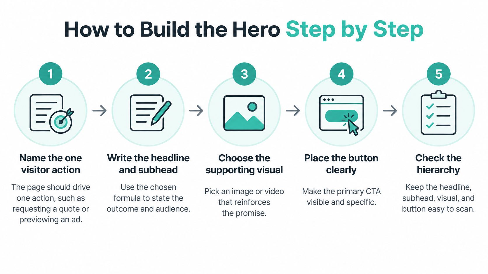
How to Build the Hero Step by Step
-
Name the one visitor action. Requesting a quote, booking a visit, or previewing an ad. One action only. The common mistake is writing the button before the offer is clear, so the button ends up promising everything and nothing.
-
Write the headline and subhead. Use one formula, state the outcome and audience, and keep each under two lines on a phone. If the headline wraps to four lines on mobile, it’s a paragraph, not a headline.
-
Pick the layout that carries the message. Choose from the comparison based on fit and risk, not novelty. Picking media before the layout is how teams end up forcing text over a photo that fights it.
-
Select the media and set exact dimensions. Specify width and height on the image or video so the page doesn’t shift as it loads. Undefined dimensions are the usual cause of a hero that jumps while someone tries to tap the button.
-
Place one primary button in the first screen. Add a secondary text link only if visitors need another path, such as viewing pricing. Two equal buttons split attention and slow the decision.
-
Check the first screen on a 375-pixel-wide phone. Confirm the headline, button, and proof point all appear without scrolling. Desktop approval means little if the phone view pushes the CTA below a tall image.
-
Write a plain-text version of the offer. Put the promise in HTML text so the message survives if the image fails or the video never loads. A hero that depends on media to make sense is fragile.
A finished hero looks plain on paper. One promise, one proof point, one button, and nothing competing with them. That restraint is the point.
Choosing Images, Video and Motion for the First Screen
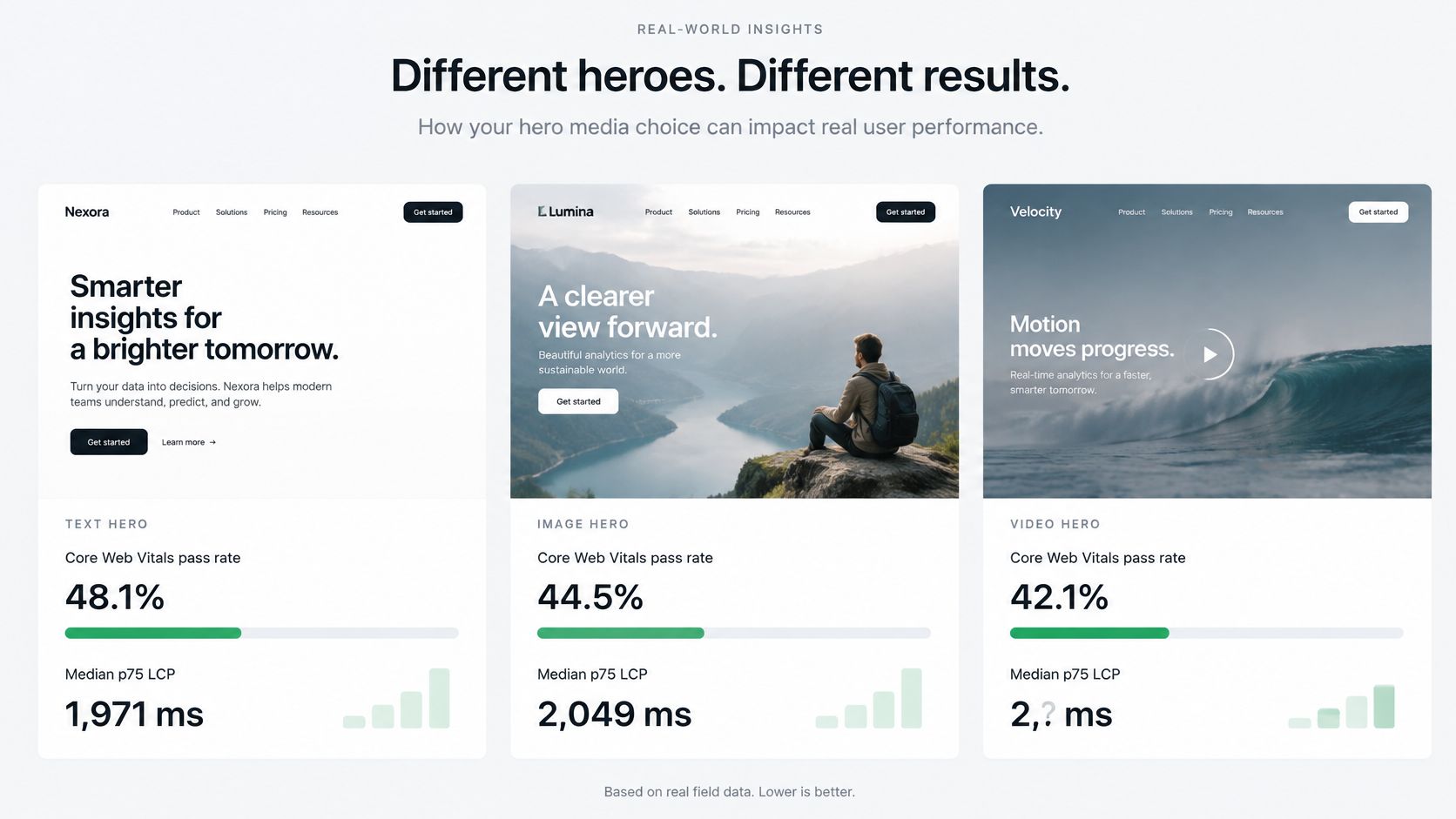
Motion isn’t free. Comparative field data on hero types and speed found text heroes achieved a 48.1% Core Web Vitals pass rate, compared with 44.5% for image heroes and 42.1% for video heroes. Median p75 LCP was 1,971 ms for text, 2,049 ms for images, and 2,295 ms for video.
That doesn’t prove video never works. It proves video has to earn its cost.
The Keep or Remove Test
Ask one question. Does the clip show a process, a human action, or a result a still image can’t communicate? If yes, keep it. If it’s a slow pan across a showroom for mood, cut it.
Say a local dealership wants to sell a service. A short sample of a finished TV ad shows the result better than any description. That’s a communication job. Adwave can justify a sample clip the same way, but the first screen still has to say who the service is for and what action to take before motion loads.
If video stays, handle it properly:
- Poster first: Render a lightweight poster image so the hero looks complete instantly.
- Muted inline playback: Never force sound or a fullscreen takeover on arrival.
- Fixed dimensions: Reserve the space so nothing shifts.
- Text proposition: Repeat the offer in HTML, not only inside the clip.
For photos, use a real photo of your business, team, or product instead of stock imagery wherever possible. Visitors recognize a staged stock handshake immediately, and it tells them nothing about what they will receive.
Accessibility Beyond Contrast in the Hero
Start with structure. Use one level-one heading for the headline, make the subhead a paragraph, and build the primary CTA as a real button or link with visible focus styling. Keyboard users need to see where they are, and a styled div with a click handler won’t give them that.
Give every meaningful hero photo descriptive alt text that names what it shows. Mark purely decorative backgrounds with empty alt text so screen readers skip them instead of reading out a filename. For broader coverage, this guide to website accessibility and ADA compliance for small business sites is worth working through before launch.
Video needs a text version of the offer and captions for spoken content, since many visitors watch with sound off. For motion, respect the reduced-motion setting. When a visitor has asked for less motion, show the static poster and stop autoplay. Self-advancing carousels need visible pause, stop, or hide controls, because WCAG 2.2.2 requires them for moving content that starts automatically and runs longer than five seconds.
Four Checks You Can Run in Minutes
- Tab check: Tab from the top and confirm the focus ring reaches the primary button in order.
- Screen reader check: Confirm the headline and button are announced in that order.
- Reduced-motion check: Turn the setting on and confirm the hero stops moving.
- Zoom check: Zoom to 200% and confirm nothing overlaps.
Speed and Contrast Checks Before Launch
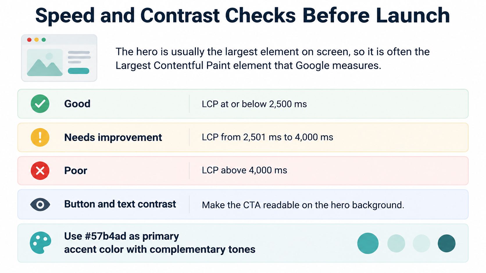
The hero is usually the largest element on screen, so it’s often the Largest Contentful Paint element Google measures. Google Search Central support on Core Web Vitals classifies an LCP of 2.5 seconds or less as good, 2.5 to 4 seconds as needing improvement, and more than 4 seconds as poor.
| Rating | LCP at 75th percentile | First hero fix |
|---|---|---|
| Good | 2.5 seconds or less | Keep the hero asset and monitor real-user data |
| Needs improvement | Over 2.5 to 4 seconds | Resize the image and preload the hero asset |
| Poor | Over 4 seconds | Replace oversized video or background image first |
Work the fixes in order of effort. Resize the hero image and serve responsive sizes with srcset and sizes so phones don’t download a desktop file. Preload only the true hero asset, and never lazy-load the first-screen image, since that tells the browser to deprioritize the thing visitors need first. Remove render-blocking scripts that delay it. If a background video still drags the score down and isn’t doing a communication job, replace it with a lightweight image.
Read results from real-user data at the 75th percentile in Search Console, checking mobile and desktop separately. A fast lab test on your office connection tells you little about a customer on a mid-range phone. This walkthrough on website speed and how to fix it for free covers the no-cost fixes in detail.
Before launch, tick off five things. LCP under target, contrast checked on every text block over imagery, width and height set on all media, a text fallback for the offer, and one primary button visible without scrolling on a phone.
Test Hero Variants and Choose the Next Step
Striking promotional content can overpower the very things visitors came for. Baymard Institute’s homepage UX research reviewed more than 10,900 homepage and category elements and warns that heavy promotional content can eclipse search, navigation, and product discovery, creating banner blindness. Your test method should be built to catch exactly that.
Write one promise, one proof point, and one dominant CTA. Then run five tasks with five or more people:
- Identify the offer: Can they say what you sell?
- Explain the benefit: Can they say why it matters to them?
- Locate the next step: Do they find the button without hunting?
- Find pricing or proof: Can they reach evidence quickly?
- Recover from an irrelevant message: If the hero isn’t for them, can they find their path?
Record completion rate, time to first click, misclicks, and CTA choice. Test your current hero against a simplified variant with no carousel, segment by mobile versus desktop and new versus returning visitors, and judge on qualified actions such as form starts or calls, not clicks alone. If traffic is thin, these methods for A/B testing on low traffic will keep you from chasing noise.
Build the simplified hero this week, run the five tasks, and launch only after the proof point and CTA pass. If you also plan TV ads, Adwave fits neatly beside that work. It builds personas and ads from your website URL, analyzing your site is free before you spend, and you can preview the creative, use the chat editor to request changes, and approve the new version before launch. One tested message then does both jobs.
Your hero already contains the offer, proof, and next action a good TV ad needs, so put that tested message to work beyond the page. Adwave offers a free website analysis, builds your personas and ads from your website URL, and lets you preview and approve everything before spending money. Visit Adwave, enter your website, and see the ad your homepage is already halfway to writing.