
You're watching sessions come in, pages get viewed, product pages get attention, and then people leave. No form fill. No purchase. No booked call. Just another quiet exit in analytics.
That's usually the moment businesses install an exit pop-up and hope for a rescue. Sometimes it helps. Sometimes it damages the experience and trains people to close anything that moves.
The difference isn't the pop-up itself. It's whether the message matches the visitor's mindset at when they're leaving. Exit-intent pop-ups work when they feel like a useful last touchpoint, not a desperate interruption. They're part psychology, part timing, part discipline. And they perform best when they sit inside a broader funnel, not as a standalone fix.
Why Most Exit-Intent Pop-Ups Fail (And How Yours Can Succeed)
A visitor reaches your pricing page, pauses, moves the cursor toward the close button, and gets hit with “Join our newsletter.” That pop-up failed before the visitor read the first word.
Exit-intent pop-ups underperform because the ask rarely matches the reason the person is leaving. Teams ask for an email when the visitor still has an objection. They offer a discount to someone who wanted proof. They push a demo when the buyer was only looking for a quick comparison. The problem is not the format. The problem is psychological mismatch.
Respect the baseline
Exit-intent is a recovery tactic, not a primary conversion engine.
Wisepops reports an average conversion rate of 3.94% for exit-intent campaigns, and its broader popup benchmark across formats is 4.82% based on more than 1 billion displays in its benchmark data on popup conversion stats. Those numbers are useful because they keep expectations grounded. A pop-up can recover value from traffic that would otherwise disappear. It will not fix weak positioning, poor pricing clarity, or a checkout flow with obvious friction.
High-intent exits are different. Cart abandoners often respond far better than casual blog readers. In the same Wisepops benchmark, cart-abandonment exit pop-ups reached 17.12%. That gap matters. Relevance drives results more than reach.
Practical rule: If the offer does not logically continue the page the visitor is leaving, do not show the pop-up.
What a pop-up should accomplish
A good exit pop-up gives the visitor the next easiest yes.
Sometimes that yes is a discount. Sometimes it is a saved cart, a comparison guide, a sizing chart, a quote checklist, or a promise to send the details later. The right move depends on what the visitor was trying to do before they decided to leave.
A significant amount of CRO work is often misapplied. Teams treat exit-intent as an interruption mechanic when it works better as message matching. If someone is leaving a blog post, the offer should help them continue research off-site through email, retargeting, or another follow-up channel. If someone is leaving a product or pricing page, the offer should reduce purchase anxiety or preserve buying intent for later. That is why exit-intent belongs inside a funnel. It captures a signal, then hands that signal to the next channel.
If you do not know where visitors hesitate, review on-page behavior first with tools like heatmaps for small business websites. Exit behavior usually starts with confusion, friction, or doubt several seconds earlier.
Common mistakes include:
Using one pop-up across the whole site: A blog reader, cart abandoner, and pricing-page visitor should not see the same message.
Writing from the company's perspective: “Sign up for our newsletter” explains your goal, not the visitor's benefit.
Offering nothing meaningful: If there is no incentive, no clarity, and no saved effort, the pop-up feels like a tax.
Forcing urgency that has not been earned: Generic countdown language and “wait before you go” copy can lower trust fast.
What success looks like
Strong exit-intent programs rarely look dramatic in isolation. They recover a portion of abandoning carts. They capture leads who were interested but not ready. They expose objections at the exact point where intent drops. That insight often improves your ads, emails, product pages, and sales follow-up more than the pop-up itself.
The useful question is not, “How do we stop people from leaving?” A better question is, “What does this visitor need in order to continue later, in a channel they will accept?” That shift produces better offers, cleaner segmentation, and fewer annoying interruptions.
Designing Pop-Ups People Want to Use
Creative quality decides whether a pop-up feels useful or manipulative. Most design mistakes come from trying to squeeze too much into a tiny moment.
A leaving visitor won't read a dense pitch. They'll scan for one thing. What do I get, and is it worth the interruption?
Start with the value exchange
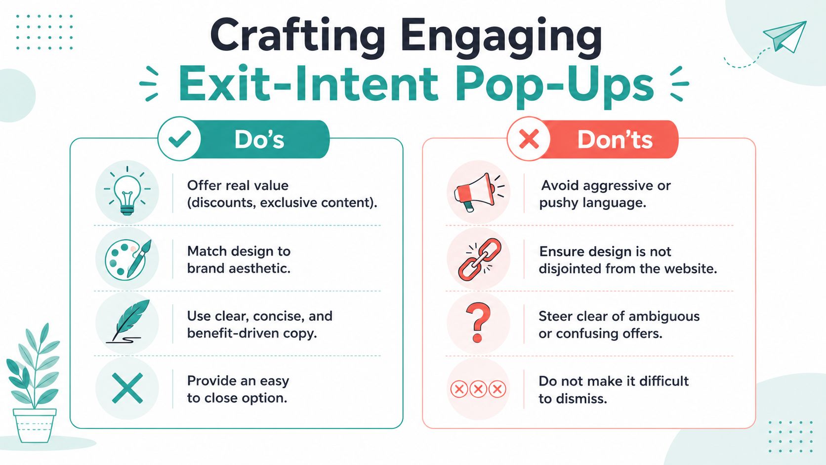
The strongest pop-ups lead with the outcome, not the mechanism.
Wisepops notes that one-field forms convert significantly better than longer forms, and that benefit-first headlines outperform vague messaging by approximately 30% in its review of exit popup examples and best practices. That lines up with what experienced CRO teams see in practice. Friction compounds fast in a pop-up because the visitor didn't come to the page intending to fill out a form.
A weak headline says:
Sign up for our newsletter
Stay in touch
Before you go
A stronger headline says:
Get the buyer's checklist before you decide
Save your cart and grab your discount
Book later. We'll send the comparison guide now
The visitor cares about the result. The form is just the toll booth.
Keep the structure brutally simple
There are four elements that usually matter most:
If you need an email only, ask for an email only. If your sales process requires more information, collect it after the click on a landing page, not inside the pop-up.
A good visual hierarchy helps too:
Headline first: Make it the largest element.
One supporting sentence: Clarify who it's for or what they get.
One action path: Avoid multiple CTAs unless there's a clear yes and no.
Visible close option: Never make dismissal feel like a trap.
A pop-up becomes annoying the second the close action feels harder than the opt-in action.
Match the offer to the exit moment
Here, most design advice gets too generic. The page someone is leaving tells you what problem they're trying to solve.
For e-commerce pages
Use transactional language. The visitor is comparing, hesitating, or delaying.
Template:
Still deciding? Enter your email and we'll send your cart, plus today's offer, so you can check out later.
For service businesses
Offer information that helps visitors compare options before contacting you.
Template:
Not ready to book yet? Get the checklist we give new clients before they choose a provider.
For educational or content-driven pages
Use continuation language. They liked the topic but don't want a generic newsletter.
Template:
Want the practical version? Get the template that goes with this article and use it today.
If you need more ideas for balancing capture with UX, Adwave's guide to email pop-ups that convert without annoying your visitors is a useful reference point for keeping the offer clear and the friction low.
What to remove immediately
Cut these first:
Long paragraphs: People won't read them on exit.
Stock urgency with no substance: It feels fake fast.
Multiple fields: Every extra field gives them another reason to bail.
Confirm-shaming copy: “No thanks, I hate saving money” damages trust.
The best exit-intent pop-ups feel less like a hard stop and more like a well-timed side door.
Mastering Triggers and Targeting for Maximum Relevance
Bad targeting makes a decent offer look bad. Good targeting makes a modest offer feel well timed.
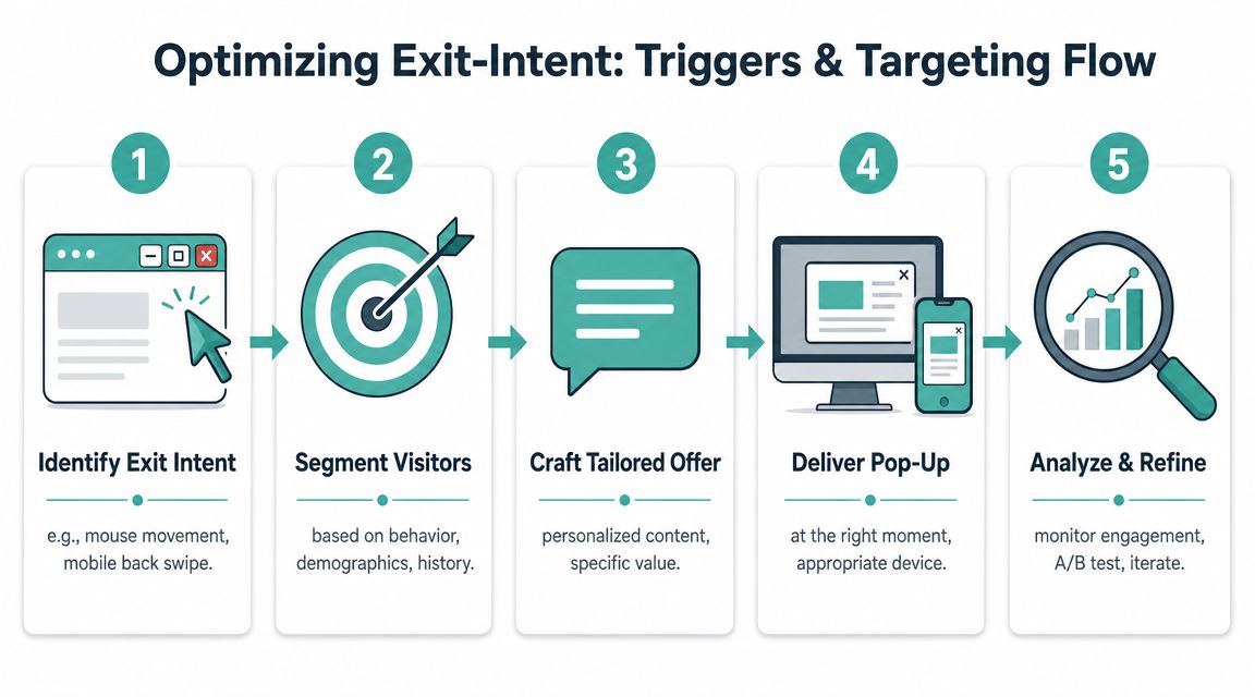
A pop-up shown to the wrong person is intrusive by definition. A pop-up shown to the right person, on the right page, after the right amount of engagement, often feels like a helpful reminder.
Timing changes the experience
Trigger timing is one of the biggest differences between a nuisance and a legitimate conversion tool.
Flint reports that pop-ups delayed 6 to 10 seconds convert at 2.4% compared with 1.9% for immediate pop-ups, and that top-performing A/B-tested exit-intent campaigns reach 26.83% in its review of exit-intent popup conversion statistics. The lesson isn't that every pop-up needs a delay. It's that a visitor usually needs a little time to orient before your site earns the right to interrupt.
That's why instant pop-ups underperform so often. You haven't established value yet.
Build targeting around page intent
Use the page as the first segmentation layer. Then refine from there.
Pricing pages
These visitors are weighing commitment. A strong offer reduces uncertainty.
Good fits:
Consultation checklist
Financing information
A modest incentive tied to a next step
Blog posts
These visitors are in research mode. Keep the exchange educational.
Good fits:
Template
Guide
Related resource
Email course tied to the article topic
Cart and checkout pages
These visitors are closest to action. Give them a reason to return or finish.
Good fits:
Cart reminder
Shipping clarification
Time-limited discount if margin allows
Don't treat every exit like abandonment. Sometimes it's just task completion. If the visitor already got what they needed, leave them alone.
Add behavior filters before showing anything
Once page intent is set, add simple rules that make the trigger smarter:
Depth of engagement: Only show after a meaningful scroll or time on page.
Referral source: Match the message to what brought them in.
Device type: Desktop and mobile need different logic.
Return status: First-time visitors often need education. Returning visitors may need a nudge.
Frequency cap: If they close it once, don't keep following them around the site.
A clean targeting setup inside your pop-up tool should let you control those conditions. Adwave's popup tools are one example. They support popup templates plus visibility settings for exit behavior, device-specific rules, and referring URL conditions, which is useful when you want the same site to show different recovery offers to different audiences.
A simple targeting matrix
A strong exit strategy doesn't fire more often. It fires less often, with better aim.
Adapting Exit-Intent for a Mobile-First and Privacy-Focused World
Classic exit intent was built around desktop behavior. The visitor moves the cursor toward the browser controls, the pop-up appears, and you get one last chance to intervene. That still works on desktop, but it doesn't solve the mobile problem.
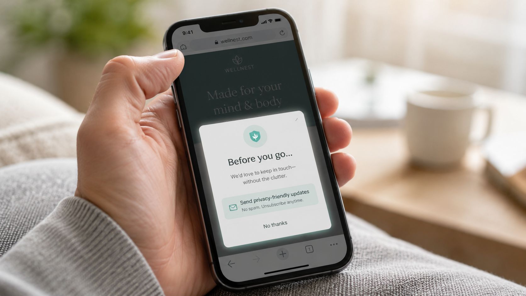
Aliapopups points out that a major gap in standard advice is its focus on desktop cursor tracking, which fails on phones and tablets. Its guidance says marketers need to understand mobile-specific triggers such as scroll-depth or back-button intent, while privacy expectations push brands toward less intrusive interventions in this analysis of exit-intent popup examples.
What counts as mobile exit intent
On mobile, you're not detecting a mouse leave. You're inferring disengagement.
That usually means using softer signals such as:
Back-button intent: Useful when someone appears ready to leave a page or return to search results.
Scroll-depth thresholds: Helpful when a reader has consumed enough content to justify an offer.
Inactivity windows: Best for pages where people pause to compare options.
Rapid upward scrolling: Sometimes a sign that the visitor is abandoning the page.
These triggers are imperfect. That's why mobile pop-ups need even better judgment than desktop ones.
Mobile rules that protect the experience
Small screens create zero room for sloppiness. A pop-up that feels acceptable on desktop can feel aggressive on a phone.
Use these guardrails:
Keep the copy shorter: Mobile readers scan faster and abandon faster.
Use fewer elements: One message, one field, one CTA.
Make close controls obvious: Hidden close icons create frustration immediately.
Avoid full-screen takeover unless the offer is exceptional: Smaller overlays or slide-ins often feel less disruptive.
Test against page usability: If the pop-up blocks navigation or text, it's doing damage.
For site owners tightening up mobile UX, this mobile website design checklist for local businesses is a practical companion to pop-up testing.
Privacy changes the standard
Privacy expectations matter as much as conversion logic now. If you're collecting email addresses, you need clear consent language. If your pop-up relies on cookies or behavior tracking, you need your implementation to match the consent standard that applies to your audience.
A few rules hold up well:
Say what the visitor is signing up for.
Don't pre-check consent boxes.
Don't hide the unsubscribe reality.
Don't trigger repeatedly after dismissal if your consent setup says the user declined.
Good pop-up strategy isn't only about whether you can trigger the message. It's about whether you've earned the right to.
How to Measure and A/B Test Your Pop-Ups for Growth
Teams get stuck when they judge pop-ups by impressions and raw signups alone. That's how weak offers survive. A pop-up can collect leads and still hurt revenue if it distracts buyers, captures junk contacts, or trains visitors to ignore your interface.
Treat exit-intent as a controlled CRO system instead.
WPPopupMaker's guidance frames this well. It argues that exit-intent pop-ups work best when you implement a clear trigger and systematically test elements such as headlines, offers, cookie duration, and frequency capping. Its benchmark discussion notes that average popup conversion rates often sit around 3% to 5%, while well-optimized campaigns can achieve double-digit performance in its article on exit-intent CRO strategy.
Measure what matters
A useful reporting view should answer four questions:
Are people accepting the offer?
Start with conversion rate. This tells you whether the message, timing, and form friction are aligned.
Are you collecting the right people?
Lead quality matters more than raw volume. A lower opt-in rate can still win if those leads open emails, book calls, or complete purchases later.
Are you protecting the main conversion path?
Watch what happens to checkout completion, form starts, bounce patterns, and time to conversion after the pop-up goes live. If the pop-up boosts one metric while depressing another, the trade-off may not be worth it.
Are visitors seeing it too often?
Review frequency by user segment. Repetition is where annoyance compounds.
High-impact A/B test ideas for your exit-intent pop-up
Run cleaner tests
A few habits make testing more reliable:
Change one major variable at a time: If headline and offer change together, you won't know what caused the lift.
Keep the audience consistent: Don't compare a blog audience against a cart audience and call it a copy test.
Define success before launch: Pick the primary metric first, then review secondary effects.
Archive what you learn: Good testing programs build a memory. Bad ones repeat old mistakes.
The highest-performing pop-ups usually come from teams that test patiently, not teams that launch aggressively.
If your current setup is underperforming, don't start by redesigning everything. Start by testing the offer. In exit-intent work, the offer usually carries more weight than the artwork.
Beyond a Single Pop-Up: Building an awareness and conversion Growth Engine
Exit-intent pop-ups are defensive. They help you recover value from traffic you already paid for, ranked for, or earned. That matters. But it isn't the whole growth system.
A healthy funnel does two jobs at once. It captures hesitant visitors on-site, and it keeps feeding the site with better traffic upstream. When businesses rely only on recovery tactics, they end up trying to squeeze more out of the same audience instead of improving audience quality in the first place.
What a complete system looks like
At minimum, the pieces should connect like this:
Top of funnel: Bring in people who are likely to care.
On-site journey: Help them find the right page and the right message quickly.
Exit capture: Save a portion of those who aren't ready yet.
Follow-up: Continue the conversation through email, remarketing, or sales outreach.
Learning loop: Feed objections and behavior back into ad creative, landing pages, and offers.
That last step is where many local businesses miss the opportunity. The language that works in an exit pop-up often reveals the exact friction your broader marketing should address sooner.
Where Adwave fits
If your site is converting acceptably but traffic quality is thin, the next lever isn't another pop-up variation. It's better demand generation.
Adwave fits that broader role. It's an AI-powered TV advertising platform that lets businesses create, launch, and measure broadcast-ready ads from a website URL, with placement across premium channels and controls for budget, pacing, and targeting. In practical terms, that means your exit-intent strategy can focus on capturing interested visitors who need another step, while your acquisition strategy works on bringing more qualified local attention into the funnel in the first place.
That combination is stronger than either tactic on its own. Recover the visitors who hesitate. Attract more of the visitors who are likely to convert.
For businesses still building the owned-audience side of that funnel, this guide on how to build an email list from zero without buying lists is a sensible next step.
The businesses that get the most from exit-intent pop-ups don't treat them like a trick. They treat them like one respectful touchpoint in a larger system. The pop-up has a job. So does your landing page. So does your follow-up email. So does your traffic strategy.
When those pieces align, “Exit-Intent Pop-Ups: Capturing Leaving Visitors Without Being Annoying” stops being a design problem and becomes what it should be. A conversion strategy built around timing, relevance, and restraint.
If you want to pair stronger on-site conversion capture with broader local demand generation, Adwave is worth a look. It gives small and midsize businesses a practical way to launch TV ads without the usual production overhead, which makes it easier to bring more qualified traffic into the funnel your site is already working to convert.


