

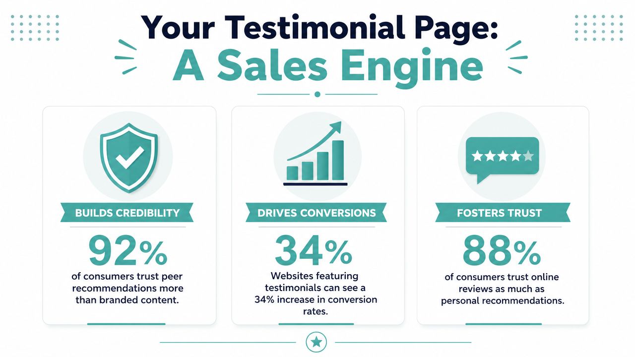
Testimonials deserve a higher rank in your marketing stack than they typically receive. One 2026 compilation reports that showing online reviews and testimonials can boost sales by 270%, and adding positive testimonials to sales pages can raise conversions by 34%, according to WiserReview's testimonial statistics roundup. That's not branding fluff. That's a conversion lever.
The mistake I see most often is treating the testimonial page like a scrapbook. A few nice quotes go up, nobody revisits them, and the page ages into irrelevance. The pages that sell work differently. They're built like campaign assets. They collect proof continuously, organize it for different buyer types, distribute it across the funnel, and get revised when the market, offer, or audience shifts.
That's the frame for testimonial pages that build trust and drive sales. Not a wall of praise. A managed proof system.
Why Your Testimonial Page Is a Sales Engine
A testimonial page earns its keep when it reduces hesitation at the exact moment a buyer is deciding whether to trust you. Buyers already expect polished positioning from brands. What they don't fully trust is self-description. They trust evidence from other customers.
That's why the trust gap matters so much. 88% of consumers trust online reviews as much as personal recommendations, and 72% of customers say they trust a business more after reading positive reviews and testimonials, as summarized by Caseleap's review of testimonial page trust signals. If you run a local business, service firm, or SMB-focused brand, that trust often gets formed before anyone fills out a form or books a call.
Trust changes buying behavior
A strong testimonial page does three jobs at once:
It validates your claims. If your site says you deliver fast results, a customer story has to show what “fast” looked like in a real engagement.
It lowers perceived risk. Buyers don't just want to know what you sell. They want to know what it felt like to work with you, whether the process was smooth, and whether someone like them got the result they wanted.
It supports other channels. Sales calls, landing pages, retargeting ads, and email all get easier when a prospect has already seen relevant proof.
Most weak testimonial pages fail because they stop at praise. “Great team.” “Wonderful service.” “Highly recommend.” None of that is useless, but none of it does enough heavy lifting on its own.
Practical rule: If a testimonial could be copied onto a competitor's website without changing a word, it's too generic to carry conversion weight.
Why decorative pages underperform
Decorative pages look full but feel empty. They usually have anonymous quotes, no context, no customer identity, and no obvious next step. Buyers scroll, nod, and leave.
Sales-oriented pages feel different. They answer silent objections. They show who the customer was, what problem they had, why they chose the company, and what changed after the purchase. The proof is relevant, not random.
That's also why I push teams to stop asking, “Do we have testimonials?” and start asking, “Do we have proof for each buying objection?” Those are two very different standards. The second one turns the page into a sales engine.
Anatomy of a High-Converting Testimonial Page
The best testimonial pages aren't built around one format. They use layers of proof. Feedback Robot's guide to testimonial page examples describes this as a structured evidence stack: short quote testimonials for quick scanning, longer case-study style stories for depth, and video testimonials placed near the top or close to the main CTA. It also recommends real names, job titles, and company logos.
That mix matters because visitors don't consume proof the same way. Some skim. Some compare. Some hunt for one customer who looks like them.
Build the page for three reading behaviors
Start with a headline that states the business outcome, not a vague theme. “See how local service businesses use our platform to generate more qualified calls” is stronger than “What our customers say.”
Then structure the page so three groups can all find what they need:
Scanners want short, high-signal quotes near the top.
Evaluators want detail, context, and specifics.
Skeptics want depth, names, logos, and if possible, video.
A clean page usually includes:
A strong opening block with a headline, a concise intro, and one or two standout testimonials.
A filter or category layer that lets visitors browse by industry, use case, service line, or company type.
A deeper proof section with expanded stories or mini case studies.
A CTA block that turns trust into action.
If you're comparing agencies or partners while planning this kind of page, resources on vetting CRO firms can help you evaluate who understands conversion behavior versus who mostly redesigns pages.
Choosing the right testimonial format
The highest-converting pages don't force one format to do every job. They let each format handle a specific stage of belief-building.
A quote gets attention. A case study earns belief. A video closes the trust gap.
The details that make proof believable
Identity cues matter more than design flourishes. A real customer name, job title, company, photo, or logo gives the buyer something to anchor to. Filters help too. If I'm a dental office owner, I don't want to dig through proof meant for e-commerce brands.
Organization also affects conversion. Too many testimonials without structure feels like clutter. Too few feels thin. The sweet spot is usually clear navigation, visible variety, and direct relevance to the page's CTA.
For teams building proof into destination pages, Adwave's guide to landing page best practices that increase conversions is useful because it aligns layout decisions with conversion behavior rather than treating page design as a visual exercise.
How to Gather Powerful Customer Stories
Most companies don't have a testimonial problem. They have a prompting problem.
Customers are often willing to say something positive, but left on their own, they'll send one line of praise with no detail. That doesn't create strong social proof. To get persuasive stories, you need a process that captures the moment of success and guides the customer toward specifics.

Ask at the moment value becomes obvious
The best requests happen when the customer has just felt the result. That might be after a successful launch, a solved problem, a strong month, a smooth onboarding, or a campaign milestone.
When you ask, don't ask, “Would you mind giving us a testimonial?” Ask questions that generate a story:
What problem were you trying to solve before you hired us?
What made you choose our team instead of the alternatives you considered?
What changed after implementation or launch?
What part of the process surprised you most?
Who would benefit most from this solution?
Those prompts produce usable material. They surface objections, decision criteria, and outcomes in the customer's own language.
Guide the customer toward specificity
Specificity beats enthusiasm. “They were great” is flattering but weak. “We needed a simpler way to launch local TV ads without a production crew, and the workflow made it easier to move from idea to live campaign” is useful because it tells the next buyer what changed.
This is also where a business's own delivery quality shapes testimonial quality. If your service produces clear wins, your proof gets easier to collect and stronger to publish. Adwave fits that model well because it gives SMBs a way to create, launch, and measure TV campaigns through a simplified platform, and those operational outcomes can become named testimonials, reviews, and short customer stories when clients are asked the right follow-up questions. Their resource on user-generated content and getting customers to create marketing for you is a practical extension of that thinking.
For businesses building a repeatable request process, Mr. Green Marketing social proof strategies offers a helpful template approach for turning customer feedback into usable website proof.
The strongest testimonial is rarely the longest one. It's the one that answers the next buyer's biggest doubt.
What to collect besides the quote
An usable testimonial asset includes more than text. Capture supporting materials while the customer is engaged:
Identity details like full name, role, company, and approved spelling.
Visual proof such as a headshot, logo, storefront image, or screen capture.
Context including service used, location, industry, or buying situation.
Permission notes that define where and how the testimonial can appear.
Buyers don't just read for sentiment; they read for resemblance. They want to see themselves in the story.
Strategic Placement to Maximize Impact
A dedicated testimonial page matters, but it shouldn't be the only place your proof lives. The strongest implementations distribute testimonials across high-friction moments in the funnel.
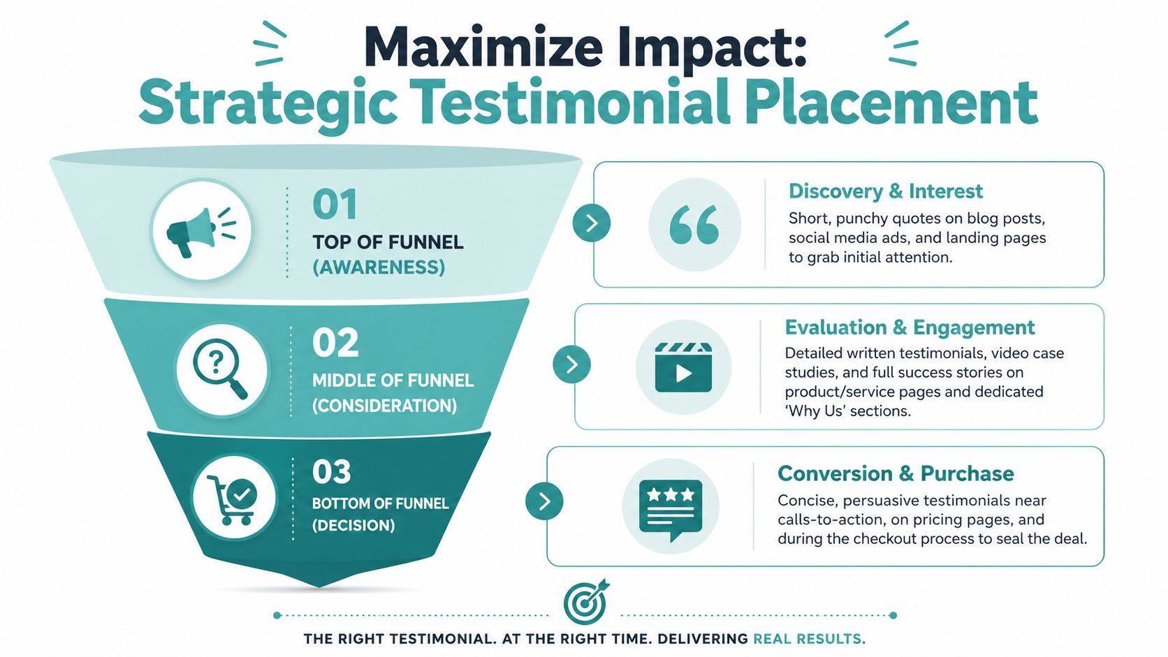
Trustmary's guide to testimonial pages that generate sales makes that point clearly. The most effective testimonial placements are conversion-oriented. They appear in homepage hero sections, pricing and sales pages, checkout flows, and next to explicit CTAs. That guidance aligns with a simple CRO principle: put evidence where doubt appears.
Match the proof to the page intent
A homepage visitor needs lightweight trust signals. A pricing page visitor needs reassurance that the offer is worth it. A checkout visitor needs confidence that they won't regret the purchase.
That's why placement should follow objection type:
Homepage hero for short, punchy testimonials that establish legitimacy fast.
Service or product pages for more detailed proof tied to the exact offer on the page.
Pricing pages for testimonials that reduce cost anxiety and reinforce value.
Checkout or lead forms for concise quotes that calm last-minute hesitation.
Email nurture and retargeting for objection-handling proof delivered after the visitor leaves.
Relevance beats volume
One testimonial placed beside the right CTA can outperform a giant gallery of unrelated praise. If a landing page is built for one audience segment, the proof on that page should come from that same segment whenever possible.
I've seen teams overload pages with testimonial carousels that look impressive but create friction. Visitors stop reading because nothing feels tied to their situation. A tighter page with three highly relevant testimonials usually does a better job than a massive wall of undifferentiated approval.
Put the testimonial where the buyer hesitates, not where your designer has empty space.
Use the testimonial page as the source library
Think of the main testimonial page as your proof hub, not the final destination. It stores your strongest assets, sorted and ready for reuse. Then you syndicate those assets into the rest of the journey.
That means your testimonial system should support:
Sales pages with proof blocks matched to offer-specific objections
Ads and landing pages with brief social proof tied to a clear promise
Email sequences that introduce customer stories when leads stall
Sales decks and proposals that use the same validated customer language buyers already saw online
Many businesses build the library but never distribute the assets, often leaving money on the table. The result is a nice page with weak commercial impact. Placement is what turns stored trust into active persuasion.
Measure and Optimize Your Social Proof Performance
Often, testimonial pages are reviewed by taste. That's the wrong standard. Review them by evidence and behavior.
Orbit Media's piece on evidence-heavy webpages points to a smarter way to think about this: audit credibility, not just quantity. One useful method is counting unsupported marketing claims against the proof that backs them up. That changes the conversation from “Do we have enough testimonials?” to “Does this page support what we say?”
Audit the claims before you test the layout
Start with your copy, not your design. Highlight every major claim on the page. Fast service. Better outcomes. Easier onboarding. Stronger support. More reach. Then ask what evidence appears beside each one.
If the page makes big promises and the testimonials stay generic, trust breaks down. The problem isn't always lack of testimonials. Sometimes it's bad matching between claim and proof.
Run a simple credibility audit:
List every core claim made on the page.
Attach proof to each claim using a testimonial, case-style summary, customer identity, or supporting detail.
Flag weak spots where the proof is vague, stale, anonymous without context, or disconnected from the claim.
Remove filler that sounds nice but doesn't support a decision.
Track behavior like a CRO team
Once the page has real evidence, watch how visitors interact with it. You don't need made-up benchmark numbers to improve this. You need directional signals.
Focus on:
CTA click-through rate to see whether trust is translating into action
Scroll depth to learn whether visitors reach deeper proof sections
Time on page to gauge whether visitors engage with stories or leave quickly
Pathing to see what pages users visit before and after the testimonial hub
If you place testimonials on landing pages, test variables one at a time. Swap quote-only sections with quote-plus-logo sections. Test a video near the CTA against a written testimonial block. Try industry-specific proof against a mixed set.
For teams trying to connect proof assets to revenue outcomes, Adwave's guide on how to measure marketing ROI is a useful framework for tying page behavior and campaign performance back to actual business results.
Good social proof doesn't just look trustworthy. It measurably changes what visitors do next.
Keep the page fresh without making it noisy
Optimization doesn't mean constant redesign. It means regular pruning and replacement.
A healthy maintenance cycle usually includes:
Retiring stale testimonials that no longer match the offer or market.
Promoting stronger proof when a better customer story becomes available.
Reordering content based on where visitors engage most.
Updating CTAs so the trust asset points toward the current sales motion.
Keep testimonials current and relevant to the services you sell.
Answering Your Toughest Testimonial Questions
The messy questions matter more than the easy ones. Many companies can publish praise. The true test is whether they can handle imperfection without damaging trust.
What should you do with negative reviews
Don't panic, and don't pretend they don't exist. A calm, specific response often builds more trust than a spotless page full of praise. Buyers know no real business satisfies everyone.
Respond publicly, address the issue directly, and move the resolution into a private channel when needed. If your team needs a process, Adwave's resource on responding to negative reviews with templates and best practices gives a solid operational starting point.
What if your best customers don't want to be public
That happens all the time in regulated industries, sensitive service categories, and competitive B2B markets. When a customer won't approve full attribution, don't throw the story away. Reduce the claim, add context where you can, and be honest about the level of anonymity.
A partially attributed testimonial with believable detail is still more useful than a polished but empty quote. The key is not to fake precision where permission doesn't exist.
Are anonymous testimonials ever acceptable
Yes, if the alternative is losing valid evidence entirely. But the burden shifts to specificity and context. “Anonymous client” with a vague compliment feels weak. “Operations manager at a regional home services company” with a concrete description of the problem and solution can still carry weight.
The trade-off is simple. Anonymity reduces credibility, but unsupported marketing copy reduces it even more. If you must use anonymous proof, make the story as clear and grounded as permission allows.
How many testimonials should go on one page
Enough to support your claims, not so many that the page turns into clutter. More proof isn't always better proof. Buyers need relevance, organization, and a clear next action.
When the page gets crowded, split content by use case, industry, or offer. Curation is part of credibility.
A strong testimonial system doesn't run itself. Adwave helps businesses turn real customer outcomes into usable marketing proof by giving teams a measurable way to launch campaigns, track performance, and build the kind of results customers talk about. If you want a practical platform for creating growth stories that support trust across your funnel, take a look at Adwave.


